More than 70% of online shopping carts get abandoned. Many merchants see that as a leak. I see it as one of the clearest revenue opportunities in Shopify.
After testing cart and checkout flows across dozens of stores, the pattern is consistent. Shoppers rarely abandon for one reason. They leave because shipping costs show up late, checkout asks for too much too soon, payment options feel limited, or a basic question about fit, delivery, returns, or product compatibility goes unanswered at the exact moment they need confidence.
That is why cart abandonment is bigger than a recovery sequence. Recovery still matters, and it can produce strong returns, but the bigger win comes from preventing hesitation before it turns into drop-off. The best-performing stores handle both sides. They reduce friction in checkout and remove uncertainty earlier in the buying journey.
That broader approach is central to improving ecommerce conversion rates. The goal is not only to win back shoppers who left. It is to give more of them enough clarity and trust to finish the purchase on the first visit.
Table of Contents
- The Hidden Opportunity in Lost Carts
- Diagnose Your Abandonment Problem with Data
- Streamline Your Checkout and Remove Friction
- Build Unshakable Trust and Answer Questions Instantly
- Automate Your Multi-Channel Cart Recovery Engine
- Quick-Win Tactics for Shopify Merchants
- Frequently Asked Questions about Cart Abandonment
The Hidden Opportunity in Lost Carts
Every abandoned cart tells you something. The mistake is treating all abandonment as the same event.
Some carts are abandoned by low-intent browsers. Those happen, and they always will. But a large share of lost carts comes from shoppers who were close to buying and hit friction, doubt, or distraction at the wrong moment. That's why abandonment shouldn't be framed as a pure failure. It's a map of where revenue gets stuck.
Two different problems get lumped together
A lot of teams chase a single fix. They redesign the cart page, add a discount popup, or launch an email flow and hope the problem goes away. In practice, abandonment usually comes from two separate causes:
- Checkout friction: too many steps, weak calls to action, delayed fee disclosure, forced account creation, slow form completion
- Purchase uncertainty: unresolved questions about product fit, delivery timing, return terms, payment safety, or whether the item is right at all
If you only work on recovery messages, you'll miss the shoppers who never felt confident enough to continue. If you only work on UX, you'll miss the shoppers who got distracted and needed a reminder.
Abandoned carts are rarely random. Shoppers usually leave for a reason, and that reason is often visible if you look one step earlier in the journey.
Treat abandonment like stalled intent
That shift matters. A stalled checkout isn't just a lost order. It's a broken conversation.
A shopper added to cart because something was working. Interest existed. The job is to identify what interrupted it. Sometimes the answer is operational, like surfacing shipping earlier. Sometimes it's psychological, like making returns easier to understand. Sometimes it's immediate support, because the shopper had one simple question and no fast way to get an answer.
The best stores build for both prevention and recovery. They reduce the chances of abandonment before checkout starts, then recover the carts that still slip through.
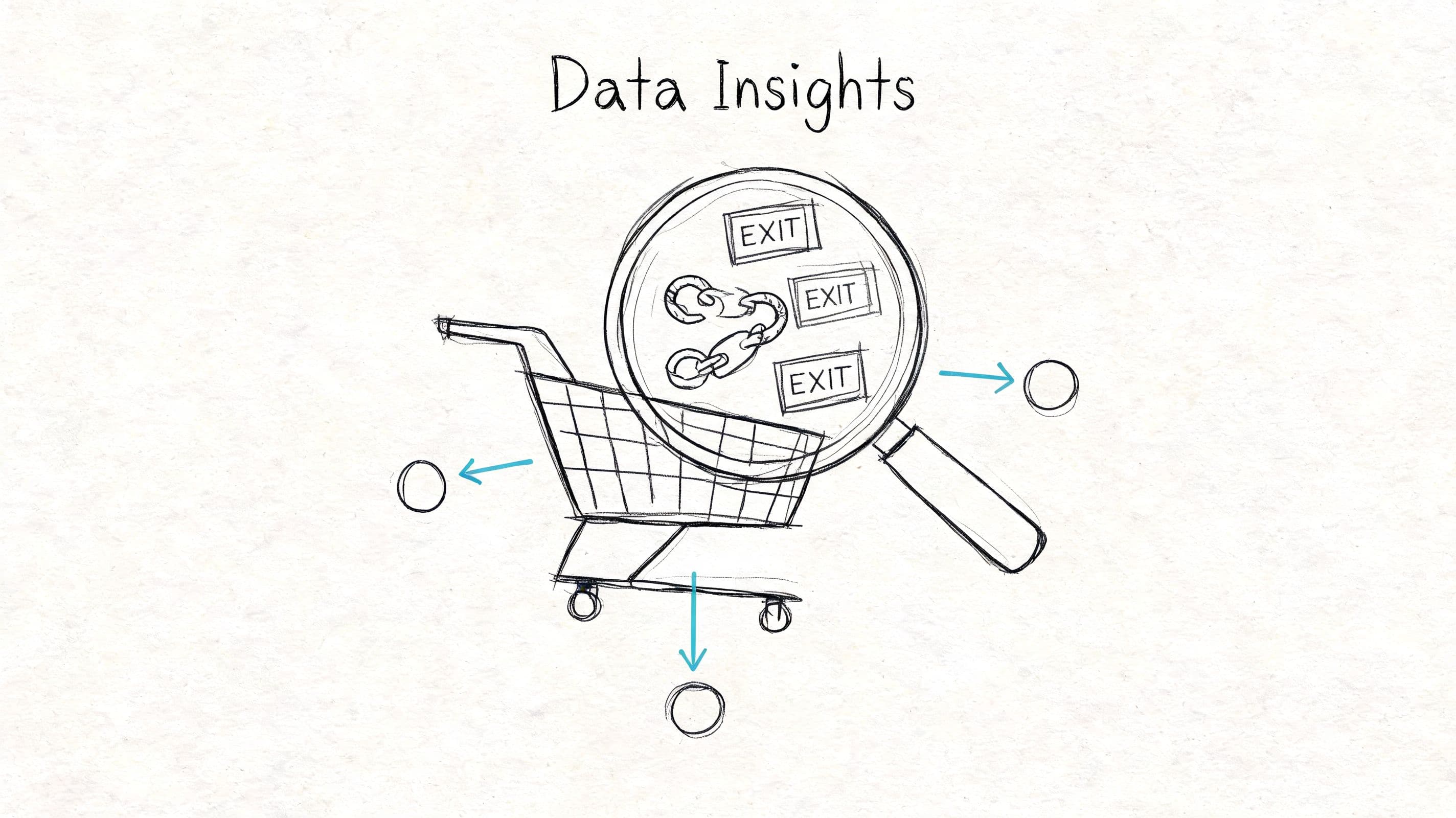
Diagnose Your Abandonment Problem with Data
If you don't know where shoppers are leaving, your fixes will be sloppy. Good teams don't optimize “checkout” as a blob. They isolate the exact screen, field, or moment where intent drops.
Start with the checkout funnel
Build a funnel that shows each step from cart view to completed purchase. In GA4, Shopify analytics, or your preferred tool, map at least these stages: cart, checkout start, shipping info, payment, and purchase. Then break drop-off by device, traffic source, and new versus returning visitors.
This is the practical starting point because 21% of abandonments are tied to checkout processes that are “too long/complicated,” as summarized by Stripe's guidance on reducing cart abandonment. You can't fix “too long” until you know which step feels long to your buyers.
Use a simple operating rule. Don't try to improve every screen at once. Find the highest-exit step and work there first.
Watch real sessions, not just dashboards
Numbers tell you where. Session recordings tell you why.
When you watch cart and checkout replays in FullStory or Hotjar, a few patterns usually stand out fast:
- Repeated field corrections: shoppers keep fixing address, zip, or card-entry errors
- Idle pauses: someone stops for a long time on shipping or payment, often a sign of confusion
- Backtracking: users bounce between cart, product page, shipping policy, and FAQ
- Mobile struggle: thumb-heavy form interaction, zooming, mis-taps, and abandoned inputs
Those are not cosmetic issues. They are revenue leaks.
Practical rule: review recordings from your highest-intent sessions first. Start with users who added to cart and reached checkout, then dropped before payment.
A metrics framework helps keep this work disciplined. If you need a benchmark for what to track beyond abandonment itself, this guide to e-commerce KPIs that matter is a solid reference point for structuring the funnel.
Ask abandoning shoppers what blocked them
Most stores underuse direct feedback. A short exit survey on cart or checkout can surface patterns that analytics alone won't show.
Keep it lightweight. One question is enough:
- What stopped you from completing your purchase today?
Then offer a few selectable responses and one open-text field. Make the options practical, not academic:
- Shipping cost surprised me
- I wasn't ready yet
- I had a question
- Checkout took too long
- I didn't trust something
- Payment issue
- Other
You're not trying to build a perfect research program. You're trying to gather enough signal to prioritize the next fix.
A useful workflow looks like this:
- Identify the worst-performing checkout step
- Review session recordings for that step
- Read survey responses from those sessions
- Group issues into friction, uncertainty, or technical error
- Test one meaningful change at a time
That sequence beats random optimization every time.
Streamline Your Checkout and Remove Friction
Checkout friction rarely looks dramatic. It shows up as one extra field, one unclear button, one late surprise on shipping, one payment error that gives the shopper no next step. Stack enough of those together and a buyer who was ready to purchase starts hesitating.
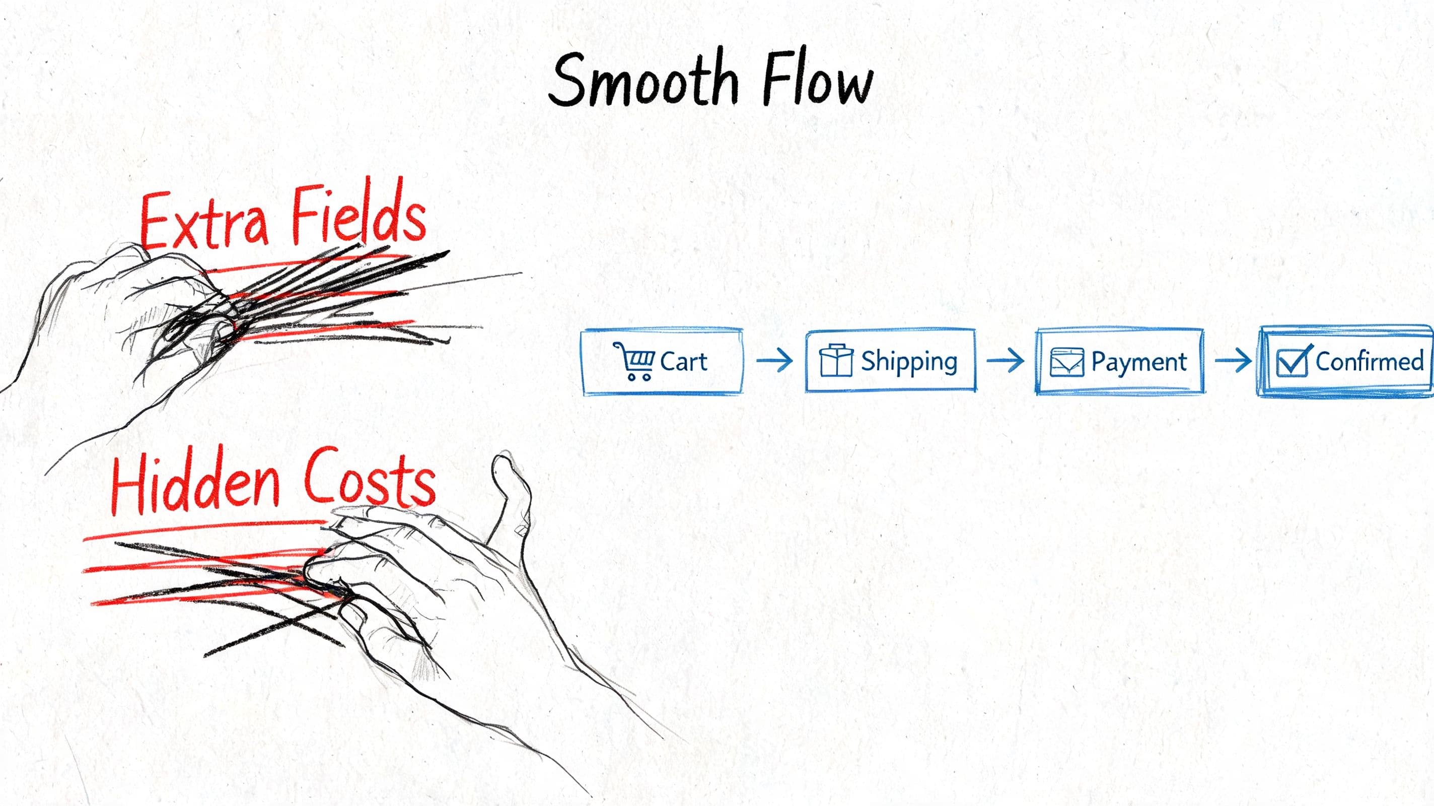
The fastest checkout wins usually come from subtraction. Remove effort. Remove ambiguity. Remove late surprises.
That matters before recovery ever starts. If the path to purchase feels easy and predictable, fewer shoppers make it to the abandoned cart bucket in the first place.
Cut steps before you polish design
A polished checkout can still lose sales if it asks for too much work, especially on mobile where patience is thin and typing is annoying.
Start by auditing every field and every click. If a field does not help fulfill the order, satisfy a legal requirement, support retention in a clear way, or reduce fraud, it needs a strong reason to stay. Many Shopify checkouts carry old habits from internal preferences, not buyer needs.
Focus on the basics:
- Remove nonessential fields: every extra input creates delay and raises the chance of error
- Enable autofill: address and payment autofill reduce manual entry and speed up completion
- Allow guest checkout: account creation is a post-purchase retention tactic, not a checkout requirement
- Use a progress indicator: buyers are more likely to finish when the remaining steps are obvious
- Write explicit button copy: “Continue to payment” sets expectations better than “Next”
Single-page versus multi-step checkout is usually the wrong debate. I have seen both win. Single-page can feel faster, but it often gets crowded on smaller screens. Multi-step can convert well when each step is short and the progress indicator is clear. The better question is simpler. Can a first-time buyer understand the path instantly and complete it without stopping to think?
Show full costs early
Late price surprises are still one of the easiest ways to lose a sale.
Shoppers do not just react to the amount. They react to the timing. If shipping, taxes, or fees appear only after they have invested time entering details, trust drops and comparison shopping starts.
Show the actual total as early as you can. If exact shipping depends on location, make the estimate process available in cart. If delivery timing varies, give a realistic range instead of vague language. If a promotion applies, show the discount clearly so the math feels credible.
A practical order of operations:
| Checkout element | What to do |
|---|---|
| Shipping cost | Show it in cart or as soon as address is known |
| Taxes and fees | Surface them before payment, not after card entry |
| Delivery timing | Give a clear range, not a generic promise |
| Promo logic | Apply discounts visibly so totals feel trustworthy |
Some merchants hold back costs to protect margin perception. That usually backfires. You may preserve average order value on paper, but you lose completed orders from buyers who feel misled at the last step.
Make payment feel easy and safe
Payment should be the lowest-friction part of checkout. If it feels confusing or risky, buyers pause right where intent should be highest.
Three fixes usually matter most:
- Offer familiar payment methods: cards, wallets, and local options should match how your audience already prefers to pay
- Keep the page clean and credible: visible security cues, policy access, and a clutter-free layout reduce hesitation
- Write useful error messages: tell shoppers exactly what failed and what to do next
Mobile deserves its own review. Tiny tap targets, cramped forms, hidden wallet buttons, and keyboard jumps can wreck conversion even when desktop looks fine. Test on an actual phone, from product page to confirmation screen.
Prevention matters here too. A lot of shoppers reach checkout with unresolved questions about shipping, returns, sizing, or compatibility. If you answer those earlier through product content, cart messaging, or a chatbot knowledge base for common pre-purchase questions, checkout has less uncertainty to absorb.
A useful walkthrough on checkout UX is below. Watch it with your own checkout in mind, especially on mobile.
A high-converting checkout has a clear feel. It confirms, guides, and gets out of the shopper's way.
Build Unshakable Trust and Answer Questions Instantly
A smooth checkout won't save a sale if the shopper still feels unsure. A lot of abandonment happens earlier, when someone is hovering on a product page or cart page thinking, “I'm interested, but I'm not fully convinced.”
That hesitation often has nothing to do with layout. It comes from missing confidence.
Trust breaks before checkout starts
FullStory's analysis highlights a gap many merchants miss. Shoppers often abandon because they don't feel ready to buy due to unanswered questions about fit, compatibility, or delivery, as explained in its piece on reducing cart abandonment through better customer experience. That's not a narrow checkout issue. It's a readiness issue.
The strongest stores build a visible trust stack across product, cart, and checkout:
- Return policy visibility: don't bury it in the footer
- Shipping clarity: expected timing should be easy to find
- Contact access: email, chat, or help center should be obvious
- Consistent product detail: sizing, materials, dimensions, compatibility, care, and usage info should be complete
- Reassurance near decision points: on the product page, in cart, and near payment
Trust signals work best when they answer a real concern. Generic badge clutter doesn't do much on its own.
Real-time answers prevent silent drop-off
This is the part most cart abandonment guides underweight. Shoppers don't always leave because checkout was too hard. They leave because they hit one unresolved question and had no quick path to clarity.
In fashion, it's often fit or fabric. In beauty, it's shade, skin type, or routine compatibility. In home goods, it's dimensions, materials, or delivery. In wellness, it's usage and policy questions. The pattern is the same. High-intent doubt goes unanswered, so the session dies.
A strong help experience should do three things well:
- Answer product questions instantly
- Surface shipping and return details without forcing a page hunt
- Stay consistent with what support and policy pages say
If you're building that workflow, a well-structured chatbot knowledge base matters more than is generally appreciated. Fast answers only help if they're accurate and grounded in your actual catalog and policies.
Shoppers rarely announce that trust is the issue. They just stop moving forward.
The stores that prevent more abandonment don't only optimize buttons and fields. They reduce uncertainty at the moment it appears.
Automate Your Multi-Channel Cart Recovery Engine
Abandoned cart emails can recover revenue, but the bigger lift comes from treating recovery as part of one connected system. VWO found that personalized cart abandonment emails can reduce abandonment by 10% to 30%, and retargeting can bring back 26% of shoppers, compared with 8% without retargeting, in its roundup of cart abandonment statistics and recovery tactics. For Shopify stores, the practical takeaway is clear. Recovery should start before the shopper is fully gone, then continue across the channels they respond to.
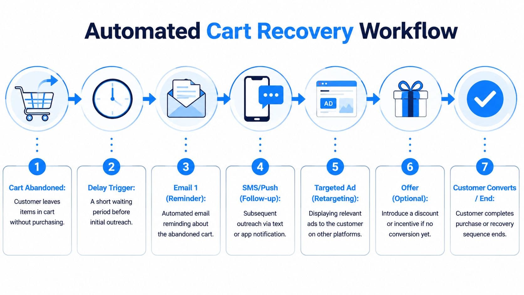
Build the sequence around shopper intent
Time delay matters, but intent matters more.
A shopper who added one SKU, viewed shipping twice, and stalled at payment needs different follow-up than someone casually dropped three products into cart and left. Stores that treat both cases the same usually over-message low-intent traffic and under-support high-intent buyers.
A practical sequence looks like this:
| Timing | Channel | Job of the message |
|---|---|---|
| Shortly after abandonment | Remind the shopper what they left behind and send them back to the exact cart | |
| Later if no purchase | Email or SMS | Answer likely objections such as shipping cost, delivery timing, returns, or product fit |
| After that | Retargeting ad | Keep the product visible and bring the shopper back while consideration is still active |
| Optional final step | Use urgency or a measured incentive only if margin and buyer behavior justify it |
The strongest flows change message angle by cart type. Single-product carts usually respond to clarity and reassurance. Multi-item carts often need help narrowing the choice. Higher-ticket products need more proof and fewer gimmicks.
If you need a starting framework for email timing and structure, Breaker's drip campaign strategies are useful for mapping reminders without repeating the same message three times.
Connect onsite recovery with offsite follow-up
Many stores leave money on the table at this stage. They wait until the shopper exits, then try to win them back with email alone.
A better setup handles uncertainty during the session, then continues the conversation after the visit ends. If someone hesitates in cart or checkout, trigger help first. If they still leave, follow up with messages that reflect what they viewed, what they added, and where they stalled.
A strong recovery engine usually includes:
- Exit-intent support: prompt for questions before offering a discount
- Inactivity triggers: surface shipping, return, sizing, or compatibility answers when progress stops
- Fast first follow-up: send the first reminder while product interest is still fresh
- Behavior-based retargeting: show the exact product or closely related category, not a generic brand ad
This is the broader prevention angle that many cart recovery articles miss. Recovery does not begin in the inbox. It begins the moment buying intent slows down on site.
For teams sorting out triggers, channel roles, and reporting, this guide to e-commerce automation tools for retention and recovery workflows is a useful framework.
Recovery performs better when it feels like a helpful continuation of the session.
Protect margin and avoid discount training
Discounts recover some carts. They also train bad behavior if they appear too early or too often.
I have seen plenty of stores create a predictable pattern without realizing it. Shoppers learn that leaving the cart produces a coupon, so abandonment becomes part of the buying process. Revenue gets recovered, but margin gets weaker and baseline conversion does not improve.
Use incentives with control:
- Hold discounts until later in the sequence
- Reserve stronger offers for price-sensitive segments or repeat abandoners
- Test non-discount nudges first, such as delivery clarity, reviews, stock pressure, or returns reassurance
- Exclude recent purchasers and low-intent visitors from aggressive recovery flows
What usually underperforms is easy to spot:
- Immediate blanket discounts
- Generic subject lines with no product context
- Messages that only say “you left something behind”
- Identical copy across email, SMS, and retargeting
What holds up better over time:
- Product-specific reminders
- Messages tied to the actual objection
- Channel sequencing based on behavior, not fixed timing alone
- Offers used as a later lever instead of the opening move
Good automation is disciplined. It reduces uncertainty in real time, follows up with context, and protects margin while it recovers demand.
Quick-Win Tactics for Shopify Merchants
A lot of Shopify abandonment is self-inflicted. The good news is that many of the fixes do not require custom code, a redesign, or a new tech stack. They come from cleaning up defaults, tightening app choices, and closing the information gaps that make shoppers hesitate before they ever start checkout.
What to change inside Shopify first
Start with the buying path you already have. If the cart and checkout are even slightly confusing on mobile, recovery flows end up doing work that the storefront should have handled earlier.
Focus on the settings and touchpoints that remove uncertainty fast:
- Keep checkout guest-friendly: extra account friction costs conversions, especially for first-time buyers
- Enable the right accelerated payments: Shop Pay, Apple Pay, Google Pay, and PayPal can reduce form fatigue if your audience already uses them
- Tighten your checkout copy: button labels, field instructions, and error messages should be plain, specific, and easy to scan
- Place shipping, returns, and contact details near decision points: shoppers should not have to hunt for basic policy answers
- Test the full purchase flow on real devices: complete purchases on iPhone and Android to catch keyboard issues, wallet glitches, sticky banners, and layout breaks
One pattern shows up across Shopify stores. Merchants often invest in abandoned cart apps before they fix pre-purchase hesitation. That leaves money on the table. If shoppers cannot quickly confirm delivery timing, sizing, compatibility, or return terms, many will leave before checkout recovery even has a chance to work.
What to add if shoppers still hesitate
Once the basics are clean, add tools that reduce doubt during the session, not just after abandonment.
A practical Shopify stack usually includes:
- Email automation: for abandoned checkout, cart, and browse flows
- Session replay or behavior insight tools: to spot where shoppers stall or rage-click
- Review and social proof apps: to reinforce confidence on product and cart pages
- Real-time assistance tools: to answer product, shipping, and policy questions while intent is still high
Trade-offs matter at this stage. Every app can add value, but every app can also slow the storefront, clutter the interface, or create overlapping messages. I would rather see a store run three well-configured apps than ten apps fighting for the same moment.
If support keeps getting the same questions, treat that as conversion research. Repeated questions about sizing, delivery windows, ingredients, compatibility, or returns are not just support tickets. They point to missing information that should be visible earlier in the buying journey.
Shopify's native analytics can show whether checkout completion improves after changes. Pair that with support transcripts, on-site search terms, and cart-page behavior. The fastest wins often come from problems hidden in plain sight, especially the questions shoppers try to answer before they decide whether your checkout is worth finishing.
Frequently Asked Questions about Cart Abandonment
Most merchants ask the same set of questions after they've cleaned up their checkout and launched recovery flows. The answers are usually less complicated than people expect.
| Question | Answer |
|---|---|
| What's the first thing to fix if cart abandonment is high? | Start with your highest-exit step in checkout. Don't redesign everything at once. Find where shoppers stall, then remove friction there first. |
| Should I offer a discount in every abandoned cart email? | No. Lead with a reminder and useful context. Use incentives carefully or shoppers may learn to wait for them. |
| Is cart abandonment mostly a checkout problem? | Not always. Many shoppers leave because they still have unanswered questions about the product, delivery, or returns before they ever feel ready to buy. |
| What should my abandoned cart email include? | The abandoned product, a clear path back to checkout, and messaging that reflects likely hesitation. Generic reminders are weaker than messages tied to actual cart context. |
| Do exit-intent popups work? | They can, if they offer help or clarity. They work less well when they interrupt too aggressively or default to discounts immediately. |
| How many recovery channels should I use? | More than one, but only if the messages are coordinated. Email, SMS for opted-in users, onsite prompts, and retargeting can work together when timing and content are aligned. |
| How do I know if uncertainty is the issue? | Look for shoppers bouncing between product pages, policies, and cart, or review survey responses and support questions. Those patterns usually point to unresolved doubts, not pure UX friction. |
| What's the biggest mistake merchants make? | Treating all abandonment the same. Some users need a simpler checkout. Others need reassurance. The fix depends on the cause. |
The merchants who improve fastest don't obsess over the abandonment rate as a vanity metric. They study where intent breaks, remove the cause, and build recovery around the actual reason people left.
If you want to prevent more abandoned carts before they happen, Carti helps Shopify stores answer shopper questions instantly, reduce pre-purchase uncertainty, and follow up with timely cart-saving nudges when buyers still drop off. It's built for merchants who want a faster path from browsing to buying without adding more manual support workload.

Written by
Daniel AndersonFounder of Carti. 10+ years building ecommerce brands in apparel and supplements. Still runs a Shopify store and built Carti to help merchants convert more browsers into buyers.
Ready to boost your store's sales?
Install Carti in 5 minutes and let AI handle customer questions, recommend products, and close sales 24/7.
Start Free Trial14-day free trial