Global m-commerce payments are projected to reach $3.1 trillion by 2025, up 70% from 2020 according to Juniper Research’s m-commerce payments forecast. If you run a Shopify store, that number should change how you think about your site. Mobile commerce isn’t a side channel anymore. For many brands, it’s the storefront customers use first, judge fastest, and abandon quickest.
That’s why “what is mcommerce” is the wrong question if you stop at the definition. The better question is what mobile shopping demands from your store. On Shopify, the answer usually comes down to speed, trust, checkout simplicity, and how well you remove hesitation on a small screen.
A desktop site can survive with a few rough edges. A mobile store usually can’t. Shoppers are distracted, impatient, and often one confusing tap away from leaving.
Table of Contents
- What Is M-commerce and Why Does It Matter Now
- M-commerce vs Ecommerce Key Differences for Store Owners
- Building Your Mobile Storefront Foundations
- Tackling the Hidden Conversion Killer Mobile Security
- Strategies to Optimize Mobile Conversions on Shopify
- Measuring M-commerce Success and Preparing for the Future
What Is M-commerce and Why Does It Matter Now
Mobile commerce already accounts for a large share of online buying, and for Shopify merchants that changes how the store should be built, merchandised, and supported. M-commerce means customers browse and buy through phones or tablets. On Shopify, that often starts with a tap from Instagram, Google Shopping, SMS, or email, then ends with a wallet-based checkout on a small screen.
For a store owner, the shift is not the device. It is buyer intent under mobile constraints. Phone shoppers make fast judgments with limited space, limited patience, and a higher chance of distraction. If the product page loads slowly, the variant picker feels awkward, or shipping details are buried, the sale often disappears before the cart even starts.

Mobile buying has different stakes for Shopify brands
Merchants often assume mobile is just a smaller storefront. In practice, it is a different decision environment. The customer is usually comparing less, scanning faster, and asking a simpler question: “Can I trust this enough to buy right now?”
That creates three mobile tests every Shopify store has to pass:
- Trust is visible immediately
- The product makes sense fast
- Checkout feels easy on a phone
If one breaks, conversion drops. On desktop, a shopper may tolerate extra clicks and research. On mobile, hesitation usually ends the session.
This is why I treat m-commerce as an operations issue, not just a design issue. It affects product page structure, payment setup, support coverage, and how you read performance. A store can post solid traffic numbers and still have a mobile revenue problem hiding underneath. Merchants who track broader sales efficiency, not just order count, usually spot this sooner. That is where metrics like GMV in ecommerce become useful.
Why it matters now
Customers already shop in short bursts. They discover products while commuting, waiting in line, or half-watching TV. That behavior favors stores that answer objections quickly and remove friction before checkout.
For Shopify merchants, the practical implication is simple. Mobile traffic is not top-of-funnel traffic by default. It is often purchase-intent traffic that needs reassurance. That is why mobile trust gaps matter so much. Reviews, delivery timing, return clarity, and fast pre-purchase answers all carry more weight on a phone because there is less room for doubt.
This is also where an AI chatbot can pull real weight. On mobile, shoppers often abandon because one unanswered question blocks the sale. A chatbot that handles shipping, sizing, returns, bundle logic, or stock questions in the moment can recover demand that would otherwise vanish. If you already use tools like AI SEO Tracker competitive analysis to understand market pressure, the next practical step is fixing the mobile buying experience where that pressure turns into lost revenue.
M-commerce matters now because it changes what “store optimization” means on Shopify. The stores that win on mobile are not the ones with the most features. They are the ones that make buying feel clear, trustworthy, and fast on a real phone.
M-commerce vs Ecommerce Key Differences for Store Owners
If you run Shopify, the most useful way to compare m-commerce and ecommerce isn’t by device type. It’s by shopping context. Desktop users usually have more time, more screen space, and more patience for research. Mobile users usually want fewer decisions, fewer fields, and fewer reasons to pause.
By 2025, m-commerce is projected to account for 73% of total e-commerce sales globally, driven by 4.88 billion smartphone users according to Cimulate’s mobile commerce statistics roundup. That makes desktop optimization important, but it no longer makes desktop the default design model.
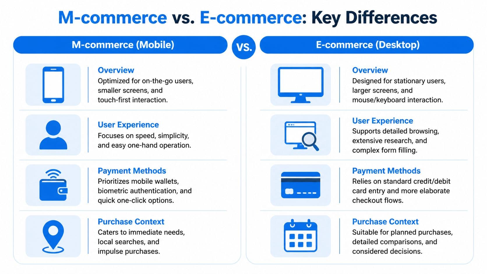
The customer context is different
On desktop, shoppers often compare tabs, read product details carefully, and tolerate a longer path. On mobile, every extra step feels heavier. Typing is slower. Images fill the screen. Navigation mistakes are easier. The store has less room to explain itself.
That affects everything from merchandising to support. A product page that performs well on desktop can still fail on mobile if reviews push the add-to-cart button too far down, the size selector feels fiddly, or shipping information isn’t obvious.
The strongest mobile stores reduce decision load. They surface the essentials early, keep navigation tight, and treat payment like part of the user experience instead of a separate backend function.
Mobile shoppers don’t give you much room for recovery. The experience has to feel clear on the first pass.
For merchants trying to benchmark how competitors handle that experience, this guide to AI SEO Tracker competitive analysis is useful because it pushes you to look beyond rankings and review what rival brands are doing on product structure, visibility, and shopper intent.
Ecommerce vs. M-commerce at a Glance
| Attribute | Traditional Ecommerce (Desktop) | M-commerce (Mobile) |
|---|---|---|
| Screen environment | Large display with room for comparison | Small display with limited attention space |
| User posture | Seated, focused, research-oriented | On the go, distracted, quick-decision behavior |
| Navigation style | Mouse and keyboard | Touch-first, thumb-driven interaction |
| Checkout tolerance | More willingness to complete forms | Low tolerance for typing and extra steps |
| Best payment fit | Standard card entry can work | Wallets and fast checkout matter more |
| Session goal | Detailed evaluation | Fast validation and completion |
| Device strengths | Easier deep comparison | Instant access, camera, location, notifications |
| Common failure mode | Information overload | Friction and hesitation from small-screen complexity |
What this means for your Shopify build
Store owners often ask whether they need a separate mobile strategy. In practice, yes. Not necessarily a separate site, but a separate set of decisions.
That means writing tighter product copy above the fold, simplifying collection pages, prioritizing wallet payments, and testing every key flow with your thumb on an actual phone. If you only review your store in a desktop browser’s mobile preview, you’ll miss real friction.
A responsive theme is a starting point. It isn’t the strategy.
Building Your Mobile Storefront Foundations
The mobile storefront that converts usually isn’t flashy. It’s disciplined. It loads cleanly, makes the next step obvious, and avoids asking too much from the shopper.
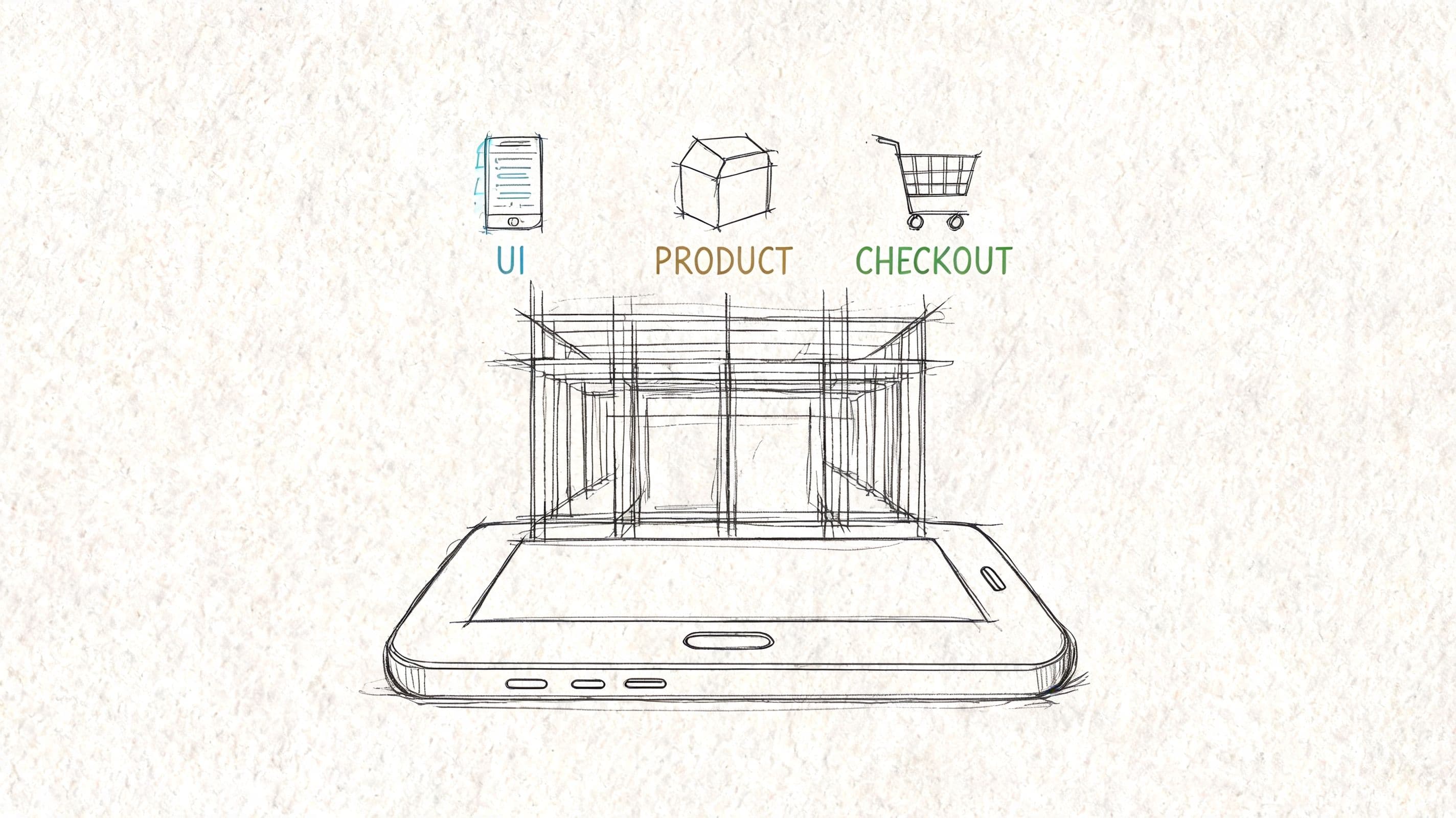
Start with thumb-first design
Most Shopify themes claim they’re mobile-friendly. That doesn’t mean they’re mobile-effective. A theme can technically resize and still create friction where it matters most.
A better standard is thumb-first design. Can a shopper open the menu, filter products, select a variant, and add to cart with one hand and without zooming? If not, the experience is still fighting the device.
Focus on a few basics:
- Keep navigation shallow: Don’t bury key categories inside layered menus.
- Prioritize the product block: Title, price, variant selection, shipping cues, and add to cart should appear without confusion.
- Use tap-friendly spacing: Buttons should feel deliberate, not cramped.
- Trim distractions: Popups that consume the whole screen often hurt more than they help on mobile.
Make payment feel native to mobile
Payment is where many stores reveal they built for desktop first. Long forms, delayed wallet options, and unclear totals add tension right when the shopper is ready to buy.
On Shopify, native-feeling payment usually means enabling the fastest methods your audience already trusts, then making those options visible early enough that the shopper expects an easy finish. Mobile checkout should feel like confirmation, not paperwork.
What works better than most merchants expect:
- Guest-first paths: Don’t force account creation before purchase.
- Visible express options: Apple Pay, Google Pay, and Shop Pay should feel like primary routes, not afterthoughts.
- Early cost clarity: Show shipping and return expectations before the shopper reaches the last screen.
- Short field logic: Ask only for what’s necessary.
Here’s a useful walkthrough on the broader mobile commerce setup and behavior patterns that shape these choices:
Audit the flow on a real phone
A proper mobile audit doesn’t start in analytics. It starts with your own checkout. Open your store on an iPhone and an Android device if you can. Try to buy a product while distracted. Try again with weak signal. Try again as a first-time visitor who knows nothing about your brand.
You’ll usually spot issues fast:
- Collection clutter makes scanning hard.
- Sticky elements block important buttons.
- Variant selectors create mis-taps.
- Promo fields trigger coupon hunting.
- Support questions appear at the worst moment, with no easy answer.
Test the store the way a customer uses it, not the way a merchant reviews it.
This part of m-commerce is operational, not theoretical. Merchants who win on mobile tend to remove small annoyances aggressively. They know conversion losses often come from moments that look minor inside Shopify but feel major on a phone.
Tackling the Hidden Conversion Killer Mobile Security
Most mobile conversion problems get blamed on price, ads, or product-market fit. Sometimes that’s true. But a lot of lost checkouts come from something less visible. The shopper doesn’t feel safe enough to continue.
Global m-commerce fraud losses exceeded $40 billion in 2024, mobile transactions were 2.5x more prone to account takeover, and 68% of cart abandonments stem from trust issues during mobile checkout according to Productsup’s m-commerce glossary and analysis. For Shopify merchants, that’s not an abstract fraud story. It’s a conversion story.

Trust breaks before checkout fails
On mobile, customers have less visual space to verify legitimacy. They can’t easily scan policy pages, compare details, or reassure themselves the way they might on desktop. If something feels off, even slightly, they hesitate.
That hesitation often shows up as practical questions:
- When will this ship
- Can I return it
- Is my payment secure
- Why do I need to enter this information
- Is this final price real
A surprising number of stores leave those questions unanswered until the customer goes looking. On desktop, that’s already risky. On mobile, it’s worse because the search for reassurance interrupts momentum.
Conversational trust matters on mobile
A trust-building mobile experience needs more than security badges. Those can help, but they don’t answer situational concerns. Clear policy language, visible contact options, and instant answers during checkout pressure matter more than decorative signals.
This is also where many merchants underestimate the value of support. When a customer asks about returns, delivery, ingredients, sizing, or payment safety, the answer isn’t just service. It’s conversion support.
Store operator insight: On mobile, unanswered questions feel bigger because each extra tap feels expensive.
If your store includes a mobile app or app-like layer, it’s worth understanding the benefits of mobile app security testing, especially if you handle sensitive customer flows beyond a standard storefront. Security work doesn’t only protect systems. It protects confidence.
For Shopify merchants, the practical move is simple. Treat trust as part of the buying journey. Put shipping, returns, payment clarity, and support access close to the product and checkout flow. If shoppers have to hunt for reassurance, many won’t finish.
Strategies to Optimize Mobile Conversions on Shopify
Baymard reports a 70.19% average cart abandonment rate, and its checkout usability research found that large e-commerce sites can gain up to 35% more conversions by improving checkout design. For Shopify merchants, the practical takeaway is simple. Mobile conversion wins usually come from reducing friction inside the buying path before adding more recovery tools.
Fix checkout before chasing recovery
Many stores try to solve mobile abandonment with extra popups, discount prompts, and reminder flows. That approach misses the main problem. If checkout feels confusing or heavy on a phone, follow-up messages are cleaning up a preventable loss.
Start by tightening the path from product page to payment.
Remove the biggest friction points
A few problems show up repeatedly on mobile:
- Unexpected totals: Shipping, taxes, or fees that appear late break confidence fast.
- Forced account creation: First-time buyers often leave rather than create a login on a small screen.
- Long form entry: Every extra field adds effort and raises drop-off risk.
- Weak progress cues: Shoppers want to know how many steps remain.
- Limited payment options: Missing Shop Pay, Apple Pay, Google Pay, or other preferred methods slows checkout and costs sales.
Shopify gives you enough control to fix most of this. Surface shipping expectations earlier. Trim unnecessary fields. Turn on accelerated payment methods. Make the next step obvious at every point.
Make the checkout feel lighter
Checkout lightness depends on design and sequencing. Mobile buyers should not have to process pricing, shipping, payment, and account decisions all at once. Put product certainty first, then ask for the minimum information needed to complete the order.
Small interface choices matter more than many merchants expect. Clear field labels, strong contrast, large tap targets, sticky checkout buttons, and concise microcopy reduce hesitation. One useful external read on practical ways to drive higher online sales is this conversion-focused piece from Picjam. It stays grounded in user experience rather than abstract CRO advice.
Build a recovery system around timing
Once checkout friction is lower, recovery becomes more efficient because you are following up on real interruptions, not confusion your store created.
For mobile shoppers, timing matters most. A delayed reminder often arrives after intent has faded, the shopper has compared alternatives, or the context for buying has passed. Recovery should bring them back to a live cart with as little effort as possible.
A workable Shopify setup usually includes:
-
An early message window
Follow up while the product is still fresh in the shopper’s mind. -
Channel sequencing Use email, SMS, or push based on how your buyers behave on mobile.
-
Cart-aware messaging
Show the product left behind and link back to checkout, not just the homepage. -
Reason-sensitive copy
If the shopper likely got distracted, focus on speed. If they hesitated, answer the missing question.
Recovery works best when it preserves buying momentum.
Use onsite support to remove pre-purchase hesitation
A large share of mobile drop-off happens before checkout starts. The shopper is still evaluating the purchase. They may want clarity on sizing, ingredients, delivery timing, compatibility, subscription terms, or returns. If the answer takes too long, they delay the order.
This is one of the clearest mobile-specific opportunities for Shopify merchants. Desktop shoppers can open tabs and research. Phone users usually will not. If your store can answer the question inside the session, you keep more purchase intent in play.
A well-implemented chat layer helps here, especially when it is tied to product and policy questions instead of acting like a generic support inbox. For stores considering that route, this guide to a web chat widget for ecommerce is useful because chat should help customers buy, not just reduce support tickets.
What works on mobile support
The strongest mobile support experiences stay out of the way and resolve doubt quickly.
Good mobile support usually does three things well:
- Clarifies policies fast
- Helps shoppers choose the right product
- Keeps the customer on the same page instead of pushing them into email or a separate help flow
What doesn’t work
Several support patterns routinely hurt mobile conversion:
- Aggressive popup chat intros
- Bots that only collect contact details
- Answers that repeat policy text without resolving the question
- Support widgets that cover add-to-cart buttons or compete with checkout elements
For Shopify merchants, the priority order is clear. Tighten checkout first. Set up fast, mobile-aware recovery second. Add onsite answers at the moment of hesitation third. Stores that execute those three pieces well usually improve mobile conversion without relying on gimmicks.
Measuring M-commerce Success and Preparing for the Future
More than half of Shopify traffic now comes from phones for many brands. That does not matter if your reporting still treats mobile as a subset of "online" and hides where buyers stall.
Measure mobile on its own. If desktop converts well and mobile lags, the fix is usually not more traffic. It is a specific friction point on product pages, in checkout, or around trust.
What to track inside Shopify
Start with a short list of metrics you can act on every week, not a dashboard full of vanity charts.
- Mobile conversion rate: Shows whether phone visitors buy.
- Mobile add-to-cart rate: Shows whether your offer, product page, and mobile UX are strong enough to create intent.
- Checkout completion by device: Shows whether the drop happens before checkout or inside it.
- Cart recovery performance: Shows whether your follow-up flow is fast enough and relevant enough to bring shoppers back.
The point is not to admire the numbers. The point is to isolate the leak.
If mobile add-to-cart is healthy but checkout completion is weak, focus on payment options, form friction, and trust cues. If add-to-cart is weak, the problem usually starts earlier with page speed, product clarity, image quality, sticky buy buttons, or unanswered questions. For stores using an AI chatbot, the tool should earn its keep by addressing these issues. It should reduce hesitation on mobile product pages, not just deflect support tickets after the fact.
For a practical reporting baseline, use this guide to e-commerce key performance indicators. It helps map each KPI to a concrete store decision.
What to prepare for next
The next phase of m-commerce is straightforward. Mobile shoppers expect faster decisions, fewer taps, and more confidence before they pay.
That changes how Shopify merchants should prioritize work.
Stronger wallet adoption will keep reducing checkout friction. Better product visualization will matter more for categories where fit, scale, or texture drive hesitation. Onsite support will also keep shifting closer to the point of purchase. Shoppers want answers inside the buying session, on the same screen, before intent fades.
The stores that benefit from those shifts usually do three things well. They review mobile behavior often. They fix friction quickly. They treat trust as part of conversion rate optimization, not as a separate brand exercise.
If your Shopify store gets plenty of mobile traffic but too many shoppers leave with unanswered questions, Carti can help close that gap. It’s an AI-powered Shopify chatbot that learns your catalog, policies, and FAQs, answers shoppers instantly in 92 languages, and helps recover carts without adding operational overhead. For merchants who want a faster, more helpful mobile buying experience, it’s one of the simplest upgrades you can make.

Written by
Daniel AndersonFounder of Carti. 10+ years building ecommerce brands in apparel and supplements. Still runs a Shopify store and built Carti to help merchants convert more browsers into buyers.
Ready to boost your store's sales?
Install Carti in 5 minutes and let AI handle customer questions, recommend products, and close sales 24/7.
Start Free Trial14-day free trial