
Across a benchmark of 500 popup campaigns, only 2.0% used an exit-intent trigger, while 95.4% fired immediately on page load, which is exactly why most Shopify stores still get the strategy wrong. The best exit-intent popup strategies don't feel like interruptions, they feel like a timely recovery step, and the data shows that restraint matters. Exit-intent popups in that benchmark averaged a 3.94% conversion rate, while popups delayed by 6-10 seconds converted at 2.4% versus 1.9% for immediate popups, a strong signal that timing can change outcomes materially (Popupsmart analysis). Independent reporting points in the same direction, with exit-intent averages landing in the low single digits and top campaigns reaching much higher, which tells you the upside comes from offer quality, targeting, and testing rather than from the trigger alone (Crazy Egg on exit popups, Wisepops exit popup examples).
This playbook pushes past the tired “get 10% off” pattern. The goal is to evolve your popup from a static discount box into a conversational recovery engine that can answer objections, recommend products, capture feedback, and route shoppers toward the right next step. That's where tools like Carti fit in, because they can turn a last-chance popup into a live sales interaction instead of a dead-end form. For a broader CRO lens, the Sprints & Sneakers growth guide is a useful companion read, but the list below gets straight to the execution.
1. Discount/Incentive Offer on Exit Intent
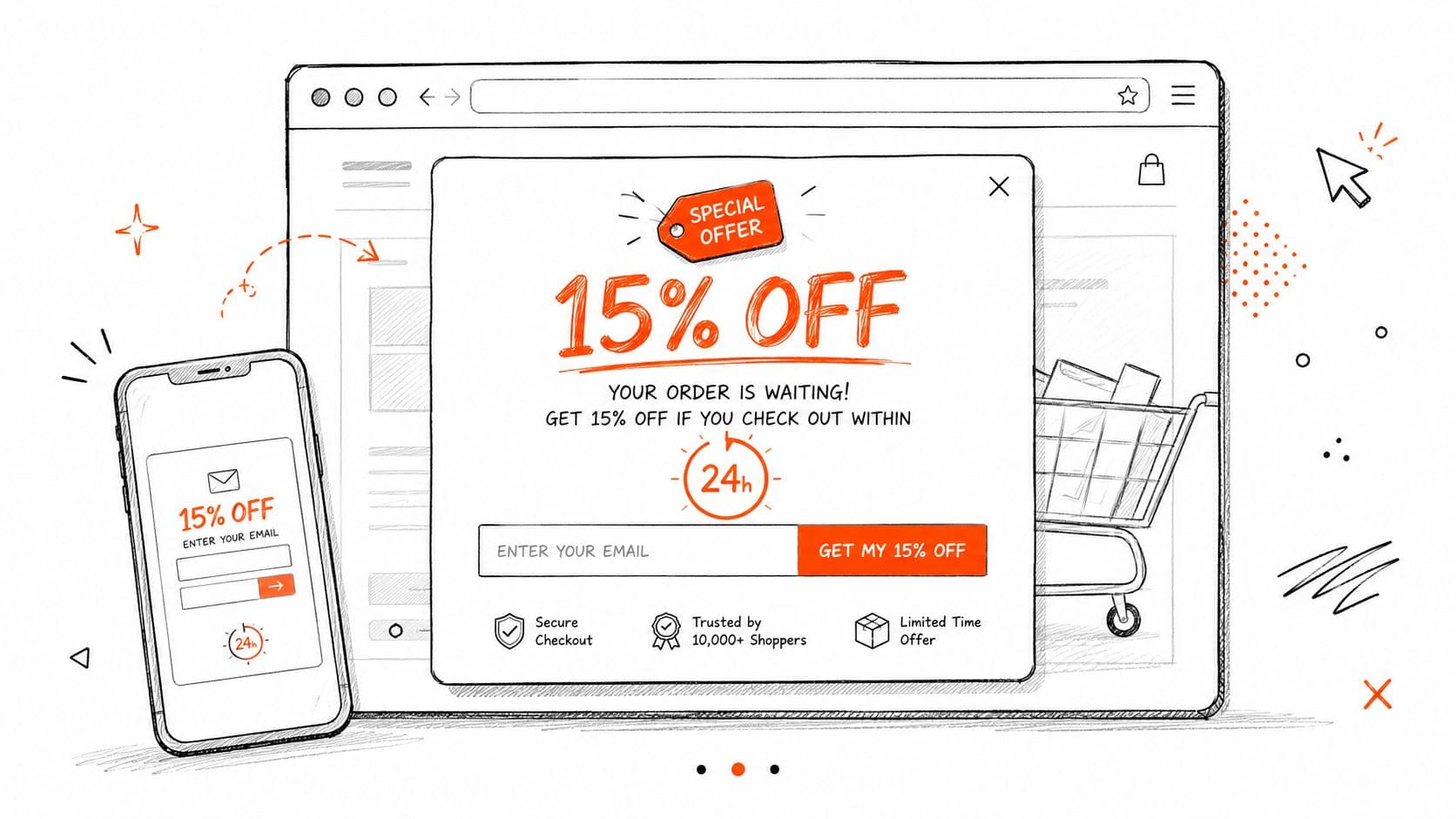
A discount still works when it's the right discount for the right visitor, but it stops working the moment it becomes your default answer. For Shopify stores, the strongest incentive-based exit popup is usually the one that feels specific, limited, and deserved, not the one that shouts the same coupon to every visitor who drifts toward the back button.
Make the offer match the traffic
The margin mistake is obvious. If paid traffic gets the same offer as organic traffic, you're probably subsidizing shoppers who didn't need help. Segment by source, then decide whether the best rescue lever is percent-off, free shipping, or a value-add like a sample or bonus item.
Fashion and beauty brands have already trained shoppers to expect strong first-order incentives. The right move isn't to copy them blindly, it's to reserve your best offer for visitors who are about to leave. A home décor store often has more room to use shipping-based incentives, while a premium beauty brand may do better with a sample or bundle than a blunt discount.
Practical rule: don't let the popup become the main pricing strategy. If every exit sees the same coupon, you train customers to wait for the next interruption.
Carti helps here by pairing the offer with instant product recommendations, so the visitor sees a better item, not just a cheaper one. That matters because many exits happen from indecision, not pure price resistance. A well-timed incentive plus a relevant alternative can move a shopper from “I'll think about it” to “this is the one.”
Use urgency without looking desperate
Countdown timers still have a place, but only if the deadline is real. Fake urgency is easy to spot and hard to recover from. Use the timer to close the decision loop, not to create pressure theater.
A tight popup also needs a short CTA. The CTA should say what the visitor gets, not just “Submit.” If the offer is strong, the copy can be direct. If the offer is weak, no button text will save it.
2. Chat-Based Exit Intent Engagement
The most underrated exit-intent strategy is not a coupon, it's a conversation. When shoppers hesitate because they're unsure about fit, ingredients, shipping, or compatibility, a chatbot can answer faster than a static popup ever will, and that's where Carti becomes much more than a support layer. See the website live support chat guide for the operational side of that setup.
Turn hesitation into a guided exchange
A fashion shopper doesn't always want a discount. Sometimes they want styling help, size reassurance, or confirmation that the item will work with what they already own. A wellness shopper may be worried about ingredients or benefits. A home décor shopper may need space-planning guidance before they commit.
That's why the best chat-based exit popup starts with a low-friction question, not a sales pitch. “Need help choosing?” works better than “Want 15% off?” when uncertainty is the blocker. Carti can use your catalog and FAQ to answer those questions immediately, which makes the interaction feel useful instead of promotional.
A chatbot should reduce friction first and sell second. If it opens with pressure, it sounds like a popup. If it opens with help, it sounds like a good associate.
For Shopify agencies, this is also a clean upsell. A chat layer gives clients a way to recover abandoned traffic and reduce support volume at the same time. That's easier to sell than another generic popup app because it ties directly to revenue and service efficiency.
Train it before you launch it
The mistake most stores make is assuming the bot can improvise. It can't. It needs your catalog, return policy, shipping info, sizing charts, and the objections your customers raise.
Use the Insights Dashboard to find the most common blockers, then shape the opening prompts around them. If shipping comes up constantly, ask about delivery timing. If sizing is the issue, start there. If reviews are the sticking point, have the bot surface social proof and then steer toward the product the shopper already viewed.
3. Cart Recovery with Abandoned Cart Messaging
Exit intent should not end at the popup. When a visitor signals they're leaving with items in cart, the popup can become the trigger for a broader recovery sequence across email, SMS, and on-site messaging. That turns one moment of hesitation into a structured follow-up path.
Recover the cart, not just the click
Carti's cart recovery logic matters. The popup can identify the at-risk cart, then hand off to messaging that references the exact items left behind, addresses the likely objection, and nudges the shopper back without restarting the sales pitch from scratch. That's a different job from a simple discount box, and it's usually more profitable because the follow-up can be personalized.
The best recovery sequences are short and specific. New customers often need a clearer incentive, while loyal customers respond better to exclusivity, early access, or restock reminders. If a shopper left because of shipping concerns, lead with shipping. If they left because of uncertainty, show the product again with a trust cue.
Match the channel to the intent
Email is usually the backbone, but it shouldn't be the only move. If the cart value or product type justifies it, SMS can provide a faster nudge. The key is not volume, it's sequence discipline. Too many reminders feel like pressure, while a carefully timed recovery flow feels like a continuation of the buying process.
Track recovery performance separately from general conversion data. Cart abandonment recovery often behaves differently from browse recovery, and the message that rescues a cart can be the wrong message for a cold visitor.
If Carti has already caught the exit signal, the chatbot can also intervene before the cart is lost. It can suggest a substitute product, answer a shipping question, or surface a complementary item that saves the session. That makes the popup a starting point for recovery, not the end of it.
4. Exit-Intent Survey/Feedback Popup
A lot of brands use exit popups to close a sale. Strong operators use them to learn why the sale didn't happen. A micro-survey captures the reason behind the exit, and that information can improve merchandising, copy, product assortment, and support content.
Ask fewer questions and get better answers
Keep it tight. One or two questions is the sweet spot if you want people to respond instead of closing the window. Ask about the blocker, such as sizing, shipping, style, ingredient concerns, or price, and always include an Other field so you don't lose the unexpected answers.
Beauty and fashion stores can use this format especially well because hesitation is often category-specific. A shopper may be almost ready to buy but still unsure about shade, fit, or compatibility. If your popup captures that reason, the next version of the experience can respond to it directly.
A feedback popup is only useful if somebody actually reads the answers. Route the responses to merchandising and CX, not just the marketing inbox.
Carti's Insights Dashboard is useful here because it can surface recurring objections instead of forcing your team to scan raw responses manually. That makes the feedback operational, not anecdotal. Weekly review is enough for most stores, and monthly sharing with product and merchandising teams keeps the insights from dying in the inbox.
Turn responses into next actions
The best surveys don't stop at data collection. They branch into another action. If a shopper says sizing is the issue, the follow-up can open a chatbot thread or show a size guide. If they say price is the issue, the next step can be a targeted incentive. If they say they're just browsing, the popup can capture the email and move them into nurture.
That's the advantage of exit-intent surveys. They don't just explain loss. They show which recovery path to use next.
5. Social Proof & Urgency Messaging
If a shopper is on the fence, the fastest way to break paralysis is often not a bigger discount. It's a stronger reason to trust the product right now. That's what social proof and urgency messaging do when they're used well, they remove doubt without forcing a deeper commitment.
Make the proof specific to the product
Generic testimonials are weak. Product-specific proof is what moves behavior. Show reviews for the exact item the shopper viewed, not the best-seller they never touched. If inventory is tight, tell the truth about scarcity. If a product is a proven favorite, use that popularity as reassurance.
That's especially effective in categories like footwear, beauty, and outdoor gear, where shoppers want confirmation that other people chose the same thing and were happy with it. A trust badge, review snippet, or stock alert can do more work than a blanket promo code because it answers a hidden question: “Do people buy this?”
Pair urgency with credibility
Urgency only works when the shopper believes it. If a store shows stock or purchase activity, it needs to reflect real inventory or real behavior. Otherwise, the popup looks engineered. Use clear, simple language, and keep the design consistent with the site so the message feels like part of the shopping experience.
A good structure is straightforward. Lead with trust, then add urgency, then give the shopper one obvious action. That's cleaner than stacking five different pressure cues in one box.
Use urgency as a decision aid, not a scare tactic. The moment shoppers feel manipulated, they stop trusting the store, not just the popup.
Carti can combine this with chat, so when the popup appears, the assistant can ask whether the visitor wants to see more customer feedback. That gives the shopper a way to move forward without guessing.
6. Content Lead Magnet / Free Resource Offer
Not every exit should be rescued with a transaction. Some visitors aren't ready to buy, and pushing a discount too early can train them to leave without thinking. A useful guide, checklist, or template can pull them into a nurture sequence that builds buying confidence.
Offer education that removes friction
The best lead magnet is tied directly to the product category the shopper was browsing. A size guide works for apparel. A skincare routine builder works for beauty. A room layout template works for home décor. The resource should answer the objection that's stopping the purchase, not just collect an email address.
That's where Carti's browsing-aware recommendations help. If a visitor has been moving through a specific product category, the popup can offer the exact resource that fits that path. A first-time visitor and a returning visitor shouldn't see the same content unless their behavior is identical, which it usually isn't.
Follow up with a sequence that earns the sale
A lead magnet works because it creates a reason to re-engage later. Deliver the content first, then use follow-up email to recommend products, and only then introduce a time-sensitive offer if the shopper still hasn't converted. That sequence is more natural than dropping straight into a discount.
If the content itself answers the main objection, the email follow-up can be light. If the content only partly solves the problem, the next message should move one step deeper into product education. The point is to keep the relationship alive until the shopper is ready.
The best content offers also create a useful handoff to chat. Once the email is captured, Carti can trigger a personalized message based on the lead magnet choice, which keeps the experience connected instead of fragmented.
7. Exit-Intent Product Recommendation / Browse Abandonment
A shopper who has browsed but hasn't added anything to cart is often stuck in decision paralysis. The fix isn't always persuasion. Sometimes it's better product selection. Exit-intent recommendations help shoppers choose, which is usually the barrier on category pages and product pages.
Recommend with context, not popularity
The recommendation engine should follow behavior, not guess broadly. If the visitor came from Pinterest, inspirational combinations make sense. If they came from search, direct category matches are usually better. If they were comparing products, the popup should reduce the choice set, not widen it.
That's why clean Shopify taxonomy matters. Tags for category, size, color, price tier, and use case give the recommendation engine enough structure to be useful. Without that, even a smart system will drift toward generic suggestions that feel random.
For stores using Carti, Smart Suggestions can turn browse abandonment into a guided shopping moment. The popup can say, in effect, “You looked at this, here's the next best match,” which is much more actionable than “Don't leave yet.”
Give shoppers a way to refine the result
Some visitors need a recommendation, others need control. For fashion and beauty, filters in the popup can help the shopper narrow by size, color, type, or concern. That reduces the number of clicks between interest and confidence.
If the shopper already knows what they don't want, don't make them browse more. Give them a tighter path.
This is also a strong moment for an AI stylist-style handoff. The popup can offer recommendations and then invite the visitor into chat if they want more help. That blend of automation and conversation works better than forcing a single path on every shopper.
For a deeper look at product-led recovery, Carti's product recommendation chatbot guide is worth reading once you've mapped your taxonomy and browsing logic.
8. Exit-Intent Customer Support / Help Request Popup
Some exits aren't marketing problems. They're support problems. If the shopper is leaving because they don't know whether the product will ship on time, fit correctly, or work with what they already own, the right exit popup is a help request, not a sales pitch.
Use support to remove the last blocker
The most effective support-focused popup is calm and direct. “Have a question? We're here to help” beats a hard CTA because it acknowledges hesitation without adding pressure. That makes it especially useful for categories where purchase anxiety is common, including fashion, wellness, and home goods.
Carti is built for this kind of moment because it can answer policy, shipping, sizing, and compatibility questions instantly, then escalate to a human if needed. That keeps the shopper moving instead of bouncing to a separate help center or waiting for an email reply.
Keep the knowledge base current
This strategy only works if the assistant has accurate information. That means product specs, FAQs, return policy, and size charts need to be current before the popup goes live. If the bot gives a wrong answer once, the shopper loses trust fast.
Use the weekly questions your team can't answer quickly as a signal to improve the knowledge base. The unanswered questions are the roadmap. They show where shoppers are getting stuck and where the site experience is failing to reassure them.
A support popup also gives Shopify agencies a clean differentiation angle. It doesn't just capture abandoned sessions, it reduces support burden and improves conversion at the same time. That combination is hard for clients to ignore.
8-Point Exit-Intent Strategy Comparison
| Strategy | Implementation complexity | Resource requirements | Expected outcomes | Ideal use cases | Key advantages |
|---|---|---|---|---|---|
| Discount/Incentive Offer on Exit Intent | Low, simple popup + coupon | Coupon setup, segmentation, popup design, email capture | Short-term conversion lift (typically 5–20% recovery) | Price-sensitive shoppers; fashion, beauty, home stores | Fast conversion lift; easy to test; builds remarketing list |
| Chat-Based Exit Intent Engagement | Medium, AI chat setup & tuning (Carti simplifies) | Product data & FAQ, chat integration, monitoring/optimization | Higher engagement; real-time objection handling; improved conversions & insights | DTC brands needing product education or high-touch sales | Real-time personalization; resolves objections; higher perceived value |
| Cart Recovery with Abandoned Cart Messaging | Medium, multi-channel automation & sequencing | Email/SMS platform, cart tracking, dynamic product feeds, segmentation | Recovers 10–30% of abandoned cart value; measurable ROI | All Shopify stores, especially high-AOV retailers | Passive recovery with high ROAS; automated & trackable |
| Exit-Intent Survey/Feedback Popup | Low, lightweight survey popup | Survey design, analytics, occasional incentive, analysis effort | Qualitative insights to inform product/UX; low direct sales impact | Stores optimizing product-market fit or experimenting with categories | Low cost; actionable customer feedback; informs other tactics |
| Social Proof & Urgency Messaging | Low–Medium, messaging + real-time data sync | Inventory and review sync, trust assets, authenticity checks | Increases trust and urgency; conversion lift for high-intent visitors | Trust-driven purchases: fashion, beauty, wellness, home | Leverages FOMO/social proof; complements discounts and chat |
| Content Lead Magnet / Free Resource Offer | Medium, content creation + gated flows | High-quality content, email automation, segmentation, nurture sequences | Builds engaged email list; longer-term nurture and higher LTV | Brands with longer sales cycles and content strategies | Attracts engaged prospects; improves lifetime value; educates buyers |
| Exit-Intent Product Recommendation / Browse Abandonment | Medium–High, recommendation engine & taxonomy | Robust product data, AI suggestions, tagging, privacy compliance | Reduces decision paralysis; increases AOV and immediate adds | Large-catalog stores where choice overwhelms shoppers | Personalized, non-aggressive help; immediate add-to-cart actions |
| Exit-Intent Customer Support / Help Request Popup | Medium, bot + escalation workflows | Comprehensive knowledge base, support staff, chat integration | Removes friction; converts questions into purchases; lowers long-term tickets | Complex products or multi-step purchases; 24/7 global shoppers | Solves purchase blockers in real time; builds trust; scalable support |
From Popup to Partner: The Future of Exit Intent
The strongest exit intent popup strategies don't treat the visitor like someone you need to stop. They treat the exit as a signal that the store has one more chance to be useful. That's a better model for ecommerce because most abandonment isn't a rejection, it's uncertainty, distraction, or a missing answer.
When you move from a static popup to a dynamic recovery system, you stop relying on one blunt tactic. A discount can still help, but now it sits inside a broader playbook that includes chat, recommendations, support, surveys, and recovery messaging. That's how you turn a last-chance prompt into a real sales conversation.
The data supports a more deliberate approach. Exit-intent is still relatively uncommon in campaign setups, which means many stores haven't refined it yet, and the gap between average and top performance shows that execution matters more than the trigger itself (Popupsmart analysis, Crazy Egg on exit popup performance). If you make the offer relevant, the response immediate, and the follow-up useful, the popup stops feeling like a nuisance and starts acting like a sales associate.
Carti fits this future because it can do what static popups can't. It can answer objections, suggest products, rescue carts, and surface the insights your team needs to improve the store over time. That's the difference between a popup that interrupts and a partner that helps close the sale.
If you want to turn exit intent into a real recovery system, start by mapping your top objections and choosing one tactic that fits each one. Then see how Carti can handle the conversation, recommend the next product, and recover the sale without adding more manual work for your team.

Written by
Daniel AndersonFounder of Carti. 10+ years building ecommerce brands in apparel and supplements. Still runs a Shopify store and built Carti to help merchants convert more browsers into buyers.
Ready to boost your store's sales?
Install Carti in 5 minutes and let AI handle customer questions, recommend products, and close sales 24/7.
Start Free Trial14-day free trial