Most stores don't have a conversion problem. They have a diagnosis problem.
If you benchmark against a single sitewide number, you miss the fact that ecommerce conversion rates vary sharply by device and channel. In 2025, overall ecommerce conversion rates are often cited around 2% to 3%, but desktop commonly converts at 3% to 4%, mobile at 1.5% to 2%, and organic search or email can reach 3% to 5%, while paid social often sits below 1.5% according to 2025 ecommerce conversion benchmarks. That changes the whole job. You don't fix a low-converting Shopify store with one generic tweak. You fix the right leak in the right segment.
The stores that improve fastest usually follow the same order. They audit the funnel, remove obvious friction, tighten product pages, close hesitation gaps with faster answers, and then build a testing rhythm. That's how to improve ecommerce conversion rate without wasting months on cosmetic changes.
Table of Contents
- Start with a Conversion Rate Audit
- Capture High-Impact Quick Wins
- Improve Your Product Pages and Trust Signals
- Use AI to Answer Questions and Drive Sales
- Build a System for Continuous Improvement
- Your CRO Flywheel and Next Steps
- Frequently Asked Questions
Start with a Conversion Rate Audit
Stop chasing a single benchmark
A sitewide conversion rate is a summary, not a strategy. It hides the full story.
A store can look healthy overall while one segment is underperforming badly. I've seen stores with acceptable blended performance where mobile paid traffic was leaking intent at every step, while desktop email traffic carried the average. If you optimize the homepage in that situation, you won't solve the actual problem.
The first pass is simple. Segment performance in GA4 by:
- Device type so you can compare mobile against desktop behavior
- Traffic source to separate high-intent traffic from colder acquisition traffic
- New versus returning visitors because these groups rarely behave the same
- Landing page group so you can identify whether the problem starts before the product page
If you need a practical framework to improve website conversions, a structured audit is more useful than another list of generic CRO ideas.
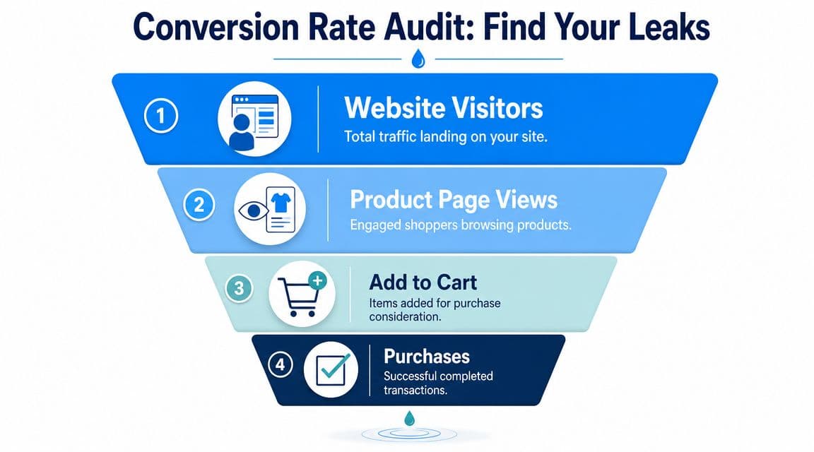
Map the funnel before changing anything
Don't start with button colors. Start with the funnel.
Look at the path from landing page to product page, from product page to cart, and from cart to purchase. That gives you a clean picture of where buyers hesitate. Pair the numbers with qualitative tools like heatmaps and session replays so you can see whether shoppers are confused, distracted, or blocked.
Practical rule: Optimize the highest-intent, highest-dropoff step first.
A short audit checklist helps:
- Pull your funnel data in GA4. You want clear visibility into page-by-page drop-off.
- Review behavior by segment. Mobile traffic often behaves differently from desktop traffic.
- Watch real sessions. Numbers tell you where people leave. Replays often tell you why.
- List friction points by severity. Hidden shipping info, weak product page messaging, and awkward form flow usually matter more than visual polish.
- Tie findings to KPIs. If you don't track add-to-cart and checkout progression, you can't tell whether a change improved the funnel or just moved the problem.
For a useful KPI baseline, this guide to e-commerce key performance indicators is worth keeping nearby while you build your scorecard.
A strong audit usually reveals one of three patterns: low-intent traffic, weak product-page persuasion, or checkout friction. Each needs a different fix. That's why broad sitewide redesigns often disappoint. They consume time, create risk, and blur the signal.
Capture High-Impact Quick Wins
A small delay or one extra checkout obstacle can erase revenue fast. After auditing hundreds of stores, I've found the fastest conversion gains usually come from fixing performance issues, reducing checkout friction, and tightening a few decision points that affect high-intent traffic first.
These are not cosmetic tweaks. They are the short list of changes that often move revenue without a redesign. Start here before you rewrite brand copy, change templates, or launch a new theme.
Fix speed before testing messaging
Performance problems weaken every stage of the funnel. Paid traffic gets more expensive, product page engagement drops, and mobile sessions leave before the page finishes loading.
Start with the fixes that usually matter most:
- Compress oversized images so product and collection pages load faster
- Lazy-load noncritical media instead of loading everything at once
- Remove or defer heavy scripts from apps you no longer use or do not need on every page
- Use a CDN and browser caching to reduce repeat-load friction
- Trim third-party tags because each script adds weight and can break page stability
Google's Core Web Vitals documentation is a better benchmark for this work than broad conversion roundups. Keep Largest Contentful Paint in a healthy range, but do not chase lab scores at the expense of merchandising or tracking. I've seen teams strip out tools they need just to improve a performance report by a few points. Revenue usually suffers when they do.
A good walkthrough of the basics is worth a watch before you hand fixes to your team:
Remove friction from checkout
Checkout work is usually operational, not creative. The goal is to reduce effort, reduce uncertainty, and let ready-to-buy shoppers finish the job.
Common fixes that work across most Shopify stores:
| Checkout issue | What to change |
|---|---|
| Forced account creation | Enable guest checkout |
| Long forms | Cut nonessential fields |
| Payment hesitation | Show payment options clearly, including express methods like Shop Pay or Apple Pay |
| Surprise costs | Make shipping costs visible earlier |
| Mobile friction | Use autofill and bigger tap targets |
Teams often waste time redesigning checkout flow instead of removing obvious blockers. If buyers have to type more, wait longer, or hunt for shipping information, fix that first.
One more quick win sits between product discovery and checkout. If shoppers reach a dead end on collection or cart pages, add relevant suggestions that help them continue shopping without forcing extra clicks. Done well, Shopify product recommendations that increase average order value can raise revenue per session. Done poorly, they distract from the primary purchase. Prioritize relevance over volume.
Use this section as a triage list. Fix the issues that affect the most sessions and the highest-intent pages first. That is how quick wins turn into measurable revenue, not just a nicer-looking store.
Improve Your Product Pages and Trust Signals
A large share of conversion lift happens on product detail pages, not at checkout. If the product page leaves basic questions unanswered, shoppers stall, compare, or leave.
Product pages have one job. Remove enough doubt for the right buyer to act.
Shoppers are judging more than the item itself. They are judging fit, quality, delivery risk, return hassle, and whether your store feels credible. Stores that miss this usually keep adding design flourishes instead of fixing the decision gaps that stop purchases.

Build pages that answer buying questions fast
Strong product pages make the decision easier without turning the page into a wall of content.
What matters most on most stores:
- Accurate product media. Show the item from multiple angles, in context, and at true-to-life scale. Overproduced visuals can raise interest but hurt conversion if the product looks different in person.
- Descriptions built around objections. Cover materials, dimensions, sizing, compatibility, care, and delivery timing. Fancy copy rarely beats clear answers.
- Reviews near the add-to-cart area. Buyers use reviews to check whether your claims hold up. If proof sits at the bottom of a long page, fewer shoppers see it when it matters.
- Visible policies. Shipping, returns, warranties, and payment options should be easy to spot. Hiding them does not reduce friction. It creates it.
A common mistake is copying marketplace templates or competitor layouts without asking what your buyers need to know. Apparel shoppers need fit guidance. Beauty shoppers need ingredient and skin-type clarity. Higher-ticket products need stronger reassurance around returns, durability, and support.
Use relevance carefully
Trust gets shoppers comfortable. Relevance helps them keep moving.
Recommendation blocks work when they match purchase intent. They hurt when they compete with the main decision. One well-placed suggestion often outperforms a page full of generic carousels.
For most stores, the highest-value recommendation types are:
- Recently viewed items for comparison shoppers
- Complementary products that naturally attach to the primary purchase
- Behavior-based suggestions based on browsing or cart activity
If you want a practical implementation reference, this guide to Shopify product recommendations that increase average order value is a useful starting point.
Personalization also has a maintenance cost. Merchandising logic drifts. Low-stock products get recommended. Irrelevant bundles show up on high-intent pages. Teams that treat recommendations as a one-time setup usually end up with clutter, not lift.
The same rule applies to tools. Use them to support the product page, not to bury it. WearView has a useful overview of AI tools ecommerce teams use to improve onsite guidance and merchandising decisions.
The best product pages answer the next obvious question before the shopper has to ask it.
Use AI to Answer Questions and Drive Sales
Many stores do the obvious CRO work and still lose buyers in the final moments before purchase. The page loads. The product looks good. The checkout works. But the shopper still has one unanswered question.
That gap is where support becomes sales.
Support friction is conversion friction
Many CRO guides underplay this issue. They talk about UX, layout, and checkout flow, but they don't deal directly with hesitation caused by unanswered pre-purchase questions. As noted in this conversion analysis from Quantum Metric, instant, context-aware answers can outperform static content when the problem is hesitation rather than lack of information.
That distinction matters. More FAQ content doesn't always convert better. If a shopper wants to know whether a serum fits sensitive skin, whether a lamp works with a dimmer, or whether a dress runs small, they often won't dig through your help center. They ask, wait, and leave if no answer comes.
Where AI fits in the funnel
Used properly, AI doesn't replace your merchandising or CX team. It covers the moments where waiting kills intent.
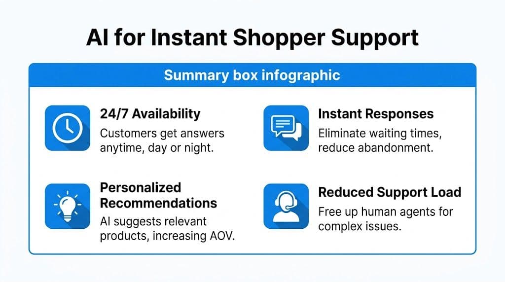
An AI layer is most useful when it can do four things well:
- Answer policy and product questions instantly so the shopper doesn't need to leave the page
- Suggest relevant products based on what the shopper is viewing
- Support cart recovery when a buyer leaves mid-journey
- Free up human agents for exceptions, edge cases, and high-value conversations
If you're comparing tooling, this roundup of ecommerce AI tools from WearView is a useful starting point.
For Shopify merchants, one option is an AI chatbot for ecommerce such as Carti, which answers shopper questions, recommends products, and supports cart recovery. The important point isn't the label. It's whether the tool reduces time-to-answer and helps buyers clear the last objection.
What doesn't work is dropping in a generic bot with canned scripts and no product context. That creates a second layer of friction. If the tool can't answer specific catalog, sizing, shipping, or return questions accurately, it won't help conversion.
Build a System for Continuous Improvement
Teams stall when CRO becomes a series of random edits. One person changes the PDP layout, someone else rewrites the CTA, then a developer tweaks checkout. Sales move, but nobody knows why.
A better model is a simple operating loop: hypothesis, test, measure, learn.
Run fewer better tests
A common mistake is testing too many variables at once. Guidance from Invesp on ecommerce CRO recommends changing one element at a time and running tests to statistical confidence. The same source notes that consolidating checkout from four pages to two can lift conversion by 10% to 35%.
That example shows why large friction fixes often beat endless micro-tests.
Use this order:
- Choose one bottleneck. Don't test six pages because six people have opinions.
- Write a clear hypothesis. Example: simplifying the shipping step will increase completion because shoppers won't pause to interpret extra fields.
- Change one meaningful element. One form step, one CTA, one layout block.
- Wait for enough data. Ending early usually produces noise, not insight.
- Record the result and the learning. A losing test is still useful if it rules out a bad idea.
Good testing programs don't reward activity. They reward clean learning.
Track the leading indicators
Final conversion rate matters, but it often moves after earlier metrics move first.
A practical scorecard usually includes:
- Add-to-cart rate to tell you whether PDP improvements are working
- Checkout progression to expose friction in the buying flow
- Segment-level conversion rate by device or channel
- Exit points on key pages so you can spot recurring leaks
Review these on a fixed cadence. Weekly is often enough for operating decisions. Monthly is better for trend interpretation. What matters is consistency. Without that rhythm, stores slip back into opinion-led changes and lose the compounding benefit of measured improvement.
Your CRO Flywheel and Next Steps
How to improve ecommerce conversion rate isn't a mystery. It's a sequence.
First, find the leak. Then remove the friction that sits closest to revenue. Tighten the product page so trust and relevance do more of the selling. Add faster answers where hesitation blocks purchase. Keep testing, but test with discipline.
That sequence creates a flywheel. Better diagnosis leads to better fixes. Better fixes create cleaner data. Cleaner data leads to sharper tests. Sharper tests make every future change less risky.
If you want another practical perspective on how teams improve website conversion rates, it's useful to compare approaches and notice how often the fundamentals repeat. The stores that win don't chase novelty. They execute the basics well and keep refining.
Most brands don't need more tactics. They need stronger priorities.
Frequently Asked Questions
What is a good ecommerce conversion rate
A good conversion rate depends on your channel mix, device mix, and product type. Broad benchmarks are useful for orientation, but they're not a target by themselves. The better benchmark is your own segmented baseline and whether you're improving from it.
How long does it take to see results from CRO
Some changes show up quickly. Speed fixes, simpler forms, and better checkout clarity can influence performance soon after launch. Broader page tests usually take longer because you need enough data to tell signal from noise. The main mistake is changing too many things before the first result is clear.
Should I focus on acquiring more traffic or improving my conversion rate
For many stores, conversion work improves the return on traffic you already paid for. If the funnel leaks, more traffic just means more wasted spend. Once the store converts more cleanly, every acquisition channel becomes more efficient.
If your Shopify store is losing buyers to unanswered questions, slow support, or hesitation near checkout, Carti gives you a practical way to close that gap with instant product and policy answers, relevant recommendations, and automated cart recovery. It fits best after you've handled the fundamentals and want a scalable way to turn more existing traffic into completed orders.

Written by
Daniel AndersonFounder of Carti. 10+ years building ecommerce brands in apparel and supplements. Still runs a Shopify store and built Carti to help merchants convert more browsers into buyers.
Ready to boost your store's sales?
Install Carti in 5 minutes and let AI handle customer questions, recommend products, and close sales 24/7.
Start Free Trial14-day free trial