The most useful number in shopify conversion rate optimization isn't your current conversion rate by itself. It's the gap. Many ecommerce benchmarks cluster around 2.5% to 3%, while Shopify-specific averages are often reported around 1.4% to 1.6%, and the top 10% of Shopify stores average 4.7% according to Toptal's Shopify CRO benchmark summary. That gap is where most stores are leaving money behind.
A lot of merchants treat conversion as a traffic problem. It usually isn't. More sessions won't fix weak product pages, unclear value propositions, slow mobile decision-making, or a checkout flow that creates hesitation at the worst possible moment. Better conversion systems do.
The stores that improve consistently don't chase random hacks. They build a repeatable process. They measure the funnel, diagnose where intent drops, fix the highest-friction pages first, and keep testing. They also stop treating chat as a support add-on and start using it where it matters most: when a shopper is undecided and one unanswered question blocks the sale.
Table of Contents
- Why Most Shopify Stores Leak Revenue and How to Fix It
- Establish Your Analytics and CRO Baseline
- Diagnose Your Leaky Funnel from Homepage to Checkout
- Implement High-Impact Changes on Your Product Pages
- Streamline Checkout and Recover Abandoned Carts
- Use AI and Mobile Speed to Boost Conversions
- Build a Repeatable A/B Testing and Measurement System
Why Most Shopify Stores Leak Revenue and How to Fix It
A small lift in conversion rate can create a large lift in revenue. On Shopify, the gap between an average store and a well-run one is often the difference between struggling to buy traffic profitably and scaling with confidence.
That gap usually comes from missed buying moments, not a lack of effort.
Most stores lose revenue in predictable places. The homepage sends broad messages instead of directing shoppers to a clear next step. Collection pages make people sort, scan, and compare too much. Product pages talk about the item but leave key purchase questions unanswered. Cart and checkout introduce doubt right when intent is highest.
I see the same pattern across audits. Stores spend heavily on acquisition, then ask visitors to do too much thinking once they land. That is expensive on desktop. On mobile, it is worse, because time-poor shoppers are making fast decisions in fragmented sessions.
The problem is often friction, not aesthetics
A polished theme can still underperform. Clean visuals do not fix weak hierarchy, hidden delivery details, confusing variant selection, vague fit guidance, or app clutter that competes with the Add to Cart button.
Good UX matters because it reduces decision effort. Shoppers should not have to hunt for shipping costs, compare three tabs to understand sizing, or wonder what happens if the product is wrong. If you want a useful refresher on the principles behind that, Website Builder Australia's UX guide is a solid reference for clarity, hierarchy, and ease of use.
Practical rule: If a shopper has to pause to figure out shipping, returns, sizing, or product fit, conversion risk goes up.
What actually improves conversion
The biggest gains usually come from reducing uncertainty at the moments closest to purchase.
Focus here first:
- Product pages: Answer buying questions before shoppers leave to find the answer elsewhere.
- Cart and checkout: Remove hesitation, especially around costs, delivery, and returns.
- Mobile journeys: Reduce taps, scanning, and comparison work so shoppers can decide faster.
- AI chat: Treat it as in-session sales assistance, not a support widget. Tools like Carti can answer fit, shipping, bundle, and product-match questions while purchase intent is still active.
Strong shopify conversion rate optimization is operational work. Set priorities based on revenue impact, track the right ecommerce KPIs for your Shopify store, and fix the leaks that make shoppers hesitate. The stores that win do not just look better. They make buying easier.
Establish Your Analytics and CRO Baseline
Stores waste months on CRO because they start with page opinions instead of buyer behavior. A store-wide conversion rate, total sessions, and total revenue will not tell you why shoppers hesitate, where they stall, or which fix is worth shipping first.
Set a baseline that shows buying intent step by step.
At minimum, use Shopify Analytics plus GA4 with ecommerce tracking configured correctly. Keep the setup tight. Bad event data creates false confidence, and an overloaded dashboard usually hides the few signals that matter.
Track the actions that mark progression toward purchase:
- Product view: Confirms traffic is reaching pages where buying decisions happen.
- Add to cart: Shows whether product pages are creating enough confidence to move forward.
- Begin checkout: Reveals whether the cart is reducing friction or adding it.
- Purchase: The revenue event.
- Search usage: Shows whether shoppers can find products without extra effort.
- Key micro-actions: Clicks on size guides, delivery details, returns, reviews, FAQs, and chat interactions.
That last category matters more than many teams realize. If shoppers repeatedly open shipping, returns, sizing, or product-match information, they are telling you where decision effort is too high. On mobile, that friction gets expensive fast because the shopper is usually trying to make a decision in short bursts, with less patience for scrolling, tab-switching, or digging for reassurance.
Your KPI set should stay small enough to review every week. A practical framework for ecommerce KPIs that matter to revenue helps keep attention on progression metrics instead of dashboard clutter.
Add qualitative evidence before you change pages
Quantitative data shows where the drop happens. Qualitative tools help explain what the shopper was trying to do when momentum broke.
Install a behavior tool such as Hotjar and use it with intent. Do not watch random recordings. Filter for mobile sessions on top product pages, cart visitors who never started checkout, and shoppers who used search or opened multiple reassurance elements before leaving.
Review these inputs:
- Heatmaps: Check whether visitors interact with key content or miss it entirely.
- Session recordings: Spot hesitation, repeated taps, dead clicks, and back-and-forth behavior.
- Scroll depth: See whether trust content, FAQs, or delivery information sit too low on the page.
- On-page feedback prompts: Useful on high-traffic pages with weak progression.
AI chat belongs in this baseline too. If you use Carti or a similar tool, track which questions appear before add to cart and before checkout. That data is not support noise. It is purchase-friction data. A spike in questions about compatibility, delivery timing, sizing, or bundles usually points to a merchandising or page-clarity problem you can fix upstream.
Shoppers rarely leave for one dramatic reason. Conversion drops when small decisions take too much work.
Build a baseline you can review on one screen
A working baseline should make weak points obvious without forcing you to dig through five reports.
| Metric | What it tells you | Why it matters |
|---|---|---|
| Conversion rate | Overall purchase efficiency | Shows whether changes produce more completed orders |
| Add-to-cart rate | Product page persuasion | Exposes weak merchandising, unclear offers, or unresolved objections |
| Checkout initiation rate | Cart effectiveness | Shows whether the cart keeps intent moving |
| Checkout completion rate | Checkout efficiency | Highlights friction in the final purchase step |
| Search usage and refinement | Discovery quality | Surfaces category confusion and poor product finding |
| Device split | Mobile vs desktop performance | Reveals friction that aggregate reporting hides |
Then segment it. Review results by device, landing page type, traffic source, new versus returning visitors, and top-selling products. I often find that a store with an acceptable overall conversion rate has one expensive mobile problem hiding underneath it. Product pages get traffic, shoppers interact, but too many of them need extra effort to answer basic buying questions.
That is why baseline work should include more than speed, bounce rate, and top-line conversion. Measure how easily a shopper can decide. If your mobile visitors rely heavily on search, repeatedly open policy content, or ask AI chat the same pre-purchase questions, the issue is not just performance. The buying path is asking them to work too hard.
Do not redesign anything until this baseline is stable for at least a week or two of normal traffic. Teams that skip this step usually ship cosmetic changes, claim a win or loss too early, and learn nothing they can repeat.
Diagnose Your Leaky Funnel from Homepage to Checkout
A Shopify funnel isn't one page. It's a chain of commitments. The buyer lands, orients, compares, evaluates, adds, reviews, and finally commits. Every step asks for a little more confidence.
If one stage underperforms, the later stages never get a chance.
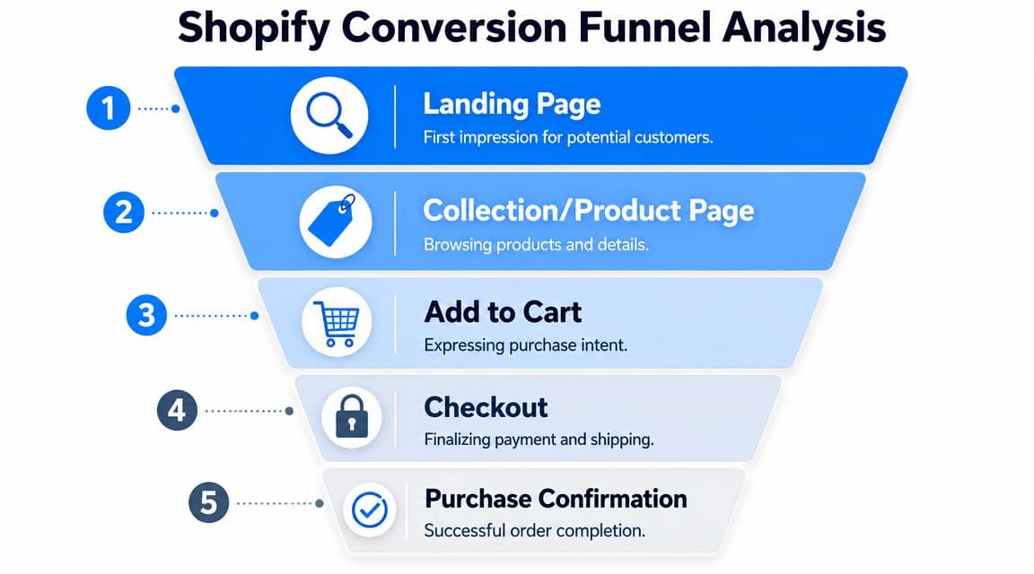
Read the funnel one stage at a time
Start with entry pages. If paid traffic lands on the homepage, ask whether the hero section tells visitors what to do next. If SEO traffic lands on collection pages, check whether filtering, product labeling, and category logic make sense fast enough for a first-time visitor.
Then move to product pages. This is usually where intent either sharpens or dissolves.
Look for patterns like:
- Traffic arrives, then bounces quickly: The page likely has a weak value proposition or mismatch with ad/search intent.
- Shoppers scroll but don't add to cart: They may be interested but still uncertain about fit, quality, delivery, or policy.
- Repeated clicks on shipping or returns info: The page isn't making reassurance easy enough.
- Frequent image zooms with little progression: Buyers may want more visual proof than the current media provides.
After that, review the cart. If people add products but stall there, the culprit is often surprise. Surprise shipping costs, surprise delivery timelines, surprise account requirements, or surprise friction before checkout begins.
The final review is checkout completion. If buyers start checkout and fail to finish, focus on complexity and confidence. The payment step might not be the issue. Confusion often begins earlier, with forms, address friction, promo code distraction, or uncertainty around total cost.
A leaky funnel usually looks normal in total traffic reports. It becomes obvious only when you inspect the handoff between stages.
Prioritize leaks by money at risk
Not every problem deserves immediate attention. Some pages are ugly but low impact. Others are plain-looking and subtly expensive.
Use a simple prioritization lens:
- Traffic volume
- Commercial intent
- Observed friction
- Ease of implementation
A weak About page can wait. A top-selling product page with strong traffic and weak add-to-cart behavior can't.
Here's a practical diagnosis map:
| Funnel stage | What to inspect | Common leak |
|---|---|---|
| Homepage or landing page | Hero clarity, CTA visibility, navigation choices | Visitors don't know where to go |
| Collection page | Filters, sorting, product labels, image quality | Too much effort to compare products |
| Product page | Value proposition, media, reviews, policies | Questions remain unanswered |
| Cart | Shipping visibility, totals, distractions | Intent drops before checkout |
| Checkout | Form friction, payment options, trust | Buyers hesitate before final submission |
Build hypotheses, not random tasks
Once you spot the drop-off, turn it into a testable idea.
Bad diagnosis sounds like this: “The page needs a refresh.”
Good diagnosis sounds like this: “Mobile users reach the product page, interact with images, open shipping information, and leave without adding to cart. The page likely isn't answering delivery and fit questions early enough.”
That kind of diagnosis creates useful actions. Move key policy details above the fold. Tighten the product summary. Add clearer review highlights. Reduce clutter around the add-to-cart module.
The goal isn't to find everything wrong. It's to identify the few leaks that are costing real revenue right now.
Implement High-Impact Changes on Your Product Pages
Most Shopify stores don't lose sales on product pages because the design is ugly. They lose sales because the page doesn't resolve uncertainty fast enough. The shopper is interested, but still has work to do.
That work needs to disappear.
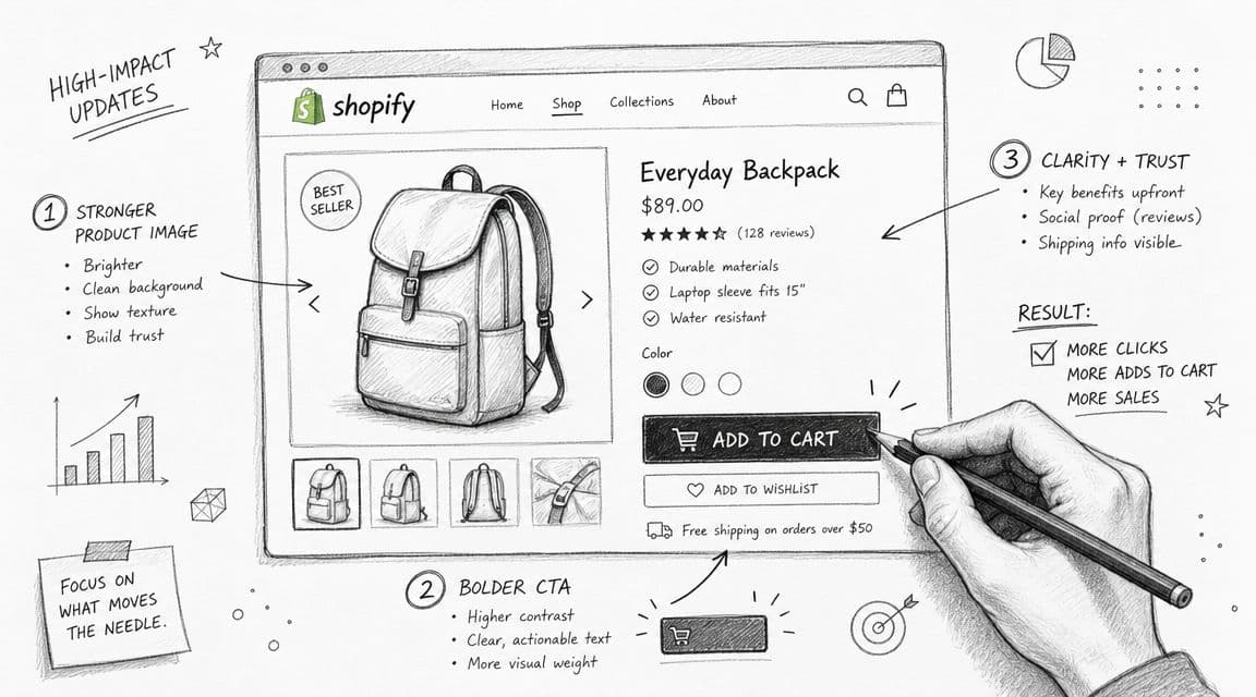
Fix the above-the-fold buying moment
The top of the product page has one job. It should tell the buyer what the product is, why it matters, how much it costs, and what they should do next.
If the first screen is dominated by oversized lifestyle imagery and vague branding, you've delayed the purchase decision.
Clean up the top section with this priority order:
- Clear product naming: Say what it is in plain language.
- Tight value proposition: One or two lines that explain the main benefit or differentiator.
- Visible price and variant controls: Don't make buyers hunt.
- Strong primary CTA: “Add to cart” should stand out, not blend into the theme.
- Immediate reassurance: Shipping, returns, delivery window, guarantee, or key trust points near the CTA.
A lot of product pages bury the most important information because the merchant wants the page to feel premium. Premium doesn't mean vague. Premium means easy to trust.
Turn the middle of the page into risk removal
Once the shopper scrolls, the page should answer objections in the order buyers naturally think.
That usually means:
- What does it look like in real use?
- Will it fit my needs?
- Can I trust the quality?
- What happens if it doesn't work out?
Your content stack should reflect that.
Use a mix of product imagery, short-form video, concise benefit-led copy, review content, sizing or compatibility guidance, and policy clarity. Don't write long paragraphs about craftsmanship if the buyer still can't tell dimensions, materials, or expected delivery timing.
Many stores achieve their fastest improvements here:
- Descriptions: Lead with benefits, then move into specifics.
- Reviews: Place them where they support the decision, not buried at the bottom only.
- Policies: Make returns, shipping, and guarantee language easy to scan.
- Media: Show texture, scale, motion, and use context.
A practical reference point is to compare your page with your own support inbox. If customers repeatedly ask the same pre-purchase questions, your PDP is under-explaining.
This walkthrough is useful if you're auditing merchandising and cross-sell placement on PDPs without cluttering the page: Shopify product recommendations.
Here's a visual explainer worth reviewing while you audit your page layout:
Field note: If reviews, shipping details, and product specifics all live in collapsed tabs, many mobile shoppers won't open enough of them to build confidence.
Use product recommendations carefully
Recommendations can help. They can also distract.
The biggest mistake is adding too many options too early. If the shopper hasn't committed to the main product, “you may also like” modules often create drift instead of lift.
Use recommendations where they support the decision:
- Complementary add-ons: Best when they increase confidence or usability.
- Alternative variants: Helpful when fit, size, style, or material preference is a real decision point.
- Bundles: Useful when the grouping makes the purchase simpler.
Avoid recommendation blocks that compete with the primary purchase action above the fold. The page should help the shopper buy the item they're considering first. Expansion comes second.
Streamline Checkout and Recover Abandoned Carts
Cart and checkout are where persuasion gives way to execution. By this point, the shopper has already done the hard work of choosing. If they leave now, it usually isn't because demand disappeared. It's because your process introduced doubt, friction, or delay.
That makes this part of shopify conversion rate optimization expensive to ignore.
Remove friction before the shopper hesitates
The strongest checkout improvements are usually boring. That's why they work.
Focus on these changes:
- Enable accelerated payment methods: Shop Pay, PayPal, and other fast options reduce effort for returning and mobile buyers.
- Keep costs visible early: If shipping or fees appear too late, trust drops fast.
- Reduce unnecessary fields: Every extra input creates one more chance to abandon.
- Support guest checkout where possible: Forced account creation often slows committed buyers.
- Keep promo code handling quiet: A visible discount field can send people leaving the checkout to search for codes.
Merchants often overestimate the role of persuasion here. The better frame is removal. Remove anything that interrupts a committed customer from finishing.
Recover carts with relevance, not pressure
Not every abandoned cart should trigger the same message. Some buyers need a reminder. Others need reassurance. Some just got interrupted.
Your recovery flow should mirror the objections that typically appear in your store:
- If shipping is a frequent blocker: Reassure around delivery timing and cost transparency.
- If fit or compatibility matters: Include the exact product and a helpful reason to return.
- If trust is the issue: Bring reviews, guarantees, or return clarity into the message.
- If attention is the issue: Keep the first reminder short and direct.
Use email first if that's your strongest owned channel. Add SMS only when consent and customer expectations are clear. Recovery works best when the message feels like continuation, not pressure.
A practical playbook for tightening this part of the funnel is how to reduce cart abandonment.
Treat the cart as a decision page
A lot of brands still treat the cart as a holding area. It isn't. It's a decision page.
The cart should confirm that the shopper made a good choice. That means product summary clarity, visible totals, delivery expectations, and a frictionless path to checkout. If the cart introduces unrelated upsells, cluttered notices, or conflicting messages, it weakens intent at the exact moment the buyer was ready to act.
Keep it tight. Confirm the product. Confirm the terms. Move the customer forward.
Use AI and Mobile Speed to Boost Conversions
A lot of mobile optimization advice is too shallow. Compress images. remove heavy apps. simplify layouts. That's useful, but it misses the bigger problem. Mobile shoppers often aren't failing to convert because the page is slightly too slow. They're failing because buying requires too much effort in too little time.
That matters because Envive reports that 79% of Shopify traffic comes from mobile, mobile converts 58% lower than desktop, and cart abandonment averages 70.19%. The gap isn't just technical. It's cognitive.
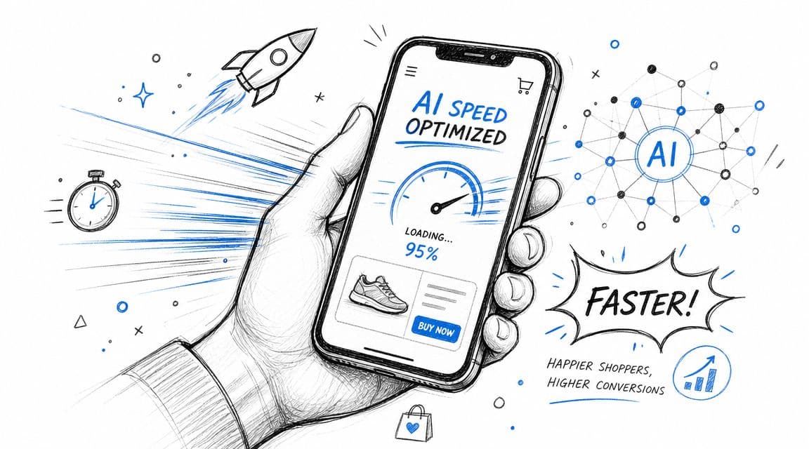
Mobile shoppers need less work, not more content
Most mobile sessions happen in fragmented attention. The shopper is standing in line, half-distracted, switching apps, or comparing products quickly. If your store asks them to open five tabs, read dense descriptions, and dig through menus for shipping or sizing, you've already made the purchase harder than it needs to be.
Reducing decision effort means simplifying the path to confidence.
That usually looks like:
- Shorter scanning paths: Key details near the CTA.
- Cleaner navigation: Fewer dead-end choices.
- Stronger product summaries: Benefits before deep detail.
- Visible reassurance: Policies and trust signals without extra digging.
- Faster discovery: Search, recommendations, and guided selection that narrow the field quickly.
This principle applies beyond speed optimization. Buyers don't need more content. They need the right answer in the shortest path possible.
For categories where visual confidence matters, richer product experiences can reduce that effort too. A good example is visualizing mattresses with AR, which shows how interactive product context can help shoppers make decisions without guessing.
Treat AI chat as in-session sales assistance
This is the most underused conversion lever in many Shopify stores.
Most merchants still deploy chat as a support widget. That leaves value on the table. The better use is objection handling at the point of decision. A shopper asks about sizing, shipping, ingredients, compatibility, stock, bundle fit, or return terms. If the answer arrives immediately and clearly, the purchase can continue in-session.
That's especially important because Shopify-focused CRO guidance has increasingly moved toward data-driven experimentation and behavioral analysis, while practical merchant discussions often point to missing product clarity, weak trust signals, and unclear value propositions as root causes of poor conversion, as summarized in this discussion of Shopify CRO and buyer confidence.
The useful role of AI chat is not “deflect support tickets.” It is:
- Answering buying questions instantly
- Helping shoppers choose between products
- Surfacing policy answers without menu hunting
- Reducing hesitation in cart
- Recovering intent before the visitor leaves
Fast answers don't just improve support. They preserve momentum while the shopper still intends to buy.
Combine faster pages with faster answers
Speed and AI work best together when they reduce both load time and decision time.
A mobile page can be technically fast and still convert poorly if the visitor can't figure out which option to buy. The reverse is also true. A helpful guided experience won't save a bloated storefront that drags under app weight and poor mobile structure.
The practical model is:
| Conversion problem | Traditional fix | Better mobile-first fix |
|---|---|---|
| Too many product choices | Add more filters | Add clearer guidance and conversational narrowing |
| Policy uncertainty | Hide details in FAQ page | Answer the question in-session and near the buying moment |
| Slow product discovery | Improve navigation labels | Pair better navigation with guided recommendation |
| Cart hesitation | Add reminder banners | Resolve objections before exit and keep checkout path clean |
If you're working on mobile CRO this quarter, don't treat page speed and conversation support as separate projects. They're part of the same goal. Help the shopper understand, decide, and act before attention fades.
Build a Repeatable A/B Testing and Measurement System
Once the main leaks are fixed, the work doesn't end. It becomes more disciplined. The next gains usually come from testing sharper hypotheses, not launching larger redesigns.
The stores that get better year after year build a loop. They don't rely on memory or gut feel.
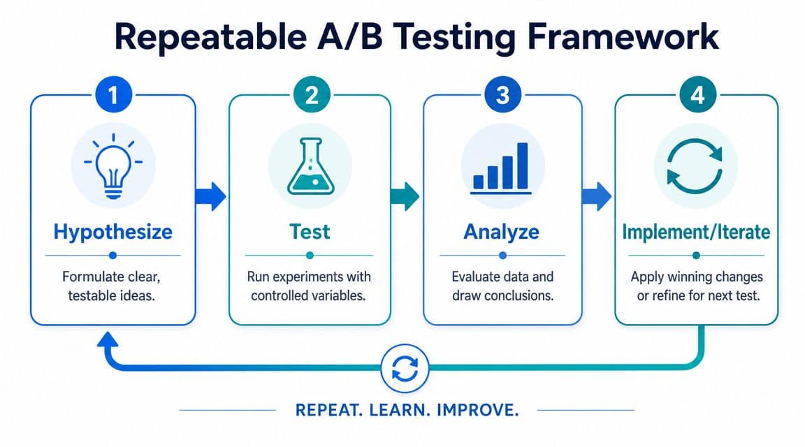
Use a simple testing loop
A practical A/B testing system only needs four steps:
-
Hypothesize
Start with observed friction. Example: mobile users engage with product details but hesitate before add to cart, so moving shipping and returns reassurance closer to the CTA may improve progression. -
Test
Change one meaningful variable at a time. Don't rewrite the page, move the reviews, change the CTA, and redesign the gallery all at once. -
Analyze
Review the primary metric first, then supporting behavior. If the test targeted product-page confidence, watch add-to-cart behavior before looking at total revenue. -
Implement or iterate
Roll out winners. Archive losers with notes. A failed test is still useful if it stops your team from repeating the same bad idea later.
The quality of the hypothesis matters more than the complexity of the tool.
Example A-B Test Ideas for Your Shopify Store
| Experiment Idea | Hypothesis | Primary Metric | Potential ROI |
|---|---|---|---|
| Move shipping and returns reassurance closer to Add to Cart | Buyers will feel more confident before committing | Add-to-cart rate | High if policy uncertainty is common |
| Replace feature-led opening copy with benefit-led copy | Shoppers will understand value faster | Add-to-cart rate | Medium to high on weaker PDPs |
| Move reviews higher on the product page | Social proof earlier will reduce hesitation | Add-to-cart rate | Medium |
| Simplify cart page upsell area | Fewer distractions will increase checkout starts | Checkout initiation | Medium to high |
| Test express payment prominence in checkout | Faster payment options will reduce completion friction | Checkout completion | High on mobile-heavy stores |
| Reduce homepage hero copy and clarify CTA | Visitors will reach products faster | Product page visits | Medium |
Keep a test log with five fields: page, hypothesis, change made, metric watched, outcome. That discipline matters more than having a fancy experimentation deck.
One warning. Don't treat every result as universal truth. A result on a high-intent product page may not apply to a category page or homepage. Test in context, learn in context, and document the conditions around the outcome.
If you want to turn onsite questions into conversions instead of support tickets, Carti is built for that job. It helps Shopify stores answer buyer questions instantly, guide shoppers to the right products, and recover intent before it disappears, all without a heavy setup process.

Written by
Daniel AndersonFounder of Carti. 10+ years building ecommerce brands in apparel and supplements. Still runs a Shopify store and built Carti to help merchants convert more browsers into buyers.
Ready to boost your store's sales?
Install Carti in 5 minutes and let AI handle customer questions, recommend products, and close sales 24/7.
Start Free Trial14-day free trial