You're probably looking at the same pattern most Shopify operators see when growth starts to stall. Traffic is coming in. Product pages are getting views. A few orders land. Most visitors leave without buying, without asking a question, and without giving you a second chance.
That gap usually gets blamed on pricing, ad performance, or product-market fit. Sometimes that's true. More often, the problem is simpler. The store doesn't make buying feel easy, clear, and trustworthy at every step.
That's what customer experience is in ecommerce. It isn't a brand exercise. It's the system that determines whether a shopper understands your offer, finds the right product, gets their concerns resolved, completes checkout, and feels good enough afterward to come back.
The stores that improve ecommerce customer experience well don't treat it like polish. They treat it like operations. They remove uncertainty before the click, reduce hesitation on-site, eliminate friction at checkout, and stay useful after the order is placed. When that system works, conversion improves, support load drops, and repeat purchase behavior gets stronger.
Table of Contents
- Your Customer Experience Gap Is Costing You Sales
- The Pre-Purchase Journey Winning Before They Arrive
- On-Site Engagement Turning Browsers into Confident Buyers
- The Checkout Funnel Sealing the Deal Without Friction
- Post-Purchase Excellence Creating Lifelong Customers
- Build a CX Flywheel with Data and Automation
Your Customer Experience Gap Is Costing You Sales
A shopper clicks your ad for a starter bundle, lands on a page that barely mentions it, scrolls past vague product copy, hits checkout, and pauses at an unexpected shipping cost. That session did not fail because demand was weak. It failed because confidence broke at three small points before the order was placed.
That is how revenue leaks out of an ecommerce store. The gap usually sits between what the shopper expects and what the site delivers. Confusing landing pages, missing product details, slow reassurance, and extra checkout friction rarely look dramatic in isolation. Together, they suppress conversion rate, increase abandonment, and make paid traffic less profitable.
The personalization gap makes the problem plain. McKinsey reported that 71% of consumers expect companies to deliver personalized interactions, and 76% get frustrated when that does not happen, according to McKinsey's research on personalization. In practice, that frustration shows up as lower add-to-cart rates, weaker conversion from returning visitors, and more support questions before purchase.
I have seen teams misdiagnose this as a traffic issue. They buy more clicks before fixing the reasons buyers hesitate. That usually raises acquisition cost faster than it raises revenue.
Practical rule: If a shopper has to stop and figure your store out, the experience is already underperforming.
The fix is operational, not cosmetic. You do not need a full redesign to improve ecommerce customer experience. You need to tighten the handoffs across the journey and remove avoidable doubt at each step. Carti is useful here because it helps teams identify recurring customer questions, spot friction patterns, and turn those signals into faster site updates instead of letting issues sit in support inboxes for weeks.
Four jobs matter most:
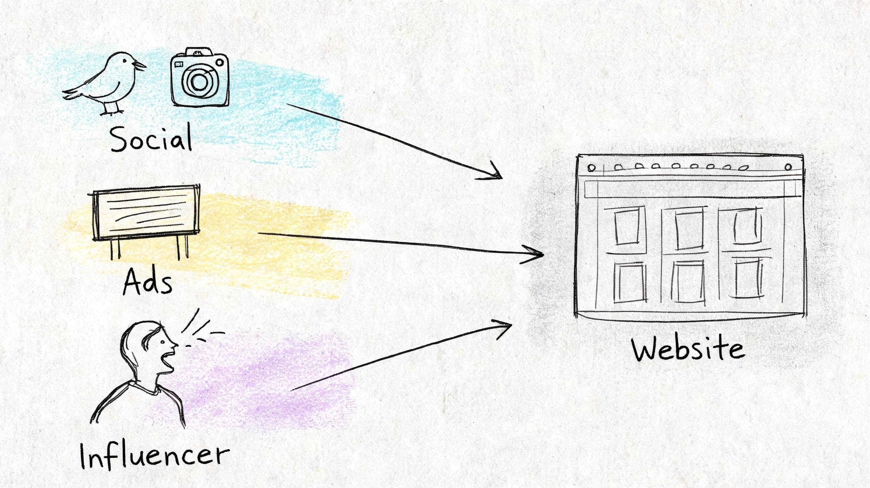
- Set clear expectations before the click: Ads, search listings, creator mentions, and landing pages should align on offer, product, and purchase conditions.
- Reduce uncertainty during evaluation: Shoppers need clear product answers, trust signals, and guidance that helps them decide.
- Protect intent at checkout: Extra fields, surprise costs, and slow pages give buyers a reason to leave.
- Keep the experience useful after payment: Fast updates, easy support, and proactive communication turn one order into repeat revenue.
The stores that win on CX usually do not feel flashy. They feel clear, reliable, and easy to buy from.
The Pre-Purchase Journey Winning Before They Arrive
A shopper clicks a paid ad for a targeted bundle, lands on a generic collection page, can't confirm shipping timing, and leaves in under 10 seconds. The media platform still charges for the click. Your analytics still count the session. Revenue never shows up.
That gap starts before the visit. Pre-purchase CX is the work of making the click feel justified the moment someone lands.
Match the click to the landing experience
Stores lose a surprising amount of paid and creator traffic by sending high-intent visitors to pages that force them to reorient. Homepage traffic can tolerate some exploration. Campaign traffic usually cannot.
The landing page should continue the exact conversation that started in the ad, email, search snippet, or creator content. That means message match at three levels:
-
Offer match
If the click came from a bundle, discount, use case, or hero SKU, repeat that framing immediately. Keep the same product focus, price context, and headline logic. -
Page logic
Put the product, supporting proof, objections, and CTA near the top. A shopper who clicked on a specific promise should not have to hunt through navigation to find it again. -
Risk reduction
Surface the details that affect purchase confidence early. Shipping windows, return policy, payment methods, sizing or ingredient info, and review proof all belong close to the buying decision.
I usually treat this as a conversion economics problem, not a design exercise. If campaign traffic bounces because the page broke continuity, the fix is cheaper than buying more traffic. LinkJolt's conversion guide covers the same principle from the CRO side.
Creator traffic needs even tighter alignment. Someone arriving from a TikTok review or creator story expects the same product angle, same use case, and a page that feels built for that audience. Generic landing pages waste borrowed trust.
Build for mobile buying behavior
Many teams still review acquisition flows on desktop first, then compress the same experience onto mobile. That misses how people shop.
According to Envive's retention analysis, mobile commerce represents 70% of all ecommerce transactions, while mobile shopping apps see 94.4% churn within 30 days. High mobile volume does not mean the experience is working well. It often means shoppers are tolerating extra friction until they decide not to.
Mobile buyers skim fast. They compare tabs, get distracted, and make decisions with less patience. Good mobile CX respects that behavior.
A few changes carry disproportionate impact:
- Shorten the route to relevant products. Menus should help visitors narrow by need, not expose your full internal category structure.
- Make the first screen do real work. Show the product or category context, why it matters, price signal, and the next action without relying on extra scroll.
- Use tap-friendly controls. Variant pickers, filters, and sticky actions need enough size and spacing to prevent hesitation and mis-taps.
- Cut visual noise. Stacked banners, aggressive popups, and oversized headers make the store feel harder to trust on a phone.
A phone session that feels tiring rarely gets a second chance.
Remove language friction before trust breaks
Cross-border conversion drops fast when shoppers cannot get basic questions answered in their own language. Only 22% of DTC brands offer multilingual chat, yet 68% of non-English shoppers abandon a cart if they can't get instant help in their native language, according to ProProfs' multilingual support statistics.
Those questions usually appear before the add-to-cart, not after it:
- Do you ship to my country?
- How long will delivery take?
- Is this sizing or spec information accurate for me?
- What happens if I need a return?
- Can I trust what I am buying?
If the answers are buried in English-only policy pages or locked behind a delayed support form, shoppers read that as risk.
This is one of the clearest places to use AI with operational discipline. Carti can answer product and policy questions across languages and give teams a live record of what shoppers keep asking, so merchandising and CX teams can fix the root issue on-site instead of repeating manual replies. For teams evaluating that setup, this guide on an AI chatbot for ecommerce is a useful starting point.
The goal is not more chat. The goal is fewer abandoned sessions caused by unanswered pre-purchase questions.
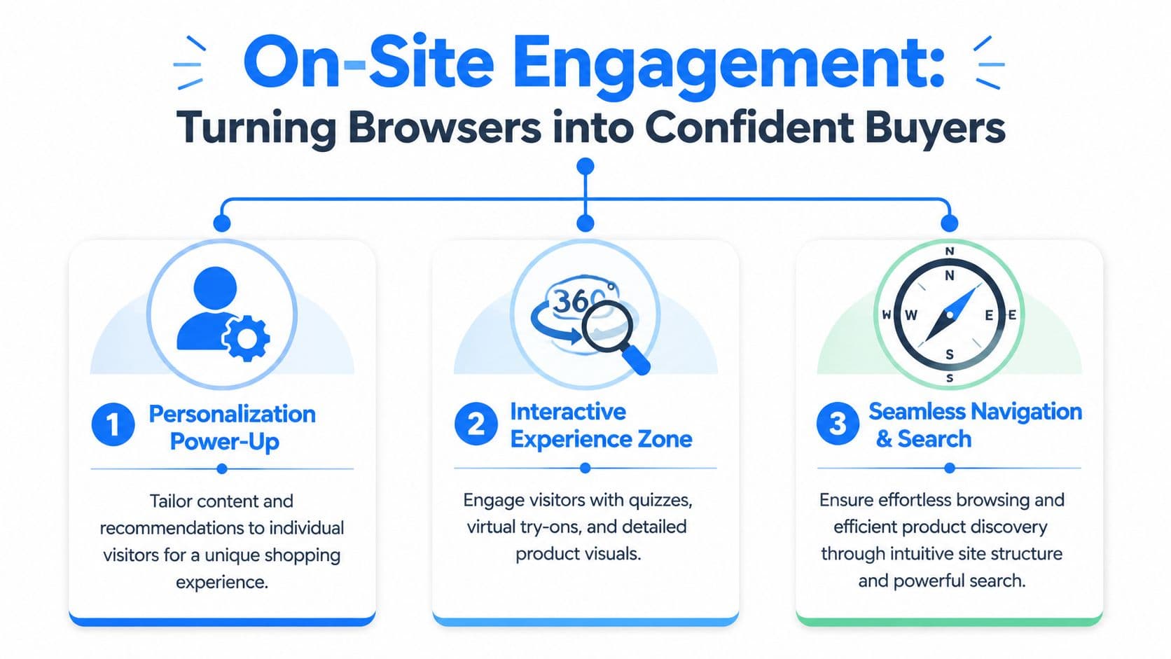
On-Site Engagement Turning Browsers into Confident Buyers
A shopper lands on a product page from a paid ad, scrolls for ten seconds, taps two images, hesitates, and leaves. That session did not fail because the store lacked activity. It failed because the page left too much risk unresolved.
On-site engagement has one job. Reduce doubt fast enough for a buyer to keep moving.
Discovery has to feel obvious
Shoppers buy faster when product discovery feels predictable. If your team names categories based on internal merchandising logic instead of buyer intent, visitors have to work to decode the store before they can evaluate the product.
High-converting stores usually get four basics right:
| Area | What works | What fails |
|---|---|---|
| Navigation | Category names buyers use naturally | Clever labels only your team understands |
| Collection pages | Strong filters, visible sort options, useful previews | Long product grids with weak filtering |
| Site search | Relevant results and typo tolerance | Empty results or keyword mismatch |
| Product listing cards | Clear imagery, pricing, and differentiators | Ambiguous thumbnails and missing context |
For a deeper breakdown of page structure, content hierarchy, and friction points, LinkJolt's conversion guide is worth reading. It complements CX work because stores convert better when the path to clarity gets shorter.
Test this on mobile. Find one specific product as if you were a first-time visitor. If it takes more than a minute, or if you need to guess which filter to use, shoppers are dropping before they ever reach a product page.
Answer the question blocking the sale
Product pages underperform for a simple reason. They describe the item, but they do not answer the buyer's real objection.
That objection is usually concrete:
- Fit and compatibility: sizing, dimensions, use cases, skin type, room type, material feel
- Purchase confidence: shipping timing, return policy, warranty, care instructions
- Decision support: comparisons, recommended pairings, what product is best for which need
A skincare shopper wants to know whether a formula will irritate sensitive skin. A furniture shopper wants to know whether a sofa fits through an apartment doorway. An apparel shopper wants to know whether the fabric stretches and how the item fits after washing. If those answers are buried in tabs, missing from the page, or trapped behind support tickets, the shopper delays the decision or exits.
Personalization helps when it delivers the next useful answer in context. As noted earlier, shoppers increasingly expect relevant experiences and get frustrated when the experience feels generic. The practical implication is straightforward. Recommend products based on the page being viewed, surface FAQs tied to that SKU, and adapt support prompts to the buyer's stage instead of showing the same widget to everyone.
Carti is useful here because it can tie product questions, catalog data, and store policies into one response layer. Teams that want a tactical setup can review this guide to an AI chatbot for ecommerce. The value is speed and specificity. A shopper gets an answer while intent is still high, and your team gets a record of which questions keep stalling conversion.
Use guidance that earns the click
Good on-site guidance is quiet. It appears when intent is visible, helps the buyer compare options, and disappears once the question is resolved.
Bad guidance does the opposite. It throws a discount popup on entry, repeats irrelevant recommendations, or interrupts a shopper reading the one section that might have closed the sale.
I use a simple standard when reviewing engagement features:
- Helpful: recommends adjacent products based on the current product or collection
- Useful: answers live questions about product details or buying policies
- Timed well: appears after behavior shows interest, not on the first second of the session
- Context-aware: matches the page, referral source, and likely buying question
A lot of personalization programs break down in practice. Stores label broad merchandising blocks as personalized, but shoppers read them as noise if the suggestions do not match the task at hand. The fix is usually less volume, not more. Fewer prompts. Better timing. Stronger relevance.
Bad engagement interrupts. Good engagement removes hesitation.
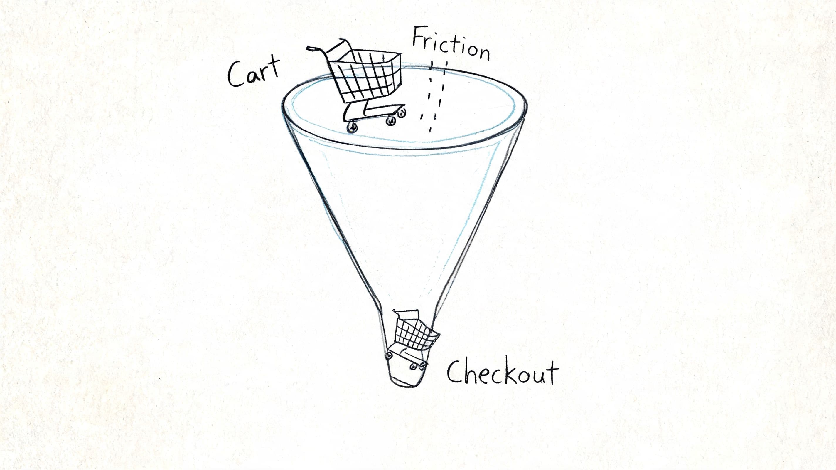
The Checkout Funnel Sealing the Deal Without Friction
Checkout is where stores discover whether their customer experience is working. Everything before it can look healthy while revenue still leaks badly at the last step.
That's why checkout deserves operator-level attention. Cart abandonment rates in ecommerce hit 70% or more, and simplified checkout matters because recovery messaging triggered within 15 to 30 minutes can recover 10% to 15% of abandoned carts, translating to a 15% to 25% increase in monthly revenue, according to ShippyPro's customer experience breakdown.
Cut the checkout to what matters
A strong checkout flow is boring in the best way. It doesn't surprise the buyer. It doesn't ask unnecessary questions. It keeps moving.
The cleanest structure is usually this:
- Cart review
- Shipping address
- Payment method
- Order confirmation
The biggest wins tend to come from operational basics:
- Guest checkout by default: Don't force account creation before money changes hands.
- Address validation: Reduce input errors before they create fulfillment issues.
- Multiple payment methods: Let buyers pay how they prefer, especially on mobile.
- Progress indicators: Show where the shopper is and what's left.
What doesn't work is treating checkout like a place to add more persuasion. This isn't where you stack extra upsells, aggressive email capture, or distracting design elements. At checkout, clarity beats creativity.
For teams tightening this part of the funnel, this guide on how to turn abandoned carts into sales offers a useful companion view on reducing friction and recovering lost intent.
Recover carts while intent is still alive
Many brands rely on delayed email reminders and call that cart recovery. It's better than nothing, but it misses the actual moment. Most abandoned carts aren't lost because the shopper forgot. They're lost because something blocked the purchase.
Common blockers include:
- uncertainty about shipping
- confusion about returns
- payment hesitation
- last-minute product questions
- distraction on mobile
That's why real-time recovery matters. The window right after abandonment is when the concern is still specific and fixable. This walkthrough on abandoned carts for Shopify is useful because it focuses on timing and context rather than just reminder cadence.
Some stores also benefit from chat-based recovery nudges because they can answer the buyer's actual objection instead of repeating “you left something behind.”
A quick visual on how that friction builds through the funnel helps when auditing your own flow:
Fix the reason for abandonment first. Then automate the reminder.
If you only chase the cart after the shopper leaves, but never remove the friction that made them leave, recovery will stay capped.
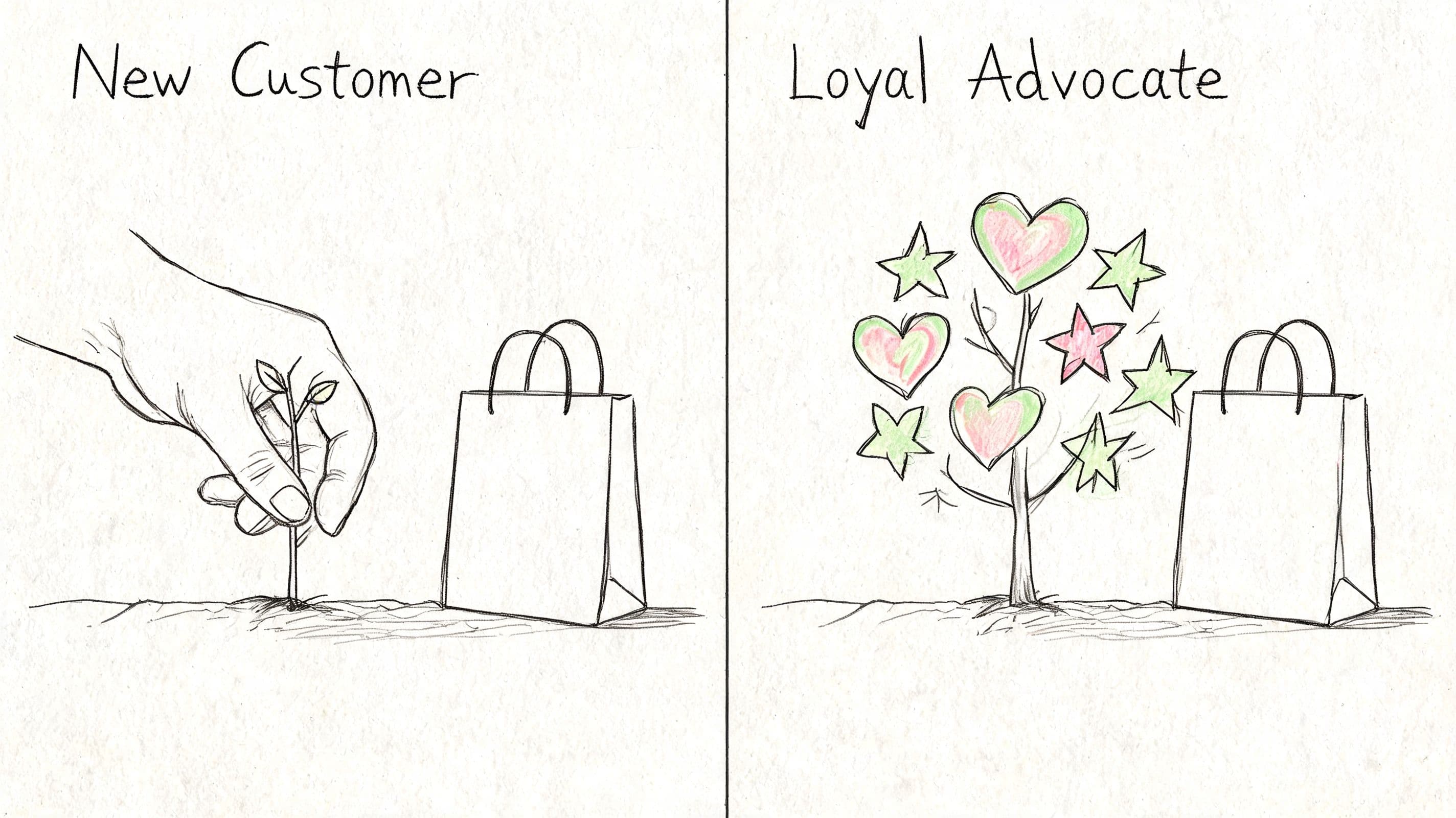
Post-Purchase Excellence Creating Lifelong Customers
A customer pays, closes the tab, and starts waiting. That waiting period decides more repeat revenue than many brands want to admit.
If the next messages are vague, tracking is hard to find, and support takes too long to answer basic order questions, the sale turns into extra ticket volume, more refund risk, and weaker second-purchase rates. If the experience is clear and predictable, customers stay calm even when fulfillment is not perfect. Post-purchase CX is less about delight and more about reducing uncertainty at every step after payment.
What good post-purchase operations look like
Strong post-purchase CX comes from clear operations and clear communication. The brands that retain well tend to get a few basics right, every time:
- Confirmation that reassures: show what was ordered, payment status, shipping expectations, and where to get help
- Proactive status updates: send useful fulfillment and delivery messages before the customer has to ask
- Return clarity: explain the policy in plain language, with steps, timing, and exceptions
- Packaging consistency: make the arrival experience match the product promise and price point
A large share of support contacts are avoidable. Customers ask where an order is because the store did not set delivery expectations. They ask how to exchange because the policy page reads like legal copy. They ask whether a delay is normal because no one explained what happens between order creation and carrier scan.
The practical rule is simple.
Answer the next obvious question before the customer opens a ticket.
That is where automation starts paying for itself. Carti can categorize recurring post-purchase questions, surface the language customers use, and help teams turn those patterns into better confirmation emails, tracking page copy, help content, and support flows. That is the stage-by-stage advantage most CX guides miss. You do not just identify friction after the sale. You use live customer questions to remove it at the source.
Keep helping after the sale
Cross-border support raises the stakes. Shoppers who need help in another language do not become easier to serve after checkout. They become more anxious, because now money is involved and the order clock is running. If your store sells internationally, accessible support and clear self-service content need to cover delivery timing, duties, address changes, exchanges, and damaged orders.
That work should map to the moments customers experience:
| Post-purchase moment | Customer concern | Better CX response |
|---|---|---|
| Right after payment | Did my order go through? | Immediate confirmation and next steps |
| During fulfillment | When will it ship? | Clear status messaging |
| In transit | Where is it now? | Easy tracking access |
| After delivery | What if it's wrong? | Visible returns and support options |
For stores tightening this stage, a look at post-purchase behavior in ecommerce helps map what customers tend to do, ask, and worry about after the order is placed.
Retention also improves when support content keeps working after delivery. Setup guides, replenishment reminders, care instructions, styling advice, and usage tips all reduce buyer regret and increase product adoption. Brands that want to build loyalty through content usually perform better when they treat that content as part of the ownership experience, not just acquisition marketing.
Good post-purchase CX feels calm, clear, and predictable. That is what brings customers back.
Build a CX Flywheel with Data and Automation
Improving customer experience often begins with isolated fixes. Teams might rewrite a product page, tweak checkout, or add a support widget. While these can help, the impact doesn't compound unless you connect the data across the journey.
A better approach is to build a CX flywheel. Each stage creates signals that improve the next one. Acquisition tells you what promise pulled the click. On-site questions tell you what shoppers still don't understand. Checkout exits reveal friction. Post-purchase tickets expose policy and communication gaps.
Track the right KPI at each stage
You don't need an enormous dashboard. You need a small set of metrics tied to real buyer behavior.
| Journey Stage | Primary KPI | Secondary KPI | Carti-Powered Metric |
|---|---|---|---|
| Pre-purchase | Bounce rate | Landing page engagement | Top pre-purchase questions |
| On-site engagement | Conversion rate | Product page exit rate | Product questions by page |
| Checkout | Cart abandonment rate | Checkout completion rate | Recovery conversations triggered |
| Post-purchase | Support ticket volume | Repeat purchase behavior | Most common post-sale questions |
The key is to pair quantitative metrics with qualitative signals. Analytics can tell you where shoppers leave. Customer questions tell you why.
Turn customer questions into site improvements
Automation becomes more useful than another reporting tool in these instances. If shoppers repeatedly ask whether a product runs small, your size guide is weak. If they keep asking about delivery timing, your shipping copy isn't clear enough. If they ask whether two products work together, your merchandising and cross-sell logic need work.
That's the loop:
- Spot recurring questions
- Fix the page, policy, or flow that caused them
- Measure whether the question volume drops
- Use the insight to improve adjacent pages and campaigns
Over time, your store gets easier to buy from because shoppers keep teaching you where the friction is.
That's how to improve ecommerce customer experience in a way that lasts. Not by adding more layers, but by using customer behavior and questions to remove the right ones.
If you want to make that process easier, Carti is built for Shopify stores that need faster customer answers, multilingual support, product guidance, cart recovery, and clearer insight into what shoppers are asking before and after purchase. It fits best when you're trying to reduce support load while tightening conversion across the full journey.

Written by
Daniel AndersonFounder of Carti. 10+ years building ecommerce brands in apparel and supplements. Still runs a Shopify store and built Carti to help merchants convert more browsers into buyers.
Ready to boost your store's sales?
Install Carti in 5 minutes and let AI handle customer questions, recommend products, and close sales 24/7.
Start Free Trial14-day free trial