Most bounce rate advice starts with speed. That's incomplete. The more useful place to start is expectation mismatch. According to Network Solutions' write-up on fixing high bounce rates, 57% of bounces stem from mismatched expectations between ad copy and landing page content. If your ad says one thing and your landing page delivers another, no amount of compression, lazy loading, or theme cleanup will save that click.
That matters even more on Shopify, where paid traffic is expensive and first impressions do most of the work. A bounce usually isn't random. It's a signal. Sometimes it says the page loaded too slowly. Sometimes it says the visitor couldn't find shipping details. Often it says your campaign promised a discount, product type, or shopping experience that the landing page didn't confirm fast enough.
If you want to learn how to reduce bounce rate in a way that lifts revenue, start with traffic intent, then fix the site experience that supports it.
Table of Contents
- What a High Bounce Rate Really Costs Your Shopify Store
- Find the Leaks Before You Plug Them
- The Foundations Fast Pages and Flawless Mobile
- Align Your Message from Ad to Landing Page
- Keep Shoppers Engaged with On-Site Assistance
- A Framework for Testing and Continuous Improvement
What a High Bounce Rate Really Costs Your Shopify Store
Bounce rate only becomes useful when you stop treating it like a vanity number. On ecommerce sites, it tells you whether the click you paid for found a reason to continue. HubSpot notes that the average bounce rate across all websites falls between 26% and 70%, with ecommerce sites ideally landing in the 26% to 40% range. It also notes that anything above 40% often points to misaligned expectations or poor site performance in its guide to bounce rate benchmarks and fixes.
For a Shopify merchant, that has a very practical meaning. A bounce can mean wasted ad spend, a missed product discovery, and one less chance to get a visitor into cart, email capture, or checkout. If the store is getting traffic but the session ends on the first page, the problem usually sits in one of two places: the promise before the click, or the experience after it.
Not every bounce is bad. Some visitors land on a store policy page, confirm a detail, and leave satisfied. Some return customers check sizing or shipping and come back later to buy. But high bounce rates on product pages, collection pages, and campaign landing pages are rarely harmless. Those are revenue pages.
Practical rule: Don't try to force bounce rate to zero. Try to understand which bounces represent satisfied intent and which ones expose friction, confusion, or a broken promise.
This is why bounce rate shouldn't be reviewed in isolation. Pair it with add-to-cart rate, landing page performance, and sales by channel. If you're also working on broader ways to improve ecommerce conversion rates, bounce rate becomes one of the quickest diagnostic signals in the stack.
A high bounce rate doesn't just say people left. It says your store failed to move them to the next step.
Find the Leaks Before You Plug Them
The fastest way to waste time is to "optimize" a store without knowing where visitors are dropping. Storewide averages hide problems. The fix is segmentation.
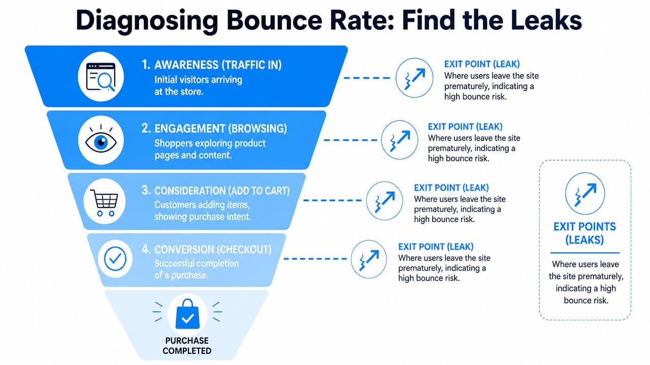
Start with traffic source, not sitewide averages
Open Shopify Analytics and GA4 and look at bounce rate by source and medium first. Organic search, branded search, paid social, email, influencer traffic, and direct visits behave differently. Treating them the same leads to bad decisions.
If one paid social campaign sends visitors to a product page and they leave immediately, the problem may have nothing to do with the page speed. The ad may be attracting the wrong shopper. Or it may promise an offer, style, or price point that the page doesn't show clearly enough.
A simple way to frame it:
| Segment | What a high bounce rate often suggests |
|---|---|
| Paid social | Weak intent fit or a misleading hook |
| Search traffic | The page didn't answer the query fast enough |
| Email traffic | The email offer and landing page don't match |
| Direct traffic | Brand curiosity without enough trust or clarity |
The most overlooked issue is intent mismatch. As noted earlier, Network Solutions reports that 57% of bounces come from mismatched expectations between ad copy and landing page content. Their example is simple and familiar: an ad pushes "free shipping," but the landing page reveals a minimum order requirement. That's exactly the kind of disconnect that kills paid traffic.
Segment by device, visitor type, and landing page
Once traffic source gives you a shortlist, break it down further.
Look at these slices:
- Device type: Mobile bounce problems usually expose layout, speed, tap targets, or clutter above the fold.
- New vs. returning visitors: New visitors need more confirmation and trust. Returning visitors usually need less explanation and faster access.
- Landing page: Product pages, collection pages, homepage, and campaign pages each fail in different ways.
- Campaign destination: Compare ads that land on the homepage versus ads that land on a product or collection page.
A homepage is rarely the best landing page for cold paid traffic. It's too broad for a click that came in with a specific expectation.
The pattern matters more than the average. If mobile paid traffic to one collection page bounces heavily while desktop email traffic to that same page performs fine, you don't have a storewide problem. You have a campaign-page-device problem.
Turn patterns into hypotheses
At this stage, don't start changing five things at once. Write a plain-English hypothesis for each leak you find.
For example:
- Ad mismatch hypothesis: The ad promises a sale, but the landing page doesn't show discounted items fast enough.
- Mobile friction hypothesis: The sticky header, pop-up, and chat launcher are crowding the first screen on product pages.
- Trust gap hypothesis: Visitors land on a new product page but don't see reviews, shipping info, or returns details early enough.
- Navigation hypothesis: Visitors who don't like the first product have no obvious path to related alternatives.
That turns analytics into action.
A good diagnostic pass usually ends with a short priority list:
- One or two traffic sources leaking hard
- A handful of landing pages doing most of the damage
- A likely reason for each leak
- A ranked order of fixes based on revenue impact
That's how to reduce bounce rate without guessing.
The Foundations Fast Pages and Flawless Mobile
Speed and mobile UX are still table stakes. They aren't the whole story, but if the store feels slow or unstable, shoppers won't stay around long enough to care about your messaging.
Semrush lays out a clean benchmark for Core Web Vitals in its guide to bounce rate and performance: LCP should be under 2.5 seconds, CLS under 0.1, and INP under 200 milliseconds. It also notes that ecommerce sites with LCP under 2.5 seconds see bounce rates drop by approximately 18% compared with sites above 4 seconds. Those aren't abstract developer scores. They map directly to whether a shopper sees the main product content quickly, whether the page jumps around while loading, and whether taps feel responsive.
What to fix first on a Shopify store
Most Shopify speed issues come from familiar sources. Too many apps. Heavy product images. Scripts loading before the page has done its main job.
Start with these:
- App bloat: Audit every installed app. If an app adds a widget, badge, upsell, review tab, or tracking script, it has a cost.
- Oversized images: Compress product and banner images without making them look cheap. Home hero images are common offenders.
- Third-party scripts: Delay anything non-essential. Live chat, heatmaps, extra analytics tags, and promotional overlays often load earlier than they need to.
- Theme clutter: Old themes accumulate sections, snippets, and code from previous tests. Clean code usually beats stacking more features onto a tired build.
For merchants who want another practical angle on the topic, these digital marketing tips for bounce rate are a helpful companion read.
Make mobile confirmation obvious
Most Shopify traffic is mobile-heavy in real life, even if each store's mix differs. That's why the first mobile screen matters so much. A shopper should know, without pinching or scrolling, what the product is, why they should trust the store, and what to do next.
Use this above-the-fold mobile checklist:
- Clear product or collection title: No vague campaign headline that hides what you're selling.
- Immediate value confirmation: Sale, category, benefit, or problem solved should appear fast.
- Visible pricing and variants: Don't force a hunt.
- Trust cues: Reviews, shipping, returns, or payment options should appear early enough to reduce doubt.
- Tappable controls: Variant selectors and add-to-cart buttons need breathing room.
If your store also depends on mobile shopping behavior, it helps to understand how buyers move on phones and why friction shows up differently there. This overview of mobile commerce behavior on Shopify is worth reading.
After you've reviewed the page yourself, watch a few real sessions or screen recordings if you have them. Merchants often assume the page is "clear" because they already know the catalog. New visitors don't.
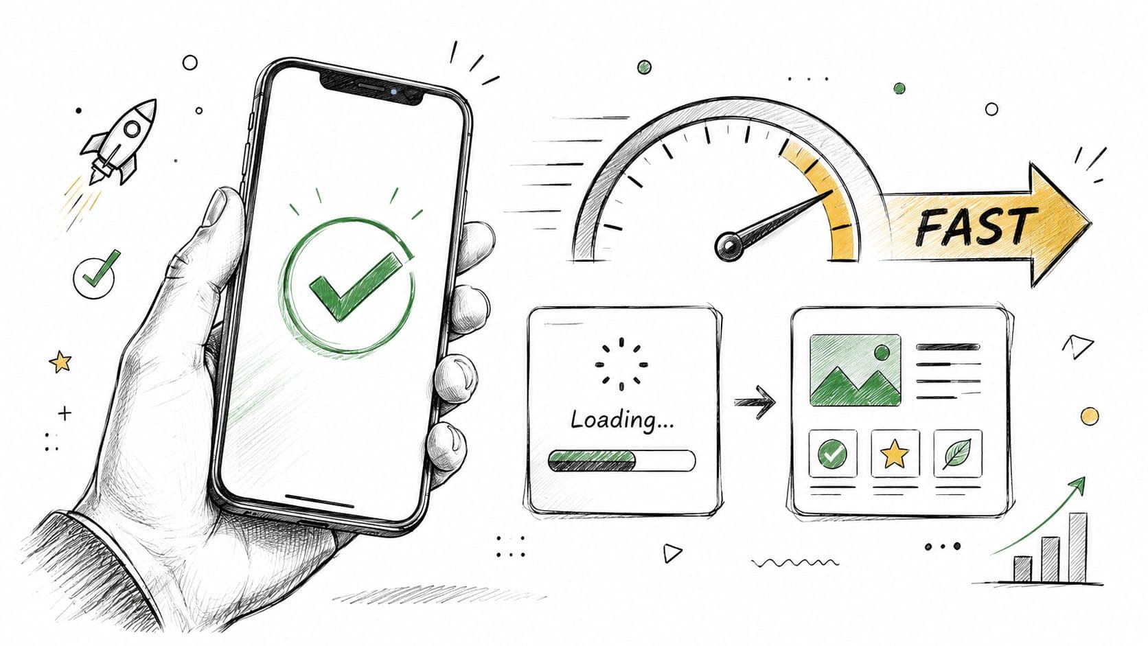
A quick visual explainer can help teams align on what speed issues look like in practice:
Audit like a merchant, not a developer
You don't need to chase a perfect Lighthouse score to reduce bounce rate. You need a store that feels fast enough, stable enough, and simple enough to shop.
Ask blunt questions:
- Does the main image appear quickly?
- Does the page jump while buttons or banners load?
- Can a shopper interact with the page immediately?
- Does a pop-up interrupt the first action?
- Does the store feel slower after every new app install?
Speed work pays off when it protects the first shopping action. If the shopper can see, trust, and tap quickly, bounce rate usually improves for the right reason.
Align Your Message from Ad to Landing Page
This is the most impactful fix for many Shopify stores because it changes the quality of the session before technical improvements even get a chance to matter.
A shopper clicks with an expectation already formed. They don't arrive as a blank slate. The ad, email, influencer post, or search snippet has already told them what they think they're getting. If the landing page doesn't confirm that expectation immediately, the session is on borrowed time.
Match the promise above the fold
The first screen should answer a simple question: Am I in the right place?
When stores miss this, they usually miss it in obvious ways:
| Click promise | Bad landing experience | Better landing experience |
|---|---|---|
| "50% off skincare bundles" | Generic homepage hero | Dedicated sale collection with discounted bundles visible |
| "Free shipping on lounge sets" | Product page with no shipping context | Collection or product page that clarifies the offer immediately |
| "Best black maxi dresses" | Homepage with mixed categories | Collection page filtered to black maxi dresses |
The mistake isn't lack of creativity. It's lack of continuity. Merchants often build clever ads, then send the click to the most convenient URL instead of the most relevant one.
If the visitor has to translate your message after clicking, you've already added friction.
Build campaign-specific landing paths
On Shopify, that often means creating more destinations, not fewer. Dedicated collection pages, filtered category pages, and focused landing pages usually outperform broad destinations because they preserve intent.
Strong campaign paths usually share a few traits:
- The headline mirrors the acquisition message: Not word-for-word every time, but close enough to confirm relevance.
- The featured products match the click motive: Sale traffic should see sale products. Gift traffic should see giftable products.
- Policy friction is answered early: Shipping thresholds, returns, delivery windows, and exclusions shouldn't be hidden.
- Navigation still offers escape routes: If the first item isn't right, related options should be close by.
This also applies to email and influencer traffic. A creator can send highly qualified clicks and still produce bad bounce behavior if the destination feels generic.
Relevance beats cleverness
Many bounce problems come from trying to make one page do too much. A homepage can't serve every campaign equally well. A general collection page won't satisfy a narrow ad angle. A beautiful hero section won't rescue a mismatch between promise and page.
The stores that handle this well usually think in scent trails. Every message leads naturally to the next one.
Use this quick review before launching traffic:
- Check the ad copy. What specific promise did you make?
- Check the landing headline. Does it confirm that promise fast?
- Check the first products shown. Do they match the click motive?
- Check the fine print. Are thresholds, exclusions, or delays hidden?
- Check the next step. Can a visitor move deeper without friction?
That's a cleaner answer to how to reduce bounce rate than endlessly swapping button colors on the wrong page.
Keep Shoppers Engaged with On-Site Assistance
Once the click lands on a relevant page and the store loads cleanly, the next job is keeping momentum. Shoppers leave when uncertainty stacks up. They can't find sizing. They don't know shipping times. They aren't sure which variant fits their need. They hit a dead end and exit.
That makes bounce reduction partly a support problem, not just a design problem.
Navigation and CTAs should remove doubt
Start with the basics. If the shopper doesn't want the exact item they landed on, the page should offer a clear next move.
Good engagement paths usually include:
- Logical internal links: Related products, adjacent collections, sizing help, and policy pages in the places shoppers need them.
- Clear CTAs: "Add to cart" is obvious. But "Shop matching sets," "View more colors," or "Compare similar styles" often matters just as much.
- Reduced dead ends: Product pages shouldn't strand the visitor with one option and no fallback.
- Clean menus and filters: Especially on mobile, filters should help narrow choices without feeling like work.
A lot of bounce reduction comes from giving shoppers a second click that makes sense.
Use assistance before frustration turns into exit
The strongest stores don't wait for support tickets. They surface help inside the session.
That can look like:
- an FAQ block near the add-to-cart area
- sizing prompts on apparel pages
- delivery messaging on collection and cart-entry pages
- on-site chat that answers product and policy questions in real time
- smart product suggestions when the current page isn't a fit
The key is timing. Assistance should appear where doubt appears. Not all at once, and not in a way that interrupts browsing.
If you're evaluating on-site support options, this guide to choosing a web chat widget for ecommerce stores is a useful starting point.
Shoppers rarely leave because they hate your store. They leave because one unanswered question made continuing feel harder than leaving.
Exit-intent works when the offer earns attention
Exit-intent pop-ups are one of the few direct interventions that can rescue a session, but only when used carefully. WP Rocket notes that exit-intent pop-ups can reduce bounce rates by up to 15% to 20% in specific A/B tests when configured correctly. It also notes that offer quality matters a lot. A high-value offer might reduce bounce rates by 18%, while a low-value one might only reduce them by 5%.
That tracks with what merchants see in practice. Bad pop-ups are annoying. Good ones answer the reason the shopper was about to leave.
Use them well:
- Lead with value: A real incentive, relevant guide, or helpful reminder works better than a generic "wait before you go."
- Match the page context: A product-page visitor should see a product-relevant offer, not a random newsletter ask.
- Limit frequency: Once per session is usually enough.
- Make closing easy: If the close button is tiny or delayed, the pop-up becomes the reason for the exit.
- Be careful on mobile: Mobile interruption gets irritating fast.
Exit-intent is a save attempt, not a strategy by itself. It works best when the rest of the page already feels credible and helpful.
A Framework for Testing and Continuous Improvement
Most bounce rate work fails because too many changes happen at once. A new hero, a new app, a new menu, a new banner, and a new offer all go live together. Then nobody knows what moved the metric.
Use a tighter process.
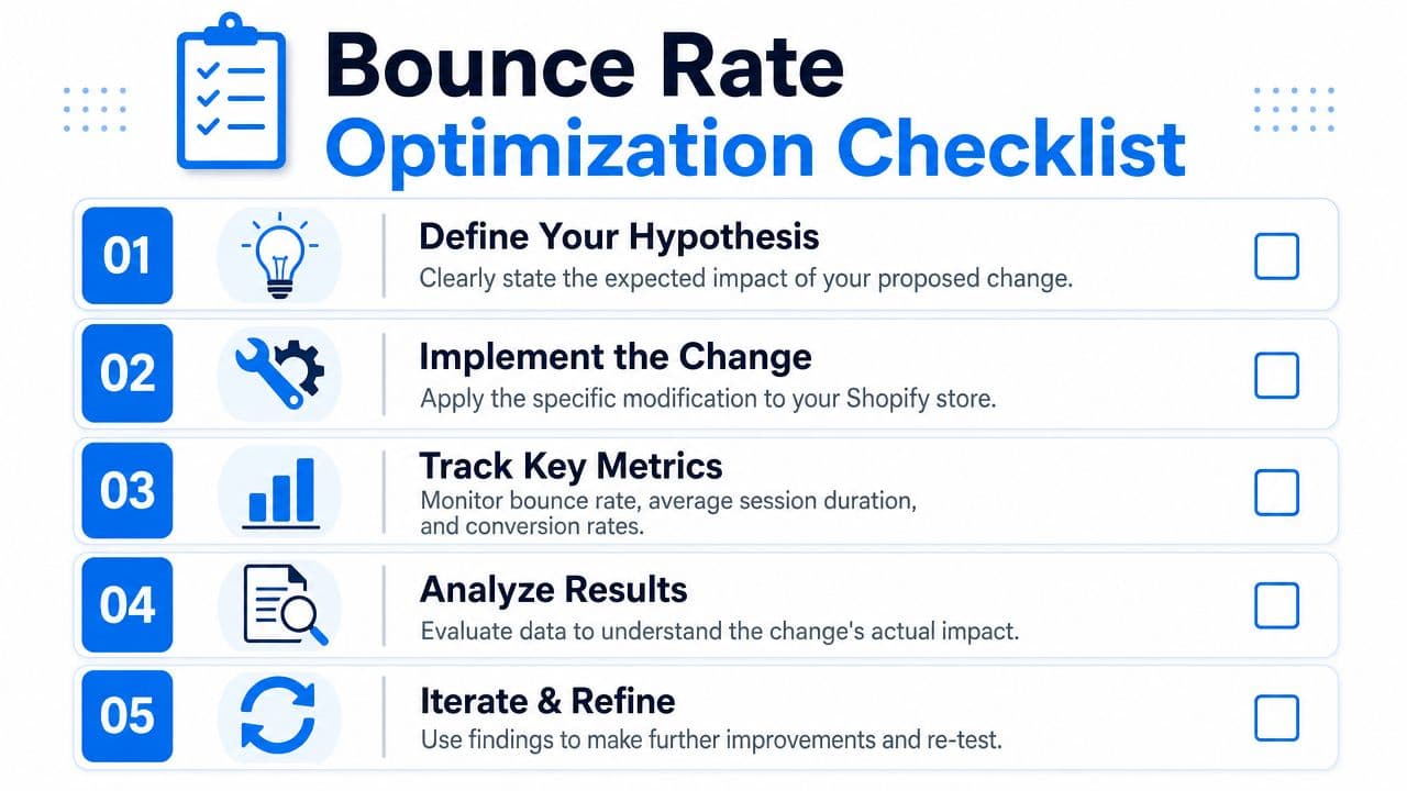
Use a simple testing loop
A practical testing framework only needs four parts:
| Step | What to write down |
|---|---|
| Hypothesis | What you think is causing the bounce |
| Change | The one thing you'll modify |
| KPI | What metric should improve if you're right |
| Result | What happened and what you'll do next |
Examples of strong hypotheses:
- Visitors from a sale ad bounce because the landing page doesn't show discounted products above the fold.
- Mobile shoppers leave because the add-to-cart area appears too low on the page.
- New visitors bounce because shipping and returns details aren't visible early enough.
Keep each test narrow. One meaningful change beats five minor tweaks.
Track business metrics, not vanity fixes
Bounce rate matters, but it isn't the finish line. A lower bounce rate with no improvement in shopping behavior doesn't help much.
Track bounce rate alongside:
- Add-to-cart behavior
- Session quality on priority landing pages
- Conversion performance by traffic source
- Revenue impact from the pages you changed
If you need a stronger process around that, this guide to Shopify conversion rate optimization gives a broader framework for tying page changes back to business outcomes.
The best bounce-rate fix is the one that improves the session and the sale, not just the dashboard.
Know when to bring in outside help
Some stores hit a point where the problem isn't obvious anymore. The easy leaks are fixed, but performance still stalls. That's usually when an outside CRO specialist earns their fee. If you're a growing merchant team and need a benchmark for what specialist support looks like, this page on hiring a CRO consultant for UK SMEs offers a useful reference point.
The main thing is discipline. Keep a testing log. Review landing pages by source. Don't declare victory because one metric moved in isolation. And don't ask bounce rate to answer questions that belong to merchandising, offer strategy, or traffic quality.
If you want to turn more of those first-click visitors into buyers, Carti helps Shopify stores answer shopper questions instantly, guide visitors to the right products, and reduce the friction that causes people to leave. It's a practical way to support sessions that would otherwise bounce, especially on product and collection pages where uncertainty kills conversions.

Written by
Daniel AndersonFounder of Carti. 10+ years building ecommerce brands in apparel and supplements. Still runs a Shopify store and built Carti to help merchants convert more browsers into buyers.
Ready to boost your store's sales?
Install Carti in 5 minutes and let AI handle customer questions, recommend products, and close sales 24/7.
Start Free Trial14-day free trial