
A shopper lands on a product page, checks the photos, notices the price, and pauses. They still don't know whether the item will fit, when it will arrive, or what happens if it's wrong. That one unanswered question can end the session before the shopper ever reaches checkout.
The global cart abandonment benchmark sits around 70.19% to 70.22%, which means roughly 7 in 10 shoppers who add an item to their cart don't complete the purchase (Baymard benchmark cited by CartFlows). That number matters, but it can also pull operators toward the wrong fix. Many teams jump straight to abandoned-cart emails, checkout redesigns, or another discount popup while the larger leak sits earlier, between product-page interest and add-to-cart intent.
A Shopify store has a simpler funnel than most diagrams suggest:
Land: A visitor arrives on a product or collection page.
Decide: The visitor weighs fit, price, delivery, returns, and trust.
Commit: The visitor adds to cart and completes checkout.
The middle stage deserves more attention. Traffic tools tell you who arrived. Checkout tools tell you who nearly finished. Neither tells you why a shopper hesitated when the product was right in front of them.
Core insight: Answer the question that blocks the decision before offering another discount.
This is a practical guide to the ecommerce conversion funnel as it operates in real Shopify stores. You'll see how to locate drop-offs, read the difference between a metric and a diagnosis, use chat transcripts as a why-signal, and place assistance where uncertainty appears. The focus is not on adding more software for its own sake. It's on making the next decision easier.
Introduction Why Most Funnels Leak in the Middle
A shopper searching for a jacket may arrive from an ad that promises warmth and a clean fit. The product page looks polished, but the size guide doesn't explain whether the cut runs small. Shipping information is buried below the reviews. The shopper opens the cart drawer, sees a total they didn't expect, and leaves to compare alternatives.
Nothing has necessarily failed technically. The page loaded. The add-to-cart button worked. The payment gateway may be perfectly reliable. The shopper reached the decide moment without enough confidence to commit.
That pattern appears across categories. A beauty buyer wants to know whether a shade suits a particular skin tone. A home shopper needs to know whether an item fits a specific space. A wellness customer wants to understand ingredients, use, or returns. The unanswered question changes, but the commercial effect is the same. The visitor becomes harder to recover because the store never identified the objection.
Traffic and checkout receive most of the tooling attention because they're easy to name. Marketers can measure acquisition cost, click-through behavior, and landing-page sessions. Operators can inspect checkout completion, payment errors, and cart recovery. The decide stage looks less tidy, even though it's where shoppers actively evaluate risk.
Baymard's research found that 42% of U.S. online shoppers had abandoned a cart in the prior three months because they were “just browsing / not ready to buy,” while 17% cited a “too long / complicated checkout process” (Baymard checkout usability research). The first reason points to unresolved intent, not merely a broken form.
A better operating question is not “How do we recover more carts?” It's “What stopped this shopper from feeling ready?”
That shift changes the work. Instead of showing another blanket offer, you answer delivery questions beside the delivery promise, explain fit beside the variant selector, and surface returns beside the purchase decision. You use behavioral data to find the leak, then conversations to understand it.
What the Ecommerce Conversion Funnel Really Is
Think of a physical store aisle. A shopper enters, notices a display, picks up a product, reads the packaging, checks the price, asks an employee a question, and decides whether to carry it to the register. The online version follows the same logic, but the employee, shelf label, packaging, and returns desk are scattered across a screen.
The three operating stages are:
- Land: The visitor arrives on a product page, collection page, campaign landing page, or another relevant entry point. The page needs to confirm that the visitor is in the right place through clear product identity, useful imagery, price, and a visible next action.
- Decide: The visitor evaluates whether the product suits their needs. Fit, price, delivery, availability, returns, reviews, and brand credibility all influence this moment.
- Commit: The visitor adds the product to the cart, reviews the order, begins checkout, enters payment details, and completes the purchase.
The funnel can also be described with five familiar labels, awareness, interest, desire, action, and retention. That model is useful for reporting and content planning, while land, decide, and commit are more useful for diagnosing a Shopify storefront. A shopper might discover a product through social media, browse from a mobile device, return through search, and purchase after a message answers a question. The journey isn't a straight line.
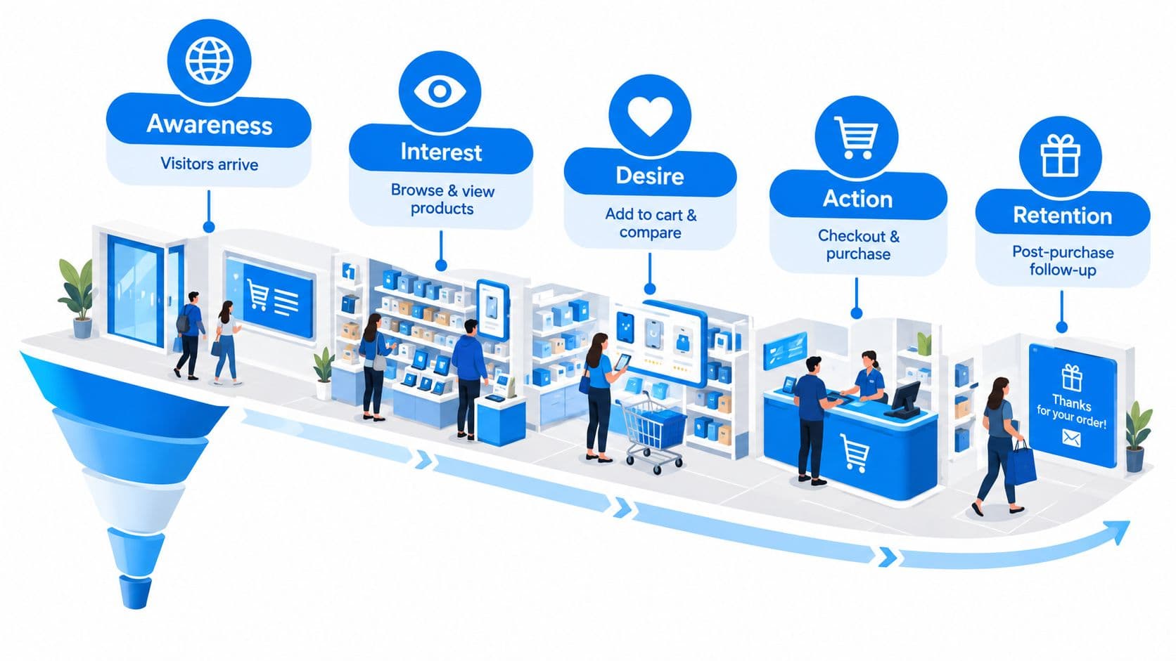
Land is a promise
The landing experience should match the reason the visitor clicked. If an ad highlights a specific use case, the product or collection page should make that use case obvious. A visitor shouldn't need to decode a broad headline before finding the relevant item.
Mobile behavior makes this less predictable. Shoppers may move between tabs, return later, or use a collection page to compare products before reopening a product page. Your analytics should treat these visits as movement through a journey, not as evidence that every shopper follows one prescribed route.
Decide is evidence gathering
The decide stage is where shoppers ask practical questions, sometimes without speaking. Product descriptions, reviews, comparison tools, sizing information, shipping details, and returns policies work together to reduce uncertainty. A strong page doesn't merely list features. It helps the visitor determine whether the product is appropriate for their situation.
For a broader view of how awareness, consideration, and conversion connect, see this guide to awareness, consideration, and conversion.
Commit includes reassurance
Commit starts before payment. The add-to-cart interaction should confirm what happened, preserve the shopper's context, and make the next action clear. Baymard's checkout usability research examines cart-page behavior and add-to-cart interactions, including dropdown carts and the transition after a product is added.
After purchase, retention begins with useful confirmation, delivery communication, product guidance, and support. The funnel doesn't end at the order confirmation. It becomes a relationship that can either make the next purchase easier or make the customer disappear.
Where Shoppers Drop Off and What the Numbers Mean
A storewide conversion rate tells you the result. It doesn't tell you where the result was created or lost. Stage-level measurement is more useful because it separates a traffic-quality problem from a product-page problem, a cart problem, or a payment problem.
A practical benchmark places end-to-end purchase conversion around 2.86% to 3.17%. The same benchmark describes a stepwise path of homepage to category at 43%, category to product at 38%, product page to add to cart at 12.4%, add to cart to checkout initiated at 51%, checkout initiated to payment entered at 63%, and payment entered to order completed at 74% (Digital Applied ecommerce benchmark).
Those figures point to a familiar operator mistake. Merchants often optimize the payment step because it sits closest to revenue, even when far more shoppers are lost before they express purchase intent. Product-page clarity, offer visibility, shipping transparency, and call-to-action placement deserve attention before a payment-flow redesign.
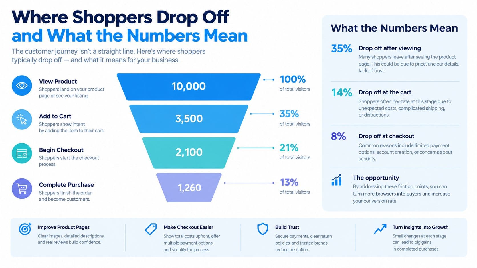
A separate 2026 benchmark reported 5.95% of sessions adding to cart, 25.0% of those shoppers dropping before checkout, and 2.16% completing a purchase (DTC Pages ecommerce benchmark). The exact rates will vary by category, traffic source, price point, and device mix. The useful lesson is directional: if qualified visitors aren't adding products, cart recovery cannot solve the primary constraint.
Read late-stage rates in context
A late-stage rate can look healthy because the people who reach that stage already have strong intent. One 2026 dataset reported median conversion rates of 3.7% sitewide, 4.7% on product pages, 23.2% on cart pages, and 34.3% at checkout (Conversion Team benchmark). Cart and checkout visitors convert at much higher rates than the average site visitor, so improving those stages can still matter. It just shouldn't blind you to the larger volume loss earlier in the path.
Speed affects every stage. Google reports that a 0.1-second improvement in load time can influence every step of the user journey, and its retail evidence associates a 0.1-second faster mobile experience with an 8.4% lift in retail conversion and a 9.2% lift in average order value (Google retail speed research). The same source summarizes independent ecommerce analysis showing about 3.05% conversion for pages loading in under 2 seconds versus 1.94% for 3 to 4 second loads.
Benchmark before changing the store
Capture your own rates for land to product engagement, product page to add to cart, add to cart to checkout, and checkout to order. Segment by device, landing page, product family, and traffic source. Then compare those movements with the questions shoppers ask.
For a practical explanation of identifying and interpreting funnel losses, use this guide to drop-off rate. Don't begin with a redesign. Begin with the stage where qualified intent disappears.
How to Track Movement and Uncover Why Shoppers Leave
GA4 funnels and Shopify reports answer the first operational question: where did shoppers stop moving? They can show visits, product engagement, add-to-cart activity, checkout initiation, and completed orders. That makes them valuable for prioritization, especially when you segment the results by device, product, campaign, and landing page.
They don't answer the second question: why did the shopper stop?
A report can tell you that visitors leave a product page before adding an item. It can't tell you whether they were unsure about sizing, waiting for payday, comparing delivery times, looking for ingredients, or unable to find the return policy. A conversion dashboard gives you location data. It doesn't give you the shopper's explanation.
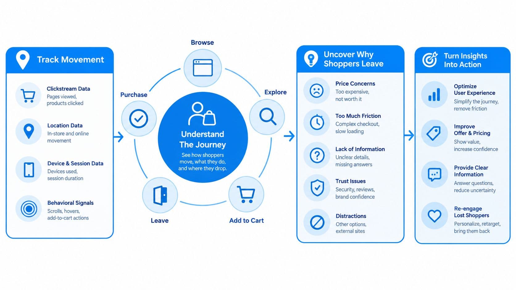
Treat conversations as a diagnostic layer
Chat transcripts are the clearest why-signal a store owns because shoppers often state their blocker in their own words shortly before leaving or buying. Read them weekly, group questions into themes, and compare those themes with the affected product pages.
Look for patterns such as:
- Fit uncertainty: Shoppers ask about sizing, dimensions, compatibility, or use cases.
- Delivery hesitation: Shoppers want a destination-specific delivery expectation or clarification about dispatch.
- Risk concerns: Shoppers search for return, exchange, warranty, or refund details.
- Selection difficulty: Shoppers need help choosing between variants, bundles, or related products.
- Price resistance: Shoppers ask what makes one option different from another, rather than requesting a discount.
The transcript isn't a replacement for analytics. It's the explanation layer that makes the analytics actionable. If product-page add-to-cart movement is weak and transcripts repeatedly mention fit, improve the fit content before changing button color.
Join interventions to commercial outcomes
Track each prompt, assistant interaction, or onsite question alongside subsequent product clicks, add-to-cart events, checkout starts, and orders. Per-prompt attribution lets you distinguish an interaction that created useful engagement from one that produced only more conversation.
Keep the review lightweight. Each week, identify the largest movement problem, read a sample of relevant transcripts, choose one page or flow change, and monitor the same stage afterward. Numbers locate the leak. Conversations explain it. The combination turns funnel analysis from archaeology into a feedback loop.
Fixing Friction at Every Stage Without More Discounts
The decide stage needs answers, not decoration. A popup can create urgency, but it can't explain whether a dress runs small or whether a replacement part fits a particular model. Discounts may rescue some price-sensitive shoppers while training others to wait, and they leave the original uncertainty intact.
Start where doubt appears.
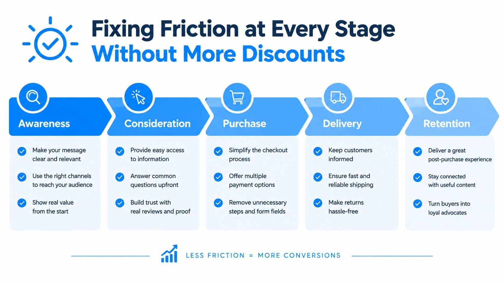
Make the product page answer-ready
Put decision-critical information close to the relevant control:
- Fit beside selection: Add sizing, dimensions, compatibility, or model guidance next to variants, not only in a distant FAQ.
- Delivery beside price: Show dispatch and delivery expectations before the shopper reaches checkout. Explain geography or exceptions in plain language.
- Returns beside commitment: Keep return, exchange, and warranty terms visible near the add-to-cart area.
- Trust beside uncertainty: Place reviews, product evidence, materials, care details, and support access where shoppers evaluate risk.
- Alternatives beside comparison: Recommend related products based on the actual catalog, with a reason for the recommendation.
The page should also handle the add-to-cart transition properly. Confirm the selected item, variant, quantity, and price in the cart drawer. Keep the shopper oriented instead of forcing an abrupt redirect that makes them wonder whether the action worked.
A conversational assistant can help when the answer doesn't fit neatly into static content. It should use the store's real catalog and policies, not improvise product claims. If the visitor is about to leave, ask a useful question about the blocker rather than displaying a generic percentage-off offer.
For stores rebuilding templates or improving mobile behavior, a Melbourne web development agency can provide implementation support when the issue extends beyond theme settings and app configuration.
Simplify the commit moment
Checkout should feel predictable. Remove unnecessary fields, support guest purchase where appropriate, make total costs visible, and preserve the product context from the cart drawer. Test mobile checkout with real devices, not only desktop browser emulation.
Speed belongs here too, but it shouldn't be isolated to checkout. Heavy scripts, oversized images, and app conflicts can slow product pages before intent has formed. Google's retail speed evidence, cited earlier, connects faster mobile experiences with movement through the funnel, so audit the page that creates the decision as carefully as the page that records payment.
Orchestrate recovery instead of repeating one message
Cart recovery works better as a sequence of helpful interventions:
- Onsite confirmation: After add-to-cart, show the chosen product, next step, delivery information, and relevant support.
- Drawer-close follow-up: If the shopper closes the cart drawer, preserve context and offer assistance tied to the product, not a generic promotion.
- Exit-intent question: Ask whether the blocker is fit, delivery, returns, selection, or something else.
- Message follow-up: Use the channel and timing that match the shopper's consent and behavior.
- Suppression after purchase: Stop recovery messages immediately when an order is completed.
Baymard-style benchmarks cited in 2026 continue to place global cart abandonment around 70.22%, while extra costs such as shipping, tax, and fees remain a leading fixable reason (Baymard cart abandonment research). The same cited channel data describes abandoned-cart email recovery around 3.33% and SMS click-to-conversion in the low-40% range, which reinforces the need for orchestration rather than reliance on email alone.
Use this practical resource on ecommerce conversion optimization to turn those principles into page and flow changes. The objective isn't to pressure every visitor. It's to remove the specific uncertainty preventing a qualified shopper from moving forward.
Shopify Implementation and Real Store Examples
Shopify gives operators a useful base, but the default setup won't automatically solve decide-stage hesitation. Begin with the product template. Make the title, price, variant choices, delivery promise, returns information, social proof, and add-to-cart action visible without forcing the shopper to hunt through navigation.
Use theme blocks and metafields for structured information such as dimensions, ingredients, compatibility, or care instructions. Keep policy content synchronized with the store's actual rules. An assistant should retrieve those details from the catalog and policy content instead of generating a confident answer that the business can't honor.
A no-code implementation can follow a simple placement pattern. Put assistance on product pages, retain context after the cart drawer closes, and use exit intent to ask what prevented progress. Product recommendations should remain constrained to in-stock, relevant items from the actual catalog.
One Carti use case measured shoppers who engaged with the assistant converting at roughly 3.5 times the store baseline, with the result tied to conversations and actual orders rather than modeled behavior. Carti stores also reported about 20% higher revenue per visitor overall, measured through the same order-joining approach. An early store attributed $3,480 in revenue during its first 30 days, again by connecting conversations and prompts to completed orders.
Those figures describe the effect of fixing one funnel stage. They didn't come from more traffic or a cheaper checkout. The mechanism was fewer decisions dying unanswered in the middle. Carti functions as an AI sales assistant for Shopify, answering product and policy questions, recommending catalog items, and supporting cart recovery.
Treat these outcomes as implementation evidence, not a promise for every store. Attribution depends on clean event joining, accurate order matching, product context, and a clear baseline. Before launch, define what counts as an engaged conversation, which clicks qualify as assisted movement, and how you'll prevent one order from being credited to multiple prompts.
Mobile performance remains a practical constraint. Test the assistant, cart drawer, product media, and checkout together. If an app adds visual weight or delays interaction, the additional guidance may not compensate for the speed loss. Tooling fixes access to answers. It doesn't fix inaccurate catalog data, unclear policies, weak offers, or a product that doesn't meet customer expectations.
Your Optimization Checklist and Measurement Plan
Run the funnel as a weekly operating loop, not a one-time redesign project.
- Check land: Review product and collection entry pages by device and traffic source. Confirm that the page matches the acquisition promise and loads quickly.
- Check decide: Compare product-page engagement with add-to-cart movement. Read transcripts for repeated questions about fit, delivery, returns, price, and selection.
- Fix the answer: Update the page content or assistant response where the question appears. Don't lead with a discount unless price is the demonstrated blocker.
- Check the transition: Confirm that the cart drawer shows the right product, variant, quantity, total, and next action after add-to-cart.
- Check commit: Inspect checkout initiation, payment entry, and completed orders for mobile and desktop. Remove avoidable fields, surprises, and delays.
- Recover intelligently: Follow up after cart-drawer closure or exit intent with context-aware assistance, then suppress messages after purchase.
- Attribute carefully: Pair each prompt or intervention with product clicks, add-to-cart actions, checkout movement, and actual orders. Avoid counting the same order twice.
GA4 and Shopify reports should locate the stage with the largest meaningful loss. Transcript themes should explain the reason. Per-prompt attribution should tell you whether the intervention changed commercial behavior. Choose the next test only when all three signals point toward the same constraint.
Ship one focused change, keep the comparison window consistent, and review whether the affected stage moved without creating a new leak elsewhere. A higher add-to-cart rate isn't enough if the cart creates confusion. A stronger recovery rate isn't enough if product-page intent remains weak.
Start today by exporting your product-page-to-cart movement, selecting the pages with the clearest gap, and reading the conversations from those sessions. Write down the unanswered questions in the shoppers' own language, then place the first answer directly beside the decision they were trying to make.
Carti gives Shopify stores an AI sales assistant that answers product and policy questions, recommends relevant catalog items, and supports cart recovery around the clock. Visit Carti to see how answering decide-stage questions can help more shoppers move from product evaluation to checkout.

Written by
Daniel AndersonFounder of Carti. 10+ years building ecommerce brands in apparel and supplements. Still runs a Shopify store and built Carti to help merchants convert more browsers into buyers.
Ready to boost your store's sales?
Install Carti in 5 minutes and let AI handle customer questions, recommend products, and close sales 24/7.
Start Free Trial14-day free trial