
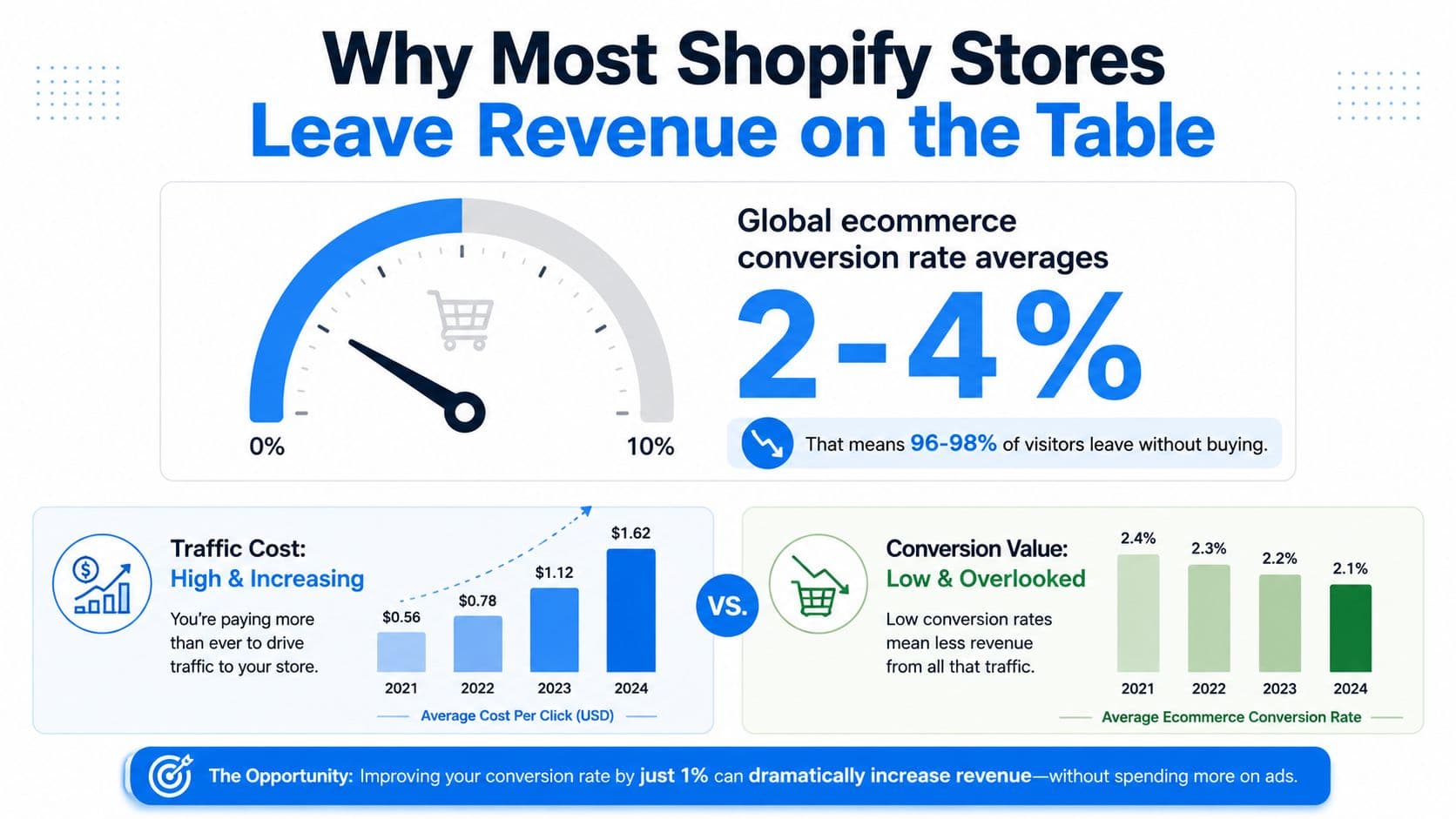
A global ecommerce conversion rate of roughly 2.5% to 2.74% means most store visitors leave without buying, even before you account for the shoppers who add products to a cart and disappear. Cart abandonment is worse still, at 70.22% globally, according to an aggregation of 50 independent studies summarized by Ringly.io's ecommerce benchmark analysis. That means the highest-value CRO work often happens before a shopper sees the payment form.
For Shopify stores, ecommerce conversion optimization isn't a hunt for a prettier button color. It's the disciplined removal of uncertainty around price, delivery, product fit, returns, and support. Traffic acquisition brings shoppers to the storefront. CRO determines whether the store earns enough trust to move them forward.
Why Most Shopify Stores Leave Revenue on the Table
The usual growth conversation starts with traffic. A store owner sees rising acquisition costs, commissions more campaigns, and hopes additional visitors will compensate for a weak purchase journey. That approach can scale the leak instead of fixing it.
The global ecommerce conversion baseline sits around 2.5% to 2.74%, depending on the source and measurement window, as summarized by CartFlows' ecommerce conversion benchmarks. In practical terms, the normal range is narrow and low. Most visitors browse, compare, hesitate, or leave without completing an order.
Cart abandonment exposes the next problem. Baymard's long-running aggregation places the global average around 70%, and the benchmark has remained in the high-60s to roughly 70% range for years, despite better payment options and more mature ecommerce platforms. For a Shopify merchant, that stability is a warning. The issue isn't a temporary technical gap. Shoppers still encounter uncertainty at the point where buying intent should be easiest to preserve.
Conversion gains need a funnel diagnosis
A store with weak product discovery needs a different intervention from a store with strong add-to-cart activity and poor checkout completion. The first may need better search, merchandising, and product education. The second may need clearer delivery costs, guest checkout, or payment troubleshooting.
That distinction matters because CRO compounds across existing demand. A modest improvement applied to a funnel where most shoppers drop off can have more commercial impact than just buying more clicks. Merchants looking for a broader framework on how to increase sales without ad spend can use the same principle: improve the experience for visitors already showing intent.
The hidden cost of generic advice
Button colors and headline tests are easy to discuss because they're visible and simple to implement. They're also often low priority. If shoppers can't tell what shipping will cost, whether a product fits their needs, or when it will arrive, a redesigned button won't resolve the objection.
The better question is, where does uncertainty enter the journey, and where does it become expensive? Answer that before changing the interface.
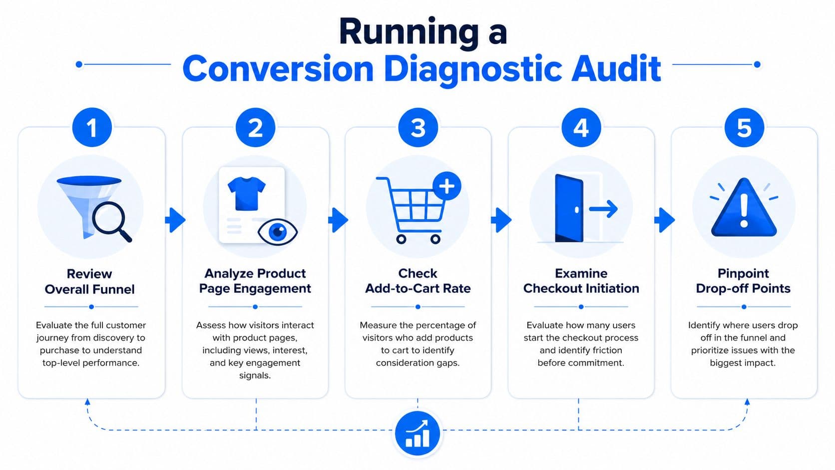
Running a Conversion Diagnostic Audit on Your Store
Start with evidence, not a backlog of CRO ideas. Shopify Analytics can show the broad movement from sessions to product views, add-to-cart events, checkout initiation, and completed orders. Your job is to turn those stages into a store-specific map, then investigate the largest leaks.
Segment before you interpret
Don't accept a blended conversion rate as the truth about every shopper. Break performance down by:
- Device: Mobile abandonment is materially worse than desktop, so compare mobile and desktop journeys separately. Checkout optimization reporting cites mobile abandonment around 76.98%, versus 64.78% on desktop.
- Traffic source: Paid social, organic search, email, direct, and returning visitors arrive with different levels of intent. A landing page that works for branded search may fail for a cold social audience.
- Funnel stage: Separate product-page exits from cart exits and checkout failures. Each stage points to a different class of problem.
- Product or collection: A sizing issue in fashion won't necessarily explain hesitation in wellness or home furnishings.
Record the volume of shoppers lost at each stage and the associated revenue exposure. You don't need a perfect attribution model to prioritize. You need enough clarity to avoid polishing a page that isn't responsible for the largest commercial leak.
Pair quantitative and behavioral evidence
Analytics tells you what happened. Heatmaps, scroll maps, session replays, and on-site search reports help explain why. Look for repeated behaviors, such as shoppers opening the size guide, tapping product images that aren't interactive, searching for delivery information, or returning to the same policy page before leaving.
A useful audit sequence is:
- Review the overall funnel: Establish the baseline for visits, product engagement, cart creation, checkout initiation, and purchase.
- Analyze product-page engagement: Identify whether shoppers see the price, benefits, reviews, delivery information, and purchase controls.
- Check add-to-cart behavior: Compare strong product interest with actual cart creation across devices and traffic sources.
- Examine checkout initiation: Look for the point where cost, account requirements, payment, or form friction appears.
- Pinpoint the drop-off: Match the analytics leak with observed behavior before writing a hypothesis.
For a practical view of software that can support this process, review ecommerce analytics tools for Shopify teams. The tool matters less than the operating habit. Every proposed change should connect to a measurable behavior and a clearly defined funnel stage.
Practical rule: If you can't name the shopper behavior behind a test idea, treat the idea as a hypothesis, not a priority.
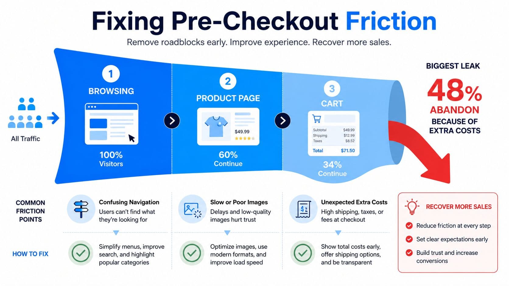
Fixing Pre-Checkout Friction Before Touching the Checkout Page
Many teams jump straight to form fields because checkout is the final visible step. That overlooks the expectations shoppers form earlier, when they decide whether the product is worth pursuing.
Baymard-linked reporting summarized by GrowTheGY's cart abandonment analysis identifies extra costs as the reason for abandonment for 48% of shoppers. The same source lists forced account creation at 26%, security concerns at 25%, slow delivery at 23%, and a long or complex checkout at 22%. The first three begin before a customer reaches the final payment step.
Make the total cost understandable early
A product page that displays only the item price asks shoppers to make a decision with incomplete information. For fashion, beauty, home, and wellness stores, shipping, taxes, returns, and delivery timing can materially change perceived value.
Surface the information where intent develops:
- Product pages: Explain shipping thresholds, estimated delivery windows, and return conditions near the purchase controls.
- Cart drawer: Show the running total and any remaining requirement for a shipping benefit without forcing a checkout visit.
- Collection pages: Use concise delivery or returns cues when those policies distinguish your offer.
- FAQ content: Answer the questions customers repeatedly ask before they commit.
Don't hide fees to protect the product page's visual simplicity. A clean layout that creates a surprise at checkout is less useful than a slightly denser page that sets accurate expectations.
Remove avoidable trust questions
Guest checkout should be visible rather than treated as a fallback. Security signals should appear beside the action they support, not buried in a footer. A clear returns explanation can do more work than a generic trust badge because it addresses the actual risk the shopper is weighing.
Proactive support also belongs here. A customer wondering whether a garment runs small, whether a serum suits a skin concern, or whether a lamp includes the required fitting may never add to cart. Static copy helps only when it anticipates the question. Conversational support helps when the shopper asks it directly.
The trade-off is important. Too many pop-ups interrupt browsing, while no assistance leaves high-intent shoppers alone with unresolved objections. Trigger help around observable hesitation, such as repeated policy views, product comparison, or a stalled cart, rather than greeting every visitor with a sales prompt.
Building a Product Page and Discovery Layer That Converts
A product page doesn't operate in isolation. Search, collections, recommendations, product media, reviews, and support collectively determine whether a shopper can move from interest to confidence.
Start with search behavior. Review internal search terms that return weak results, especially queries using customer language rather than catalog language. Add synonym handling, typo tolerance, useful filters, and sensible zero-result alternatives. A shopper searching for a “small black work bag” shouldn't need to know the exact merchandising phrase used in your product database.
Reduce choice friction without hiding options
Recommendations work when they clarify the next decision. “Frequently bought together” can help a shopper complete a known need. “Similar products” can help someone compare. A crowded grid of unrelated products does neither.
Use recommendation logic according to the page context:
- On a product page, show compatible alternatives or complementary items.
- In the cart, surface practical additions that don't distract from checkout.
- After a search with weak relevance, offer close matches and explain the relationship.
- For returning shoppers, use prior browsing or purchase signals carefully and transparently.
A deeper treatment of Shopify product recommendations is useful when deciding whether merchandising rules or behavior-based suggestions fit your catalog. The right choice depends on assortment depth, margin priorities, and how much comparison shoppers need.
Answer the question behind the click
High-quality photography, zoomable images, demonstrations, reviews, and customer content reduce different forms of uncertainty. Product video can show movement or scale. User-generated content can reveal how an item looks in ordinary conditions. A size guide can prevent a purchase from stalling, but only if shoppers can find and use it on mobile.
Use on-page content to answer specific objections:
| Shopper hesitation | Useful evidence |
|---|---|
| “Will it fit?” | Dimensions, size guidance, model context, and fit notes |
| “What does it feel or look like?” | Close-up photography, video, and customer imagery |
| “Is it right for my use?” | Benefits, use cases, limitations, and comparisons |
| “What happens if I change my mind?” | Returns, exchanges, and delivery information |
Conversational AI fits when questions vary too much for a fixed FAQ. It shouldn't replace accurate catalog data or policy writing. It should make those answers easier to access at the moment a shopper needs them.
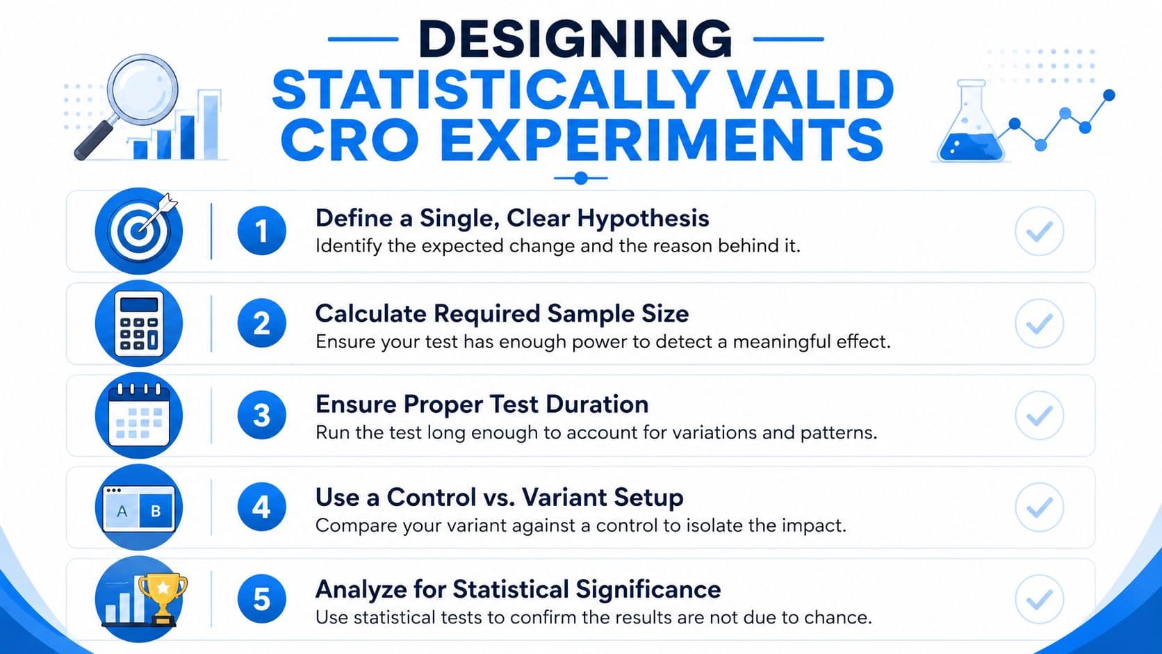
Designing Statistically Valid CRO Experiments
A test result isn't reliable because a dashboard labels one variation a winner. Ecommerce experiments need enough exposure to detect a meaningful difference and enough discipline to prevent random fluctuations from becoming strategy.
Expert ecommerce testing guidance summarized by Digital Applied's testing benchmark states that detecting a meaningful conversion lift at 95% confidence and 80% power typically requires several thousand sessions per variant, depending on the baseline rate and minimum detectable effect. That requirement should shape your testing calendar before design work begins.
Write the hypothesis before the variation
A useful hypothesis identifies the friction, the audience, the intervention, and the primary outcome. For example: “Showing the full estimated delivery cost beside the add-to-cart control will increase checkout initiation for mobile visitors because uncertainty currently appears late in the journey.”
Define one primary metric. Supporting measures can include add-to-cart rate, checkout initiation, purchase completion, revenue per visitor, or customer support engagement, but don't let a positive movement in a secondary metric override a negative purchase result without careful interpretation.
Prioritize fundamentals before novelty
The sequencing recommended in independent ecommerce summaries places guest checkout, fewer form fields, and transparent shipping and fees ahead of more decorative experiments. Those changes are associated with potential abandonment reductions of 25% to 35%, according to Digital Applied's cart abandonment data summary. Treat that range as contextual evidence, not a promise for your store.
A sensible order is:
- Remove forced account creation.
- Reduce unnecessary address and payment fields.
- Display full costs earlier.
- Test payment options and mobile completion.
- Explore recommendations, upsells, and chat-assisted nudges.
Don't change five major elements in one test. You may get a movement in the metric, but you won't know which intervention caused it, whether the combination created the effect, or whether the result applies to another audience.
Protect the integrity of the result
Calculate sample size before launch, keep the control stable, and avoid declaring a winner when the result is merely convenient. Document traffic mix, dates, exclusions, implementation details, primary metrics, and the decision made. A losing test can still identify a false assumption, while an underpowered winning test can create expensive technical debt.
Deploying AI Chatbots as a Measurable Conversion Lever
AI shopping assistants make sense when the shopper's question is the bottleneck. They're less useful as decoration, especially when the bot repeats generic brand copy or interrupts visitors who aren't showing buying intent.
Independent summaries of 2025 shopper-behavior research report a 4x lift in conversion for AI-assisted sessions, with conversion moving from 3.1% to 12.3% and purchases completed 47% faster when shoppers engage with intelligent agents, as cited by Envive's AI shopping assistant ROI summary. Those figures are benchmarks from assisted sessions, not a guarantee of incremental lift for every store. The key measurement question is whether the assistant caused additional purchases or merely attracted shoppers who were already likely to buy.
Match the assistant to high-value use cases
A chatbot can outperform another static layout test when the objection is personal, contextual, or difficult to anticipate. Strong use cases include:
- Product clarification: Answer questions about fit, ingredients, compatibility, dimensions, or intended use.
- Discovery support: Narrow a large catalog based on needs, preferences, and constraints.
- Cart assistance: Explain shipping, returns, delivery timing, and payment concerns before abandonment.
- Cross-selling: Suggest relevant complements only when they support the shopper's stated goal.
- Mobile support: Resolve hesitation without forcing a visitor to leave the small screen.
The assistant needs reliable access to product data, availability, shipping rules, returns policies, and escalation paths. If it invents an answer, confidence drops faster than it would without a bot.
Measure assisted behavior, not chat volume
Track conversations that lead to product views, add-to-cart events, checkout initiation, and completed orders. Compare assisted and unassisted cohorts while controlling for device, traffic source, product category, and shopper intent. On mobile, watch whether the chat interface obscures purchase controls or slows the page.
For Shopify merchants evaluating an implementation, Carti's AI chatbot for ecommerce is one option that combines real-time answers, product suggestions, and cart-recovery assistance. Treat it as part of the CRO stack, alongside analytics, experimentation, merchandising, and customer support. Automation should handle repeatable questions while handing complex or sensitive cases to a person.
Building a Sustainable CRO Operating Rhythm
CRO produces durable gains when the store treats it as an operating system rather than a one-time redesign. The rhythm starts with a diagnostic review, moves into a small number of high-confidence fixes, and creates a record of what the team learned.
Track purchase conversion, add-to-cart rate, checkout initiation, checkout completion, revenue per visitor, average order value, and cart abandonment. Review the funnel frequently enough to catch regressions, but don't confuse daily noise with a strategic trend. Use weekly reviews for broken journeys, device-specific issues, product questions, and operational changes. Use monthly reviews for experiment outcomes, merchandising patterns, support themes, and roadmap decisions.
Build a dashboard that answers decisions
A dashboard should tell the team what to do next. Include device and traffic-source segmentation, top landing pages, high-exit products, internal search terms, support topics, and checkout errors. Pair each metric with an owner and an action threshold, so the report doesn't become a passive collection of charts.
A useful dashboard doesn't just show that conversion fell. It points to the page, audience, behavior, and owner responsible for the next investigation.
Use a 90-day improvement cycle
Days 1 to 30 should establish the baseline. Map the funnel, segment mobile and desktop, review session behavior, inspect pricing and delivery communication, and collect recurring product questions. Fix obvious defects, but keep larger changes tied to a written hypothesis.
Days 31 to 60 should address the largest friction. Test transparent cost communication, guest checkout, form reduction, product-page evidence, and search relevance according to your diagnostic results. Don't prioritize an attractive experiment over a proven leak.
Days 61 to 90 should expand the system. Evaluate conversational assistance for unresolved product questions, improve recommendation logic, document experiment outcomes, and turn repeated support questions into better merchandising content. Keep a decision log that records what changed, why it changed, the audience affected, and what happened afterward.
Store size and traffic volume should influence cadence. A high-volume merchant can run more controlled experiments. A smaller store may learn faster from behavioral audits, qualitative feedback, and carefully monitored releases than from launching many underpowered A/B tests.
The durable advantage comes from connecting the parts. Transparent pricing reduces surprise, strong discovery reduces searching effort, product evidence builds confidence, checkout design preserves intent, and AI assistance answers questions that static pages miss. That is ecommerce conversion optimization as a working discipline, not a collection of cosmetic tweaks.
Carti gives Shopify stores a 24/7 AI sales assistant that answers product and policy questions, recommends relevant items, and supports cart recovery so merchants can address hesitation before it becomes abandonment. Visit Carti to see how its no-code chatbot can fit into your diagnostic, product discovery, and conversion workflow.

Written by
Daniel AndersonFounder of Carti. 10+ years building ecommerce brands in apparel and supplements. Still runs a Shopify store and built Carti to help merchants convert more browsers into buyers.
Ready to boost your store's sales?
Install Carti in 5 minutes and let AI handle customer questions, recommend products, and close sales 24/7.
Start Free Trial14-day free trial