
Nearly half of shoppers who start a Shopify checkout never finish it. The average Shopify checkout completion rate in 2026 is 45 to 55%, while top-performing stores reach 60 to 75% according to CartyLabs' Shopify checkout benchmarks. That gap changes how you should think about growth.
Most merchants still treat checkout as cleanup work. They spend on traffic, polish product pages, tweak offers, and leave the last step mostly untouched because Shopify checkout feels "good enough." It usually isn't. Checkout is where small bits of friction stack up fast: one extra field, one surprise fee, one missing wallet, one poorly timed upsell.
Good Shopify checkout optimization isn't a checklist you copy from a generic blog post. It depends on your plan, your catalog, your buyer intent, your market mix, and the kind of hesitation your customers bring into the payment step. Fashion, beauty, wellness, home, and cross-border stores often fail for different reasons, even when their cart abandonment symptoms look similar.
Why Your Checkout is Leaking Money
Nearly half of shoppers who start checkout never finish. If you are paying to get high-intent traffic to that point, checkout friction is not a UX issue in the abstract. It is a margin issue.
The expensive mistake is treating abandonment like a traffic problem. In many Shopify stores, the leak shows up after product-market fit is already doing its job. Shoppers add to cart, enter checkout, and then hit friction around total cost, payment fit, delivery confidence, or one more request for information they do not want to give.
That last point matters more than many teams realize. Checkout drop-off is rarely caused by a single broken field. It usually comes from stacked hesitation. An upsell that feels intrusive. A payment method that is common in the shopper's country but missing from your setup. Shipping costs that appear too late. A checkout that asks for a phone number before the store has earned that level of trust. Those are small decisions individually. Together, they suppress revenue.
For stores trying to isolate the leak, performing a CRO audit helps because it forces a page-by-page, step-by-step review of where intent weakens. That is more useful than staring at blended conversion rate and guessing.
Your own checkout drop-off rate patterns are the better starting point. Broad averages can tell you whether the problem is serious. They cannot tell you whether your biggest issue is mobile form fatigue, missing local wallets, weak trust signals at the payment step, or a privacy-conversion trade-off caused by aggressive last-minute offers.
Practical rule: If paid traffic is reaching checkout and revenue still stalls, fix the leak before you buy more clicks.
The stores that improve checkout fastest ask narrower questions. Which customer segment is dropping out. At what step. After which prompt, cost reveal, or missing payment option. That level of diagnosis is what turns checkout optimization from a generic checklist into profit work.
The Shopify vs Shopify Plus Checkout Divide
Before you optimize, you need to know which parts of checkout you can control. A lot of bad advice comes from people describing Shopify Plus capabilities as if every merchant has them.
On standard Shopify plans, your checkout is intentionally constrained. That's not always a problem. It keeps the experience stable, fast, and secure. But it does mean your optimization levers are narrower than many merchants expect.
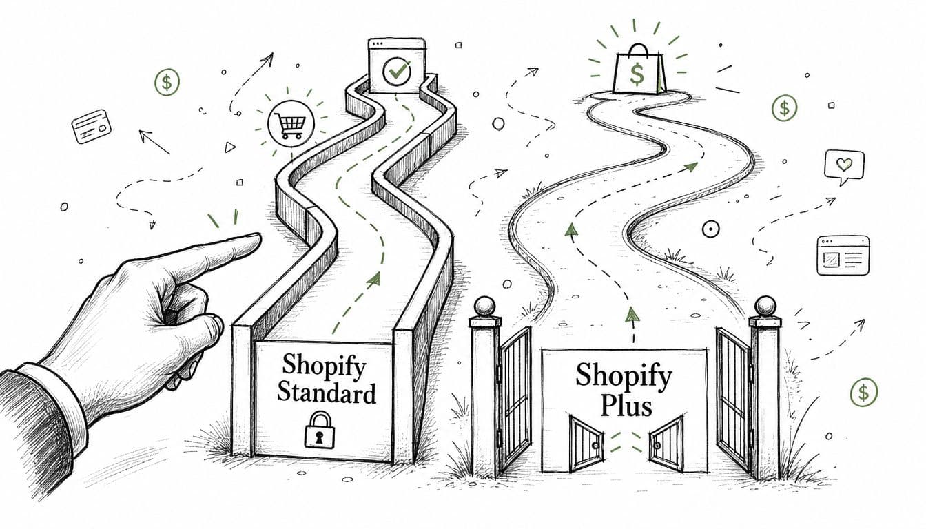
What standard Shopify merchants can control
If you're not on Plus, focus on the parts Shopify still lets you influence directly:
- Checkout settings: Guest checkout behavior, customer accounts setup, address handling, and other native configuration choices.
- Branding layer: Logo, colors, typography, and overall visual continuity between storefront and checkout.
- Payment setup: Which payment methods, wallets, and regional options you enable through Shopify-supported integrations.
- Shipping presentation: How early you surface shipping costs, thresholds, and delivery expectations before the customer reaches payment.
- Cart and pre-checkout flow: Cart drawer UX, express checkout placement, discount handling, shipping messaging, and upsell timing before the buyer enters checkout.
That last point matters more than most merchants realize. When standard-plan merchants say, "I can't customize checkout," they're often overlooking the fact that much of checkout performance is determined before checkout begins.
What Shopify Plus opens up
Shopify Plus gives merchants a wider sandbox for advanced checkout control. Historically, that included deeper customization options, and Plus still gives broader access to checkout extensibility, logic, and more specialized experiences.
That makes Plus valuable when your store has unusual operational needs, segmented payment flows, complex B2B rules, or region-specific experiences that standard settings can't handle cleanly.
Still, Plus doesn't automatically fix conversion. Plenty of Plus stores build clever checkout experiences that underperform because they add friction in the name of customization.
Customization only helps when it reduces effort, increases clarity, or resolves a real buyer concern.
The practical decision
Here's the simple split:
| Store situation | Better focus |
|---|---|
| Standard Shopify, low to mid complexity | Max out native settings, payment setup, cart messaging, and mobile usability |
| Standard Shopify with rising international mix | Audit payment localization and shipping clarity before considering platform upgrades |
| Shopify Plus with larger operational complexity | Use customization selectively, especially where default checkout doesn't fit your buyers |
If you're on standard Shopify, don't waste time wishing for total control. Fix the controllable layers first. Most stores haven't exhausted those gains.
If you're on Plus, don't treat the expanded toolkit as permission to add more elements. The best Plus checkout builds usually remove noise, not add it.
Streamline the Flow with UX and Form Design
Mobile checkout friction is where a large share of Shopify revenue dies. For many stores, the problem is not dramatic UX failure. It is a stack of small asks that feel cheap to add and expensive to the buyer.
The fastest gains usually come from subtraction.
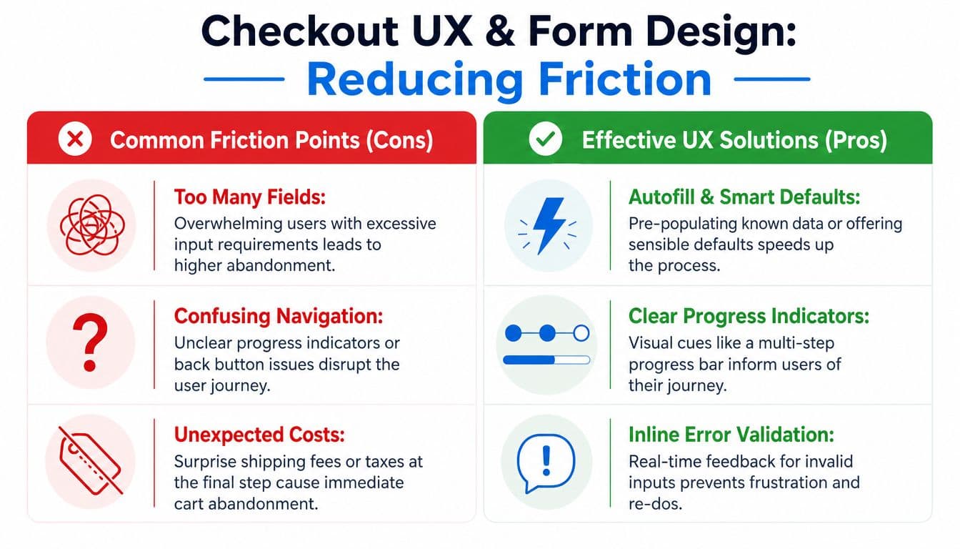
Cut fields before you change anything else
Every field has a conversion cost. Merchants often debate button color, progress indicators, or copy tweaks while leaving low-value form requirements untouched. That is backwards.
Start with a hard audit of every input in checkout:
- Keep fields tied directly to fulfillment or payment: Email, delivery details for physical products, and payment information.
- Remove fields your team only wants for reporting: Birthday, company name for B2C orders, secondary phone numbers, or any detail that does not help complete the order.
- Shift post-purchase asks out of checkout: Account creation, loyalty enrollment, survey questions, preference capture, and profile enrichment belong after the sale.
Digital products make this easier to spot. If nothing ships, shipping fields create work without giving the buyer anything in return.
Marketing and data teams often push for account creation because they want cleaner lifecycle tracking and stronger retention programs. I understand the goal. At checkout, it usually costs more than it returns. Guest checkout should be the default, then account setup can be offered on the thank-you page or in post-purchase email, once the order is already secured.
For a broader view of how checkout changes affect the rest of the funnel, this guide to Shopify conversion rate optimization is a useful companion.
Mobile UX needs fewer decisions, not prettier screens
A checkout can look polished and still underperform on phones. The issue is usually effort. Too much typing. Too much scrolling. Too many moments where the buyer has to stop and figure out what the store wants.
Good mobile checkout design is operational, not decorative.
Focus on the elements that reduce input strain:
- Large tap targets: Small checkboxes, cramped radios, and tightly stacked fields create mis-taps and form errors.
- Address auto-complete: This cuts typing time and lowers fulfillment mistakes.
- Visible primary action: The buyer should not have to hunt for the pay button after every form section.
- Fast loading pages: Heavy scripts and app layers slow the moment that matters most.
This is also where segment-specific trade-offs matter. A domestic, low-AOV store can often get away with a simpler flow because buyer risk is lower. Cross-border stores have less margin for form friction. If the shopper already has to process currency, shipping timing, and unfamiliar payment options, one more unnecessary field can be enough to end the session.
Here is a practical walkthrough worth watching if you're reviewing your mobile experience and form setup:
Prevent errors before the buyer hits submit
Many Shopify teams still treat error handling as a cleanup task. A better approach is to stop common mistakes from happening in the first place.
Three fixes usually matter more than merchants expect:
- Validate inline. Show postcode, card, or email issues while the shopper is still in the field.
- Use smart defaults. If billing and shipping are usually the same, preselect that option and let buyers change it only when needed.
- Keep context visible. Order summary, totals, and delivery details should stay easy to reference so shoppers do not backtrack just to confirm what they are buying.
One caution here. Merchants often add checkout upsells, gift options, or extra consent boxes to raise average order value. Sometimes that works. Sometimes it triggers a privacy-conversion trade-off, especially on mobile, where every added choice increases hesitation around data sharing and distracts from payment completion. If an add-on is not clearly relevant to the order or customer segment, test it outside the core flow.
The best checkout forms feel obvious because they remove reasons to pause. That is the bar.
Build Last-Minute Trust to Secure the Sale
At checkout, trust stops being abstract. The buyer is about to hand over payment details and commit to your delivery promise. If anything feels vague, inconsistent, or hidden, hesitation rises immediately.
Many stores underperform in this area. They treat trust as branding, when it's conversion infrastructure.
The wider store benchmark makes the gap clear. The average Shopify conversion rate is 1.4%, while the top 20% of stores convert above 3.2%, and a major difference is thorough checkout streamlining plus transparent pricing, according to Barn2's Shopify conversion rate analysis.
Trust has to be visible at the decision point
Generic reassurance buried in the footer won't help a buyer who is deciding whether to click "Pay now."
The strongest trust signals at checkout are usually simple:
- Recognizable payment logos: Show the methods customers already know and expect.
- Short return policy language: Not a wall of legal text. A concise reminder that returns, exchanges, or support are straightforward.
- Delivery clarity: Estimated timing, shipping method expectations, and any important constraints.
- Brand consistency: Checkout shouldn't look like the shopper has been pushed onto a different site.
A lot of teams overdesign this part. You don't need a collage of badges. You need clear reassurance near the action that matters.
Transparent pricing closes the credibility gap
Unexpected charges don't just surprise customers. They make the whole purchase feel less trustworthy.
If shipping, taxes, or fees become clear only at the last step, many buyers assume the rest of the experience may be unreliable too. That is why transparent pricing punches above its weight. It doesn't just reduce sticker shock. It protects credibility.
For stores that answer final-stage buyer questions in real time, adding a web chat widget for ecommerce checkout support can also reduce uncertainty around shipping, returns, and payment concerns before the customer leaves.
The best trust signal is consistency. The price you imply before checkout should match the price the buyer expects when payment is due.
A practical way to review trust at checkout is to inspect the payment step as if you're a first-time customer and ask three questions:
| Question | If the answer is no |
|---|---|
| Is the total cost understandable? | The buyer starts re-evaluating the purchase |
| Is the return or support promise easy to find? | Risk feels higher than it should |
| Does checkout still feel like your brand? | Suspicion rises at the worst moment |
Trust doesn't usually fail because of one dramatic issue. It fails because the customer has to fill in too many blanks on their own.
Smart Payment Shipping and Upsell Strategies
The payment step is where generic advice starts breaking down. "Add more upsells" and "offer more payment methods" sound sensible until they collide with your actual customer behavior.
The best checkout strategies don't add everything possible. They remove the wrong decisions and keep the right options available.
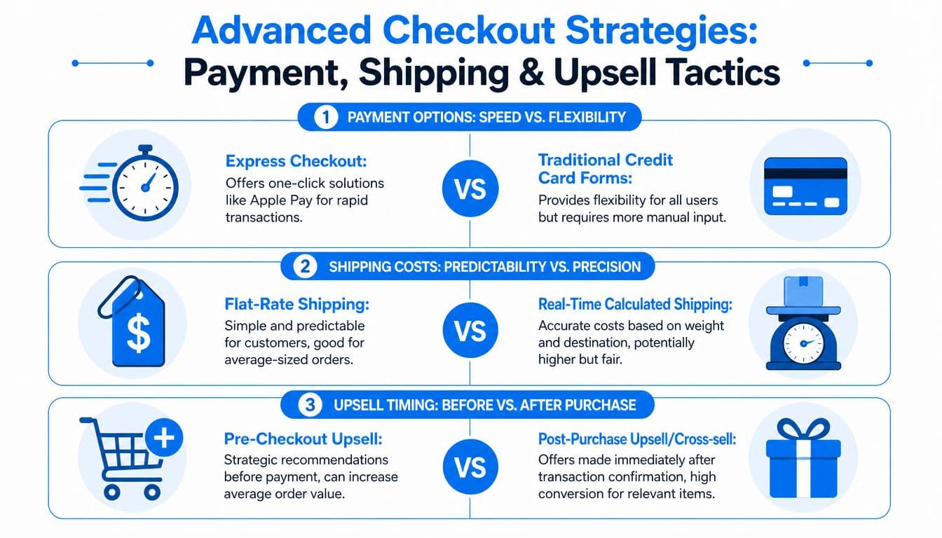
Express payment is the speed layer
For many stores, express methods such as Shop Pay, Apple Pay, and Google Pay are the closest thing to obvious upside. They reduce typing, shorten decision time, and make checkout feel familiar.
That doesn't mean traditional card forms stop mattering. Some buyers still prefer them, especially when they want full control, are using a work card, or are shopping in a way that doesn't fit a saved-wallet flow.
The right approach is usually dual-track:
- Lead with express options for speed-sensitive shoppers
- Keep standard card entry clean and easy for everyone else
- Make sure the order total and shipping expectations are already clear before payment begins
Shipping strategy belongs in the same conversation. A predictable flat-rate model can work well when order profiles are fairly consistent. Real-time calculated shipping can be the better fit when size, weight, or destination vary significantly. The mistake is not choosing one over the other. The mistake is leaving the customer uncertain until the final stage.
When upsells hurt more than they help
Most checkout advice treats upsells as automatically positive. In practice, upsells often create friction exactly when the customer is trying to finish.
The privacy-conversion paradox is highly relevant. Some shoppers, especially in fashion, beauty, and wellness, read intrusive or overly eager checkout suggestions as pressure. A static add-on module near the payment button can feel less like a recommendation and more like interruption.
That doesn't mean upsells are bad. It means timing and placement decide whether they help.
Use this decision logic:
- If the cart already feels complete, don't force visible add-ons right before payment.
- If shipping costs are already clear and the buyer is in motion, preserve momentum.
- If you have strong behavioral signals, surface relevant suggestions selectively instead of showing them to everyone.
A checkout upsell should feel like assistance, not another task.
Post-purchase often gives you cleaner economics and less conversion risk for cross-sells, warranty offers, refills, or complementary items. The sale is already secured, and the buyer's cognitive load is lower.
International payment gaps create silent abandonment
One of the most expensive checkout blind spots is international payment localization. A shopper can complete address details, look highly qualified, and still fail at the last click because the payment options don't feel normal in their market.
This is what many teams miss. They look at checkout starts and assume the issue is price, shipping, or intent. Sometimes the buyer doesn't see the local payment method they trust.
According to Convert's Shopify checkout testing discussion, missing local payment methods can depress conversion by 20 to 30% in EU and Asia markets, and many guides also miss the friction created by the privacy-conversion paradox in checkout upsells.
For non-Plus merchants, the practical response isn't to chase full custom complexity. It's to audit where your orders are coming from and compare that against the payment methods you're making available. If a meaningful share of demand is international, your payment setup should reflect that reality.
A simple framework helps:
| Scenario | Better tactic |
|---|---|
| Mostly domestic store with familiar card usage | Prioritize express wallets and cost clarity |
| Growing EU or Asia demand | Review local payment method availability and regional expectations |
| High-AOV or privacy-sensitive categories | Keep checkout visually clean and reduce aggressive in-checkout upsells |
The common thread is restraint. Add options that reduce effort. Remove prompts that compete with completion.
Win Back Lost Sales with Proactive Cart Recovery
Even an efficient checkout won't recover every buyer on the spot. Some people get distracted, hesitate, compare options, or need one more answer before they're ready.
That doesn't mean the sale is gone. It means recovery needs to start earlier and get smarter.
Recovery starts before the shopper leaves
Most stores treat recovery as an after-the-fact email sequence. That's useful, but passive. The stronger approach is to intervene while intent still exists.
If a shopper stalls at checkout, common reasons are usually specific: shipping confusion, delivery timing, discount uncertainty, return concerns, or simple indecision. Real-time support can resolve those objections before the tab closes.
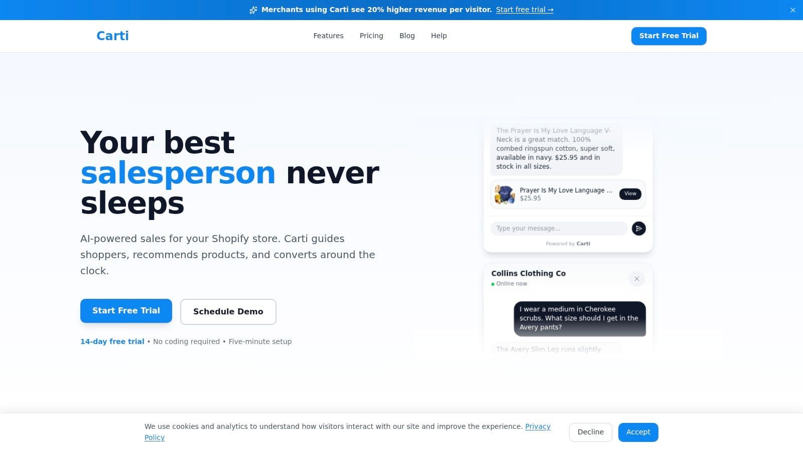
What works best here is not generic chat presence. It is targeted assistance tied to hesitation signals. A shopper lingering on shipping shouldn't see the same prompt as someone repeatedly toggling payment methods.
Practical onsite recovery prompts usually work when they are:
- Contextual: Triggered by the page or behavior, not shown to everyone at once.
- Specific: Answer a likely objection instead of saying "Need help?"
- Low-friction: Offer clarity first, not a hard sell.
If recovery only begins after abandonment, you've already accepted unnecessary losses.
Email and SMS still matter when they are specific
Traditional cart recovery still earns its place. But most sequences underperform because they are vague and interchangeable.
A better recovery stack usually includes:
- A reminder message that returns the shopper to the exact cart they left.
- A reassurance message that answers common concerns such as shipping, returns, or product fit.
- A closing message that creates a reason to act now, whether through urgency, support, or a limited incentive.
The content matters more than the channel. A weak SMS is still weak. A good email can still bring someone back if it resolves the reason they paused.
Keep the messaging aligned with the product category:
- Fashion and beauty: Size, shade, ingredient, and return questions often block the sale.
- Home goods: Delivery expectations, dimensions, assembly, and material clarity matter more.
- Wellness: Subscription terms, usage, and policy concerns often appear late in the journey.
Recovery should also feed back into optimization. If the same objections keep surfacing in replies, chats, or click behavior, your checkout and pre-checkout messaging need to carry more of that information upfront.
A good recovery system doesn't just bring back lost carts. It tells you why they were lost in the first place.
Your Prioritized Shopify Checkout Optimization Checklist
After reading a checkout guide, a common mistake is trying to fix everything at once. That usually leads to messy implementation, weak attribution, and new friction that cancels out the gains.
Prioritize in layers instead. Start with changes that remove obvious blockers. Then tighten trust and payment fit. After that, work on the segment-specific issues that actually change conversion, such as international payment gaps or upsells that create privacy anxiety right before payment.
Here is the order I recommend.
Prioritized Checkout Optimization Checklist
| Priority | Task | Impact | Effort |
|---|---|---|---|
| Quick win | Remove non-essential checkout fields | High | Low |
| Quick win | Make guest checkout the default path | High | Low |
| Quick win | Turn on address auto-complete and smart defaults | High | Low |
| Quick win | Check mobile tap targets and CTA visibility | High | Low |
| Quick win | Surface shipping costs earlier in the journey | High | Low to medium |
| High-impact project | Review checkout branding for consistency with storefront | Medium to high | Medium |
| High-impact project | Add or refine express payment options such as Shop Pay, Apple Pay, and Google Pay | High | Medium |
| High-impact project | Tighten return, delivery, and support reassurance near payment | High | Medium |
| High-impact project | Audit upsells that appear before payment and remove intrusive offers | Medium to high | Medium |
| Advanced tuning | Review international payment method fit by market | High for cross-border stores | Medium to high |
| Advanced tuning | Separate domestic and international friction analysis | Medium to high | Medium |
| Advanced tuning | Build proactive recovery flows around hesitation signals | High | Medium to high |
| Ongoing discipline | Review abandonment reasons from support, analytics, and recovery replies | High | Ongoing |
What to do this week
If checkout has not been actively optimized, start with the boring fixes first.
- Field cleanup: Remove anything that does not help complete the order.
- Guest checkout: Stop adding account friction before the first purchase.
- Cost clarity: Show shipping and total expectations earlier, not after the shopper is already invested.
- Mobile review: Buy from your own store on your own phone and note every point where the flow feels slow, cramped, or unclear.
Then move to the work that usually drives bigger gains over time.
- Payment fit: Match payment methods to the traffic you receive, especially by country and device type.
- Upsell restraint: Keep checkout focused unless the offer is tightly relevant and does not raise new privacy or intent questions.
- Recovery system: Set up proactive and post-abandonment recovery around the objections shoppers are already signaling.
The goal of Shopify checkout optimization is simple. Make buying feel easier, safer, and faster.
If a change does not improve one of those three outcomes, cut it.
For merchants who want to reduce hesitation without turning checkout into a manual support workflow, the right tools can help. Carti is built for that job. It helps Shopify stores answer last-minute buyer questions, surface relevant product suggestions, and recover abandoning shoppers with proactive onsite assistance that feels timely instead of intrusive.

Written by
Daniel AndersonFounder of Carti. 10+ years building ecommerce brands in apparel and supplements. Still runs a Shopify store and built Carti to help merchants convert more browsers into buyers.
Ready to boost your store's sales?
Install Carti in 5 minutes and let AI handle customer questions, recommend products, and close sales 24/7.
Start Free Trial14-day free trial