
Your best-selling jacket sits on a product page with clean photos, a size chart and a shipping note. A shopper taps the chart, reads the returns line, then closes the tab. She had one question, whether a medium runs small, and the page gave her nowhere to ask it.
That unanswered question is where a button either earns its place or becomes another dead contact form. The decision isn't whether to add a button. It's what happens to the question after the shopper taps it.
The scale explains why this matters beyond one storefront. Shopify's 2017 announcement reported more than 500,000 businesses in 175 countries on the platform by August 1, 2017, with 131 million people buying from Shopify stores in the previous 12 months. Every one of those storefronts fields the same handful of questions about fit, delivery and returns.
Which Ask a Question Button Fits Your Store
The shopper who leaves over an unanswered sizing, shipping or compatibility question rarely leaves over price. She leaves because the page gave her no way to ask. Four setups put a question box on that page, and they differ in who answers, how quickly, and how much of the product template changes.
Ask a question button methods compared
| Method | Best for | Coding needed | Where questions land |
|---|---|---|---|
| Theme block or section link | Stores that only need an email link | No | Your inbox |
| Custom Liquid or HTML snippet | Custom placement inside the product template | Yes, basic Liquid and HTML | Your form handler or inbox |
| Carti AI shopping assistant | Pre-purchase questions answered from your catalog and policies | No | Carti dashboard, with handoff to your team |
| WhatsApp or Messenger chat button | Shoppers who already chat in messaging apps | No | The messaging app inbox |
Match the method to the volume already arriving. A theme block or a plain section link suits a store where questions come a few times a month and one person reads that inbox every day. The week the same three questions arrive daily, an inbox stops scaling.
A custom Liquid or HTML snippet earns its place when the control has to sit inside the product template where no theme block reaches. Budget for maintenance, because a theme update can replace the file it lives in.
Carti or a messaging-app button fits a catalog where fit, delivery and compatibility questions repeat every day. Carti answers from the store's catalog and policies and passes the conversation to the team when it can't answer confidently. The WhatsApp or Messenger route lands the question in an inbox someone already watches on their phone.
Whichever method wins, the structural rule is the same. Baymard's benchmark of leading US and European ecommerce sites found that 55% of sites lacked community Q&A, 70% lacked the preferred combination of site-authored FAQs and community Q&A, and only 28% used that hybrid. Treat the button as a product-page Q&A entry point, not an isolated contact link. Place it near specifications, shipping and returns text, and the buy controls. Capture the question, the product, an email or messaging preference, and consent. Publish the checked answer on that product, then use repeats to rewrite the FAQ and the description.
Dropping the product association is the expensive shortcut. A question that arrives without a SKU or variant can't improve the page it came from. If the form runs through a theme contact page, the guide to building a contact form on Shopify covers passing product context into the submission.
Write Copy and Placement Shoppers Actually Click
Start with the label, because it moves more taps than placement does. Ask about this product names the outcome. Contact us reads as a general inbox, and shoppers assume their message will sit unanswered.
Placement comes next. The control belongs beside the buy controls, within sight of the size selector, the shipping line and the returns text. A button below a long description is a button most visitors never reach.
The room for improvement is wide. Baymard's product page benchmark reports that only 49% of ecommerce sites provide a decent or good overall product-page experience, while 51% are mediocre or worse, and its separate benchmark puts decent-or-better mobile performance at just 38% of mobile sites.
Ask for three things and no more: the question, an email or messaging preference, and consent. Every extra field adds friction at the exact moment the shopper is deciding. Pass the product ID and selected variant along with the message so the reply arrives with context.
Set the expectation after the tap
A shopper who submits a question and sees nothing assumes it vanished. Show a response-time expectation, or an answer status the shopper can return to. That single line prevents more duplicate messages than any autoresponder.
Answer quality decides whether the feature survives its first month. Replies have to match the store's real return window, eligibility rules, exclusions and process. Guess about fit only when a measurement exists, and say plainly when it doesn't.
Practical rule: one canonical answer per policy question, reused on the product page, the FAQ and in chat, so a shopper never gets two versions of the same return window.
A good model is a store that publishes its shipping and returns questions answered on one page. Copy that structure rather than writing fresh copy for each channel.
When an assistant can't answer, a named owner has to. Carti emails the store's team when it can't answer confidently, which turns the gap into a written answer the store can publish and reuse.
The pre-launch checklist
- Label: names the product, not the department.
- Placement: visible without scrolling on a phone, near the price and the size selector.
- Fields: question, contact preference, consent.
- Confirmation: a stated response time or a status the shopper can check.
- Answer source: the store's own policy text, not a guess.
- Handoff owner: the person or inbox that picks up what automation can't close.
Tap target size matters as much as wording. A thumb needs a comfortable target, and the product name should stay visible close by so the shopper knows what she's asking about.
How to Add the Button in Your Theme Editor
The theme editor route finishes in one sitting and needs no app. If the store is live, duplicate the theme first and publish only after the phone test passes.
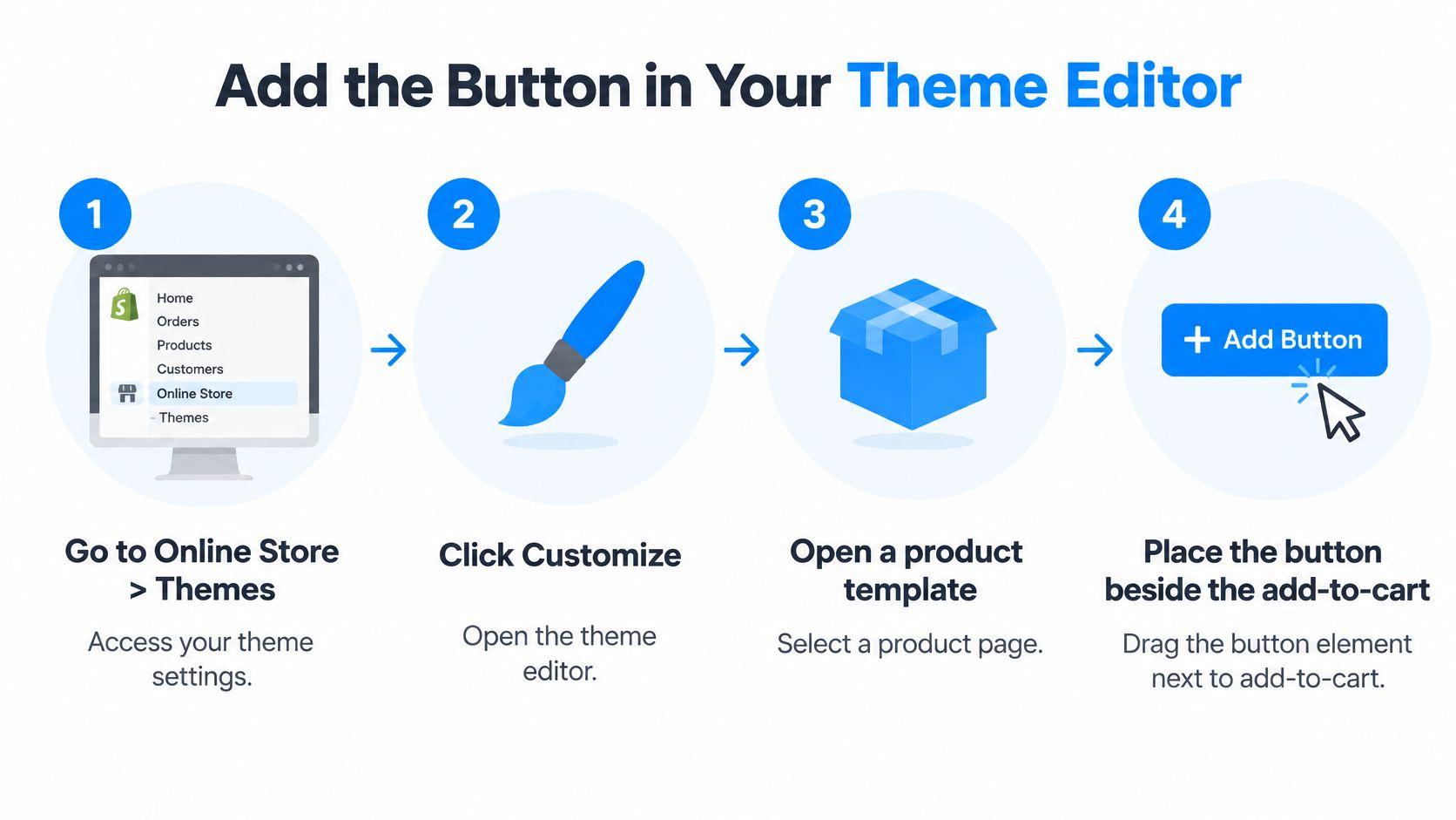
- Open the theme. Go to Online Store, then Themes, and click Customize on the live theme.
- Select a product template. Choose the product template from the dropdown at the top of the editor, then load a representative product in the preview.
- Place the control. Add a Button or Link block beside the price, below the variant picker, or next to the shipping and returns text. Use the label Ask about this product.
- Point it at a form. Send the link to a contact form or page that carries the product title, so the message arrives with context.
- Save, then preview. Check the product on desktop before touching any code.
For a placement the editor can't reach, move to code.
- Create the snippet. Open Actions, choose Edit code, and add a snippet named ask-question-button.
- Build the anchor. Paste an anchor that includes the product title and handle in Liquid, such as
{{ product.title }}and{{ product.handle }}, so the form knows which product the shopper was reading. - Render it. Add the render tag to the product template file and save again.
- Test both screens. Open the product on a phone and on desktop, tap the button, and confirm the form loads with the right product attached.
The usual slip is a snippet that shows on the homepage and not on product pages, because it was rendered in the wrong template file. A working button is visible without scrolling on mobile, clearly labeled, and tied to the correct product.
Set Up Carti as Your Shopping Assistant
Some stores want answers on the page rather than a form that waits for a human. That path starts in the Shopify App Store.
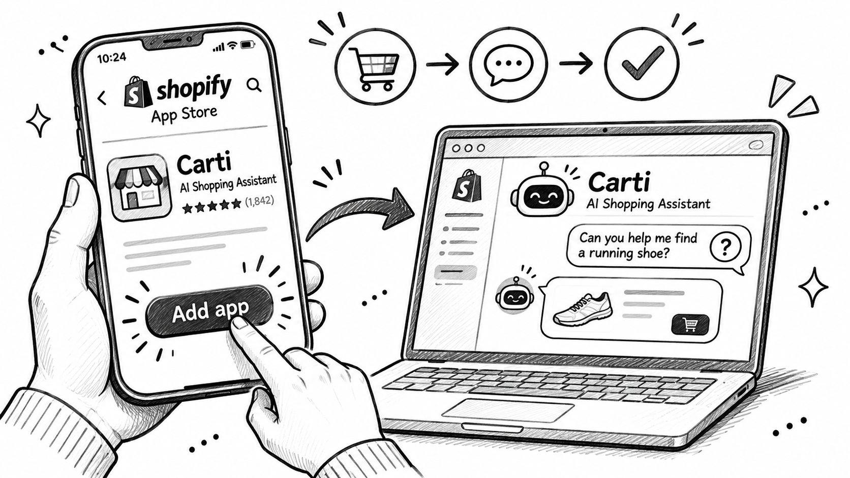
- Install the app. Carti installs from the Shopify App Store. Click Add app and authorize the permissions, and the Carti dashboard opens inside the Shopify admin.
- Turn on the embed. In the Shopify theme editor, open the left sidebar, toggle the Carti Sales Assistant app embed on, and click Save.
- Check the live storefront. The assistant stays invisible to customers until the embed is enabled, so the editor preview can look empty while the embed is off. Test the storefront URL, not the preview pane.
- Fill the knowledge base. Add policies, FAQs and the questions shoppers sent last month. Each addition improves the answers, and thin policy coverage shows up fast in replies about returns.
- Rehearse in the Playground. Chat as a shopper and check tone, answers and trigger settings. The Playground uses the current appearance, knowledge base and trigger configuration, so it reflects what a shopper will meet.
- Run the real-questions test. Take three questions a customer asked last month and put them to the assistant. Compare the replies against the store's shipping and return rules before launch.
Step 3 catches more failed launches than the rest combined. A store owner who tests inside the editor sees nothing and assumes the install broke, when the embed hasn't been saved.
A question box that answers in seconds changes what the product page can carry. Sizing, delivery and compatibility stop being support tickets and start being text on the page.
The product questions feature on how Carti handles product questions shows what the shopper sees when an answer comes from the catalog rather than a canned reply.
Make the Button Work for Every Shopper and Market
Three failures never reach the question log, because the shopper never gets far enough to submit anything. A keyboard skips the button. A screen reader announces only "Button". A hover menu opens on desktop and does nothing under a thumb. None of these produce an error, a support ticket or a metric.
Shopify's own accessibility standards state that the company uses WCAG 2.2 as its standard and tests with screen readers, voice dictation, magnification, keyboard navigation and color-contrast tools. Test the storefront against the same tools rather than trusting the theme's marketing page.
Accessibility and market failures to check
| Failure | What breaks | Fix |
|---|---|---|
| Keyboard skips the button | Tab order passes over it | Use a real link or button element in the natural page order |
| Screen reader says only Button | No descriptive accessible name | Write a label that names the product, such as Ask a question about this product |
| Button appears only on hover | Touch and keyboard users cannot open it | Keep it visible without hover on every device |
| Answer uses the wrong currency or policy | Market settings do not match the answer | Route each market to its own language, currency and policy text |
Mobile adds its own breakage. A sticky button can cover the add-to-cart control or the size selector on a small screen, so check the layout on a real phone at the zoom level a shopper uses.
Why a translated answer can still be wrong
Sizing conventions, delivery windows, duties, return terms and currency change by destination. An answer can be grammatically perfect and operationally wrong because it quotes the wrong warehouse or the wrong return window.
Shopify ties language to market and domain. In the admin, languages are added under Settings, then Languages, and a market is configured under Markets by choosing a domain strategy and selecting the language, as the Shopify language setup guide describes. Languages assigned to a domain are available to customers in every market that uses that domain.
That detail decides how question routing should work. A form that always emails the home warehouse will send a German shopper a US return address.
The domain strategy sets the rest. A store can use a subfolder such as example.com/de, a subdomain such as de.example.com, or a separate country domain such as example.fr, according to Shopify's language requirements. Basic, Grow, Shopify and Advanced plans can sell in up to 20 languages, and Shopify Plus in up to 30.
The audit before launch
- Keyboard path: tab through the product page and confirm the button receives focus in order.
- Screen reader: listen for the product name in the announcement, not just the word button.
- Each language: open the storefront in every language sold and check that policy text matches the market.
- Each market: confirm currency, warehouse, return window and size system in the answer, not only in the language.
- Each channel: check storefront, Instagram and Messenger so a question doesn't lose its product context when it moves.
Turn Question Data into Product Page Fixes
Question volume is the number most stores report and the one that misleads. A jump in questions can mean the product page lost a measurement. A fall can mean the size chart finally answers the question. Neither direction says whether the button earned money.
Events to track for the question button
| Event | Why It Matters | Warning Sign |
|---|---|---|
| Impression | Shows how many visitors see the button | Zero impressions on mobile templates |
| Tap | Shows interest in asking | Many taps with few submissions |
| Validation error | Shows form friction | Errors rising on one device or browser |
| Submit success | Confirms the question reached your queue | Gap between submissions and inbox entries |
| Answer delivered | Measures response time to the shopper | Answers taking days to publish |
| Add to cart after answer | Connects answers to buying | No lift against the control group |
| Purchase | Tracks revenue per exposed session | Flat revenue while questions keep rising |
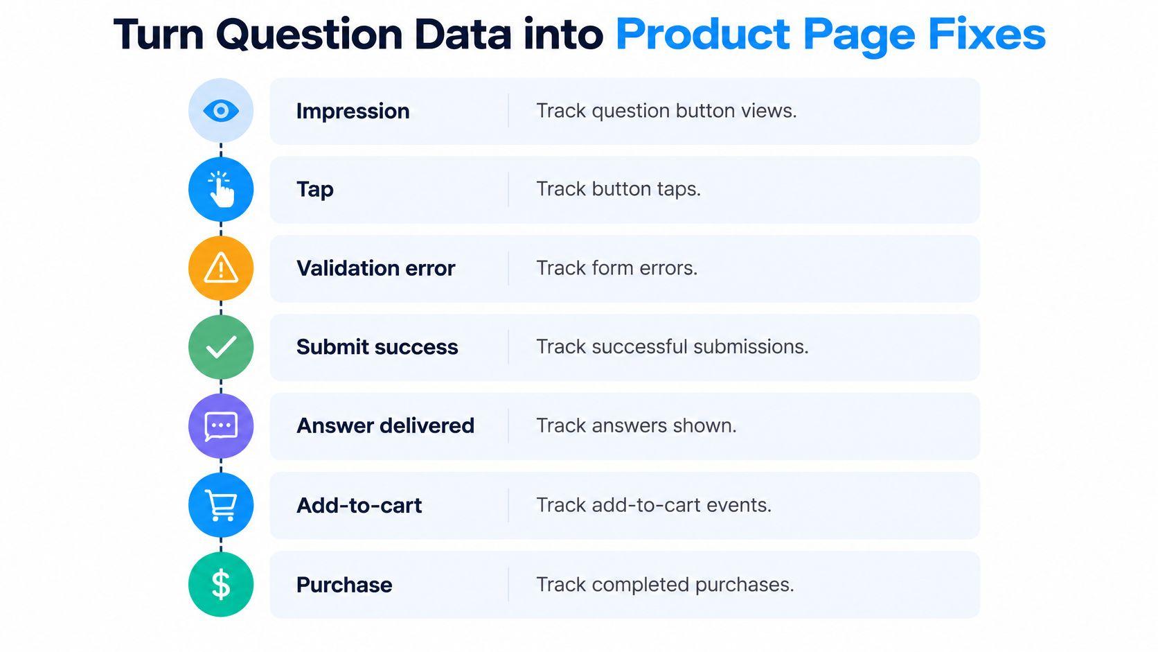
Compare conversion and revenue per exposed session against a control group, either a randomized holdout or a pre and post test. Crediting the button with a seasonal lift is the easiest way to keep a feature that isn't working, or kill one that is.
Segment every event by device, traffic source, product category and question topic. The gap between mobile taps and mobile submissions usually points at the form, not the shopper.
Read each question as product data
Tag every question with SKU, variant, language, device and whether that shopper bought. Then sort for signals: missing measurements, ambiguous materials, unclear compatibility, unanswered return scenarios. A cluster on one variant is a page defect, not a support problem.
The return cost behind those questions is measurable. DHL's 2025 survey of 24,000 shoppers across 24 countries found that 92% return up to 30% of their online purchases, and wrong size was the leading return reason. The National Retail Federation projects that 19.3% of online sales will be returned in 2025, roughly $849.9 billion in merchandise and 15.8% of annual retail sales.
That makes return questions a revenue question. Point shoppers to this store's actual return window, eligibility, exclusions and process before checkout, and never let a generic policy answer stand in for it.
What works: answer uncertainty honestly. Separate verified catalog facts from subjective fit guidance, because an overconfident "true to size" reply creates the return it was meant to prevent.
The monthly review that changes pages
Once a month, pull the top five questions per product. Change one thing on each page: a measurement in the size chart, a material line in the description, a compatibility note, a photo from a different angle. Record what the change did to question count, returns and conversion.
Then rewrite the FAQ with the same language shoppers used. A Shopify FAQ template built around real question phrasing gets found, while an FAQ written from the brand's own vocabulary doesn't.
A falling question rate after a page fix is the result to want. It means the page answered before the shopper had to ask.
Confirm the Button Works Before You Launch
Launch checks take twenty minutes and catch the failures that cost weeks.
- Check the label on both screens. On a phone and on desktop, the button should be visible without scrolling and should name the product.
- Send one test question. Confirm it lands in the right queue, with the product attached.
- Find the answer where the shopper expects it. If the store says it publishes answers on the product page, check that it appears there.
- Rehearse three real questions. Use questions customers asked last month and compare the replies against shipping and return rules. A live demo store shows how Carti answers and sells in real time, which is a faster read than a settings screen.
- Launch the simplest method that covers today's volume. A few questions a month suits a link or theme block. The same questions every day suits an assistant.
- Review after two weeks. Read the question topics and decide whether to keep the link or move up to an assistant.
The two-week review matters more than the launch itself. It replaces a guess about shopper demand with a list of questions the product page failed to answer.
Carti answers pre-purchase questions from a store's catalog, policies and FAQs, recommends products that fit, and hands the tricky ones to the team by email instead of guessing. That turns the ask a question button on a Shopify product page into a real answer before checkout, in the shopper's own language. Visit Carti to see how the assistant handles sizing, shipping and returns questions on a live storefront.

Written by
Daniel AndersonFounder of Carti. 10+ years building ecommerce brands in apparel and supplements. Still runs a Shopify store and built Carti to help merchants convert more browsers into buyers.