
A shopper lands on a product page for a linen blazer. She wants a size 8 and needs to know whether the shoulders run narrow. There's no chat window, so she taps Contact us in the footer, gets a blank page asking for her name, email, phone number and message, and closes the tab. That question had a product attached to it, and the store gave her nowhere to put it.
Most Shopify stores have a contact form and almost nobody has looked at it since launch day. It sits in the footer, routes to an address nobody checks on weekends, and asks for a phone number no one will ever dial. Meanwhile the inbox fills with the same six questions.
The form is a routing decision, a privacy decision and an accessibility decision before it's a design decision. Get the routing right and order questions stop sharing an inbox with wholesale enquiries. Get the fields right and shoppers finish the form instead of abandoning it halfway.
Choose the Right Contact Form Method and Placement
The form's job decides where it lives. A fashion store answering fit questions needs an input beside the size chart, on the product page, while the shopper is still deciding. A home brand fielding "where is my order" all day needs one page with an order-number field and a stated reply window. Those are different builds, and Shopify ships five routes to them, four of which need no code.
Shopify's form features have moved past the single Contact us page. The Shopify Forms documentation describes contact forms built for support enquiries plus two storefront formats, a popup that appears as an overlay and an inline form embedded in a specific theme section or page. Both need the Forms theme app embed switched on, and both can be translated when the store sells in more than one language. The same support guidance lists the other ways shoppers reach a store, including telephone, email, a website contact-us form and Facebook Messenger, which frames the form as one lane of a wider support road rather than the whole road.
Shopify contact form methods compared
| Method | Best for | Where it lives | Code | What happens to the message |
|---|---|---|---|---|
| Built-in contact page | General support on a Contact us page | Online Store, Pages, contact template | No | Email to the store sender address |
| Contact form section | Questions beside a product or on any page | Theme editor section | No | Email to the store sender address |
| Shopify Forms popup | Capture at a chosen moment | Storefront overlay with the Forms app embed | No | Collects customer information and can be translated |
| Shopify Forms inline | Capture inside a specific section | Theme section with the Forms app embed | No | Collects customer information and can be translated |
| Custom Liquid contact form | Extra fields such as order number | Theme code using the contact form tag | Yes | Email, and optional field names become notification labels |
Read that table as trade-offs, not a ladder. The built-in page and the contact form section are the same form in different places, and both email the store's sender address. The decision is placement. A product-page section headed "Ask about this sofa" gets read, while the identical form in the footer, headed "Contact us", gets skipped by shoppers who assume it goes nowhere.
When the native options stop short
Native forms carry text. They don't carry a photo of a cracked lampshade, a wholesale price list, or a message that should open a ticket in a helpdesk. That gap is where a third-party form app earns its place, with file uploads, conditional logic that hides wholesale fields from a retail shopper, and routing to more than one recipient. The costs are real: another script on the page, a second dashboard to check, and styling that rarely matches the theme without work.
Custom Liquid sits between the two. It stays native, needs no app, and it's the only no-app route to an order-number field or an enquiry type. Reach for it when the missing piece is a field rather than a file.
Routing rule: if the answer needs a photo, an attachment or a helpdesk ticket, the native form has run out. If it needs an order number, theme code gets you there.
Placement gets easier once you've mapped every channel the store answers on. A form that duplicates a channel shoppers already trust splits the queue, and there's a useful breakdown of how customer service channels divide the work between chat, email and social DMs.
Pick one row from the table and build that row this week. Adding a second method later is easy. Running three half-configured inboxes is not.
Add a Contact Page With the Built-in Template
Every Shopify theme ships a contact form, which makes it a standard communication channel rather than an add-on. Shopify's guide to adding a contact page covers the two placements that suit most stores: a dedicated page built from the contact template, where the form collects questions about products, policies or orders, and a Contact Form section that can sit on a product page with a heading you set yourself. Both send submissions to the store's sender email address.
The admin work takes about four minutes.
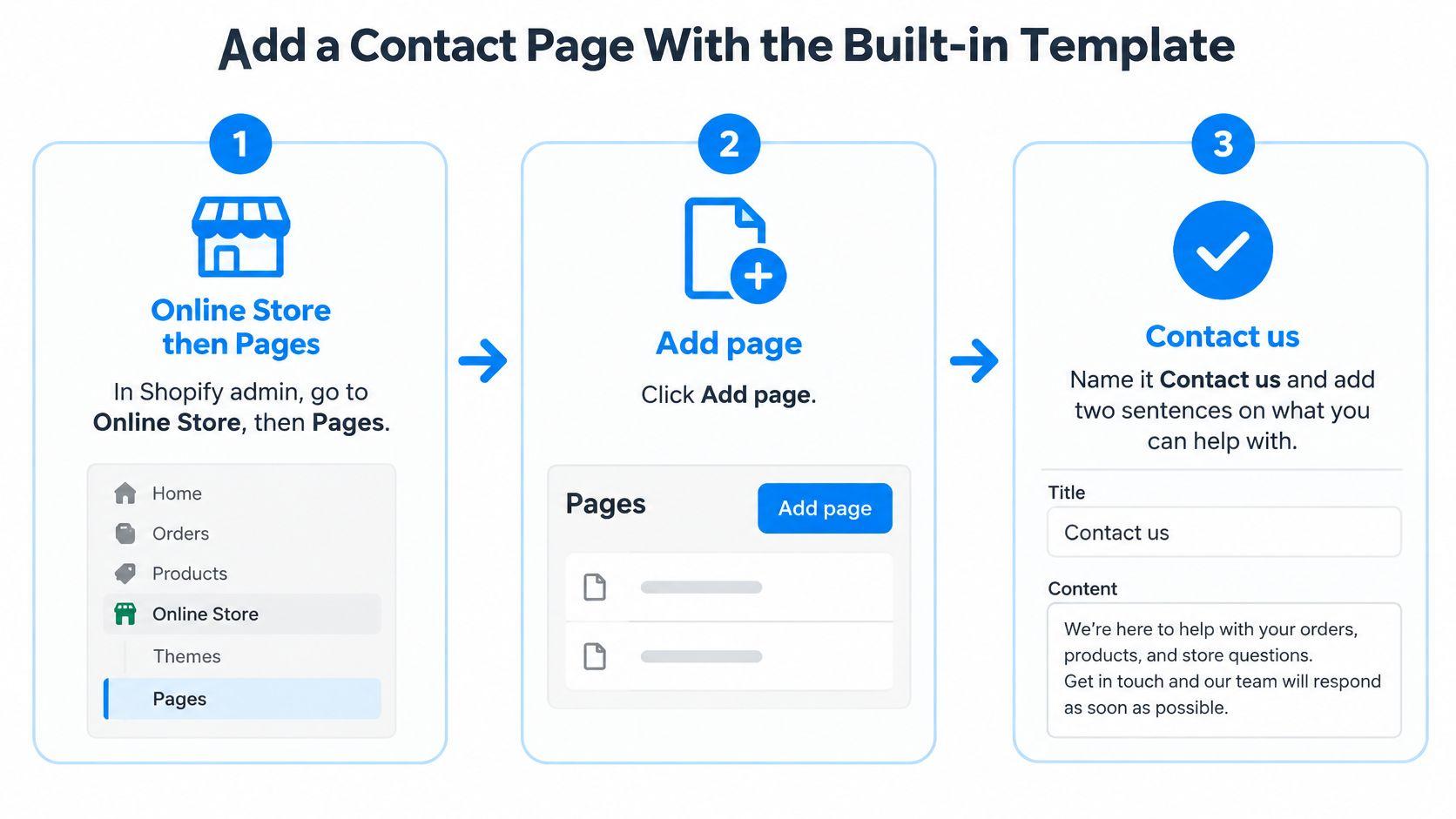
- Open Pages. In Shopify admin, go to Online Store, then Pages, then Add page.
- Name it. Title it Contact us, then write two sentences in the body about what you can help with, such as products, shipping and orders. Skip the welcome paragraph.
- Switch the template. In the Theme template dropdown, choose contact. That's the switch that loads the built-in form.
- Save, then link it. Add the page to the footer menu under Online Store, then Navigation, and to the header if support is a selling point.
- Test from a personal inbox. Send a message from your own Gmail or Outlook account and confirm the store sender address receives the name, email and message fields.
- Check it on a phone. Labels should stay visible, the email field should raise an email keyboard, and a thank-you state should appear after submitting.
- Add the product-level version. Open the theme editor, add a Contact form section to a product template, set the heading to something like "Ask about this product", and save.
That seventh step is the one most stores skip, and it's usually the one that pays. A shopper deciding between two sizes is already on the product page. Give her a form there and the question arrives with the product name attached, instead of arriving three days later from an email address with no order history.
Set the expectation in the page's opening lines. "Order questions are answered the next business day" is a promise a small team can keep. Minute-level response times are not, and a missed promise costs more trust than a slow one.
Test from outside: send the first submission from an address that isn't your own admin login. A form that only emails you looks fine until a real customer tries it.
Preview the page in an unpublished copy of the theme before publishing, since contact templates vary and a section that renders cleanly in the editor can collide with your page width on mobile. Stores selling made-to-measure textiles usually need more from this page than a support inbox, and a bedding brand taking custom orders should talk to a bedding design studio about mapping the page's questions to the sales conversation before writing a single field label.
This setup covers a plain support inbox. Move to theme code only when you need a field the template doesn't offer.
Add Custom Fields With the Liquid Contact Form
The built-in template gives you name, email and message. The moment a merchant needs an order number, the temptation is to hand-build a form that posts somewhere. Don't. Use the theme's Liquid contact tag and let Shopify build the submit plumbing. Shopify's theme documentation is clear that the tag generates the POST action, the form_type value, the UTF-8 declaration and the contact-form identifier, and that the native endpoint resolves to /contact#contact_form.
The theme code editor is where this happens.
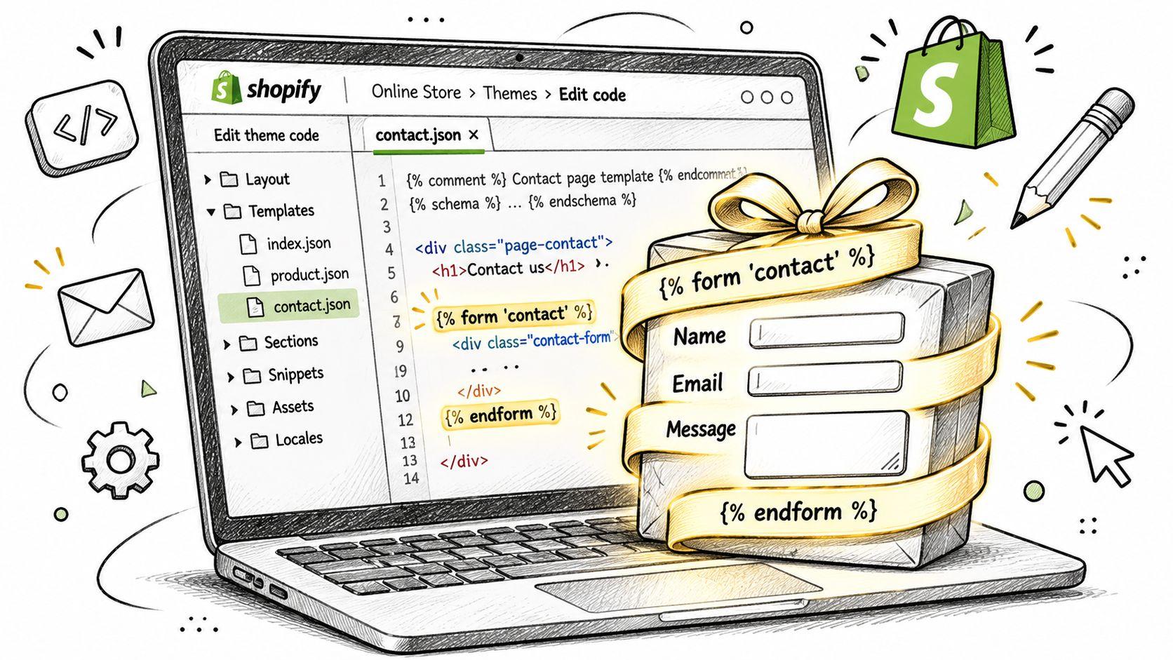
- Find the section. Open the contact page section or template in the code editor, typically sections/contact-form.liquid in a modern theme.
- Wrap the fields. Put everything inside the contact form tag so Shopify supplies the action, the form type, the encoding flag and the form id.
- Add the email input. Name it contact[email]. Without it, there's no return address and no reply.
- Add the message field. Name it contact[body]. This is the part Shopify treats as the body of the notification email.
- Add optional fields with unique names. contact[inquiry], contact[product] and contact[order] cover most stores. Optional field names become the labels in the notification email, so name them for the person reading that email, not for a database column.
- Mark only required fields. Email and message, and nothing else. A required phone number on a support form is a self-inflicted wound.
- Test both states. Submit a valid message and an invalid one on desktop and mobile, then open the notification email and check every field arrived.
Contact form fields and input names
| Field | Input name | Required | Use it when |
|---|---|---|---|
| contact[email] | Yes | Every reply needs a return address | |
| Message | contact[body] | Yes | The shopper's question or request |
| Inquiry type | contact[inquiry] | No | Routing sizing, shipping, returns, or wholesale |
| Product handle | contact[product] | No | A question about one product |
| Order number | contact[order] | No | Order status or order-specific help |
| Multi-select options | Unique name per option | No | Each option needs its own name, or only the last value is kept |
The checkbox trap catches people every time. Duplicate names in a checkbox group cause only the last selected value to be returned, so a shopper who ticks both "sizing" and "returns" sends you one of them. Give every option its own name.
Never add: a card number field, a password field, or anything that asks a shopper to confirm an account PIN. Support doesn't need them, and a form that collects them turns a help page into a liability.
Keep labels as real text beside each field. A placeholder that vanishes on the first keystroke is not a label, and on a phone it leaves the shopper guessing what the third box wanted.
Cut Friction, Protect Privacy, and Speed Replies
A support form is a short path, not a survey. Launch with an email field and the question itself, watch completion for a fortnight, then add an intent selector with four options: product question, order help, wholesale, returns. Put an optional order-number field underneath. It saves a round trip on exactly the requests that hurt most to delay.
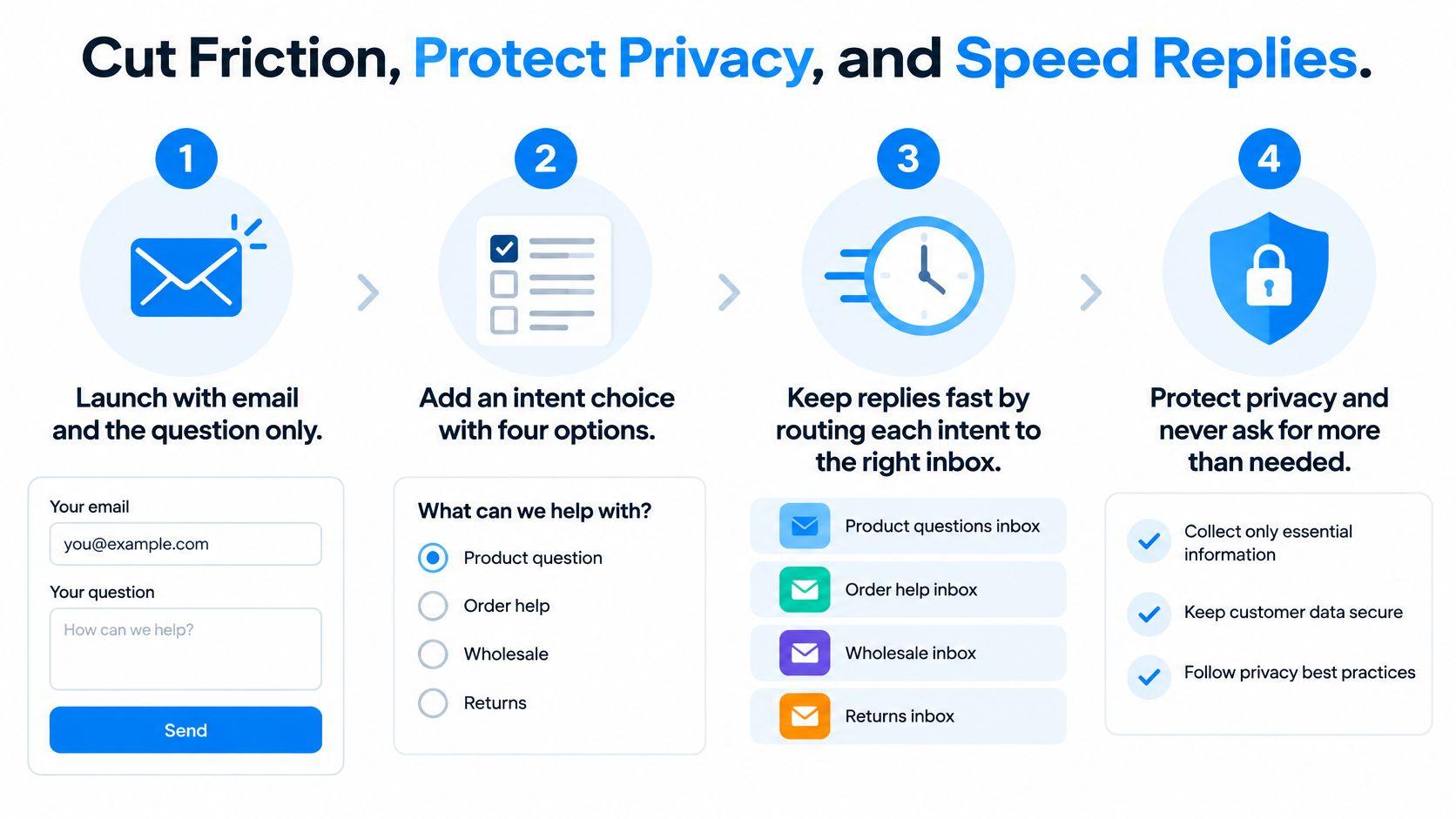
The privacy line matters as much as the fields. One plain sentence beside the submit button explaining how the message is used, with a link to the store privacy policy, does more than a paragraph of legal text nobody reads. Add a second line telling shoppers not to paste card numbers or passwords into the message box. People do it, and an inbox is the wrong place for a credit card number.
Ask for a phone number only when someone will ring it. Birth dates, full addresses and detailed personal histories on a first contact form add friction for the shopper and create obligations for the store.
What the checkout numbers do and don't tell you
Form friction is a conversion problem wearing a design costume. Baymard's checkout usability research reports a global average cart-abandonment rate of 70.19% and estimates the average large ecommerce site has 32 checkout usability improvements available, with usability-test findings pointing to a potential 35% conversion-rate increase from better checkout UX.
Those are checkout benchmarks, not contact-form success rates. Treat them as a reason to measure your own form rather than as a promised lift.
Instrument six events: view, focus, validation error, submit, successful submit, abandon. Compare completion by device, by traffic source and by field count. A form that converts at 60% on desktop and 31% on mobile has a mobile problem, not a copy problem.
On phones, use visible labels, an email keyboard, tap targets big enough for a thumb, autofill-friendly attributes and short error messages. The failure patterns repeat: placeholder-only labels, phone numbers required by default, entered text wiped after a validation error, and no confirmation state after a successful send. A shopper who can't tell whether the message went through often sends it twice or gives up.
Contact messages also carry personal data in free text, from order numbers to addresses and the occasional card digit someone pasted by mistake. That turns a support page into a data-handling question, and a guide to understanding GDPR compliance is worth reading before you ask for anything beyond an email address.
Finally, close the loop on delivery. Confirm the store sender email address reaches a human who checks it, send one test message, and verify every field in the notification. Switch on spam protection under Online Store, then Preferences, and look at which challenge it uses. Shopify's native form runs on hCaptcha, and a challenge a screen reader can't solve blocks real customers along with the bots.
Send Repeat Questions to Chat and FAQ
Keep the form. Move the repeats.
Order-specific problems, damaged deliveries, custom requests and anything with an attachment stay where they are, because a form with an order field is the right tool for a message that needs a human and a record. The questions that arrive forty times a week are a different problem, and answering them by hand is a choice, not a requirement.
Sort last month's submissions into two piles:
- Moves to self-service: sizing guidance, shipping windows, return eligibility, product comparisons, fabric and material questions.
- Stays in the form: order status, damaged items, address changes, wholesale terms, anything a shopper needs a person to confirm.
Start with FAQ copy. It costs little to maintain, works on every theme, and gives the support team a link to send instead of a paragraph to retype. A Shopify FAQ template gives the structure and the schema markup that helps the page get found in search before the question ever reaches the inbox.
If the volume holds, an assistant earns its place. Carti is an AI shopping assistant for Shopify that answers pre-purchase questions on the storefront. A merchant installs it from the Shopify App Store and enables the Carti Sales Assistant app embed in the theme, which takes under 10 minutes from install to a live widget. When it can't confidently answer something, it emails the store's team rather than guessing, which is the behavior that keeps a fallback form worth having.
The split is the point. Chat handles the questions with an answer that doesn't change. The contact form handles the ones that need a person to look something up, and it does that job better once the easy questions stop competing for attention. Publish the page, send the test, then read the repeat questions once a week and decide what moves.
Carti answers the sizing, shipping, returns and comparison questions your contact form keeps handling by hand, on the storefront, and passes the unusual ones to your team by email. It learns your catalog, policies and FAQs, replies in 92 languages, and recommends products that fit rather than just quoting a policy back. The Free plan covers 50 AI conversations a month, so you can see which questions stop landing in your inbox by visiting Carti.

Written by
Daniel AndersonFounder of Carti. 10+ years building ecommerce brands in apparel and supplements. Still runs a Shopify store and built Carti to help merchants convert more browsers into buyers.