
50.19% of shoppers are still abandoning carts on average, and that's only one piece of the leak. The bigger revenue story is that global ecommerce is still massive and growing, with $4.12 trillion generated in 2024 and a projected $7.95 trillion in retail ecommerce sales by 2027, so even small conversion gains can compound fast. The merchants who grow fastest usually stop treating ecommerce as a traffic problem and start treating it as a discovery, hesitation, and checkout problem.
Why Most Stores Plateau and What It Really Means
The store that keeps buying more traffic without fixing conversion is pouring water into a bucket with holes. That is why how to increase ecommerce sales starts with revenue per visitor, not vanity traffic growth. If ecommerce already represents 20.5% of total global retail sales in 2025 and is projected to reach 41% of all retail purchases by 2027, the upside from conversion work is obvious, because the market is large enough that small gains matter at scale. Wix ecommerce statistics
The practical mistake is assuming the bottleneck sits only at checkout. In real stores, the leak starts much earlier, when shoppers cannot quickly judge fit, price, policy, or trust. That is why most improvement work should focus on product discovery, merchandising clarity, and friction removal, not just discounting abandoners after they have left.
Diagnose the funnel before changing anything
Start with a clean baseline. Pull device-split traffic, conversion rate by template, checkout completion rate, and abandonment by step, then compare mobile against desktop before you touch design or copy. Mobile needs its own dashboard because smartphones accounted for nearly 80% of all retail website visits worldwide in 2024, and mobile devices generated the majority of online orders versus desktops and tablets. Statista online shopping topic
That device split changes what “good” looks like. A homepage that performs acceptably on desktop can still be bleeding mobile buyers if product pages load slowly, filters are clumsy, or checkout feels too long on a thumb-sized screen.
Practical rule: do not optimize the whole store at once. Find the single step where mobile shoppers disappear most often, then fix that step first.
The other number worth keeping in view is cart abandonment. Baymard-based reporting puts the average cart abandonment rate at about 70.19%, which means roughly 7 out of 10 shoppers leave before purchase. Another source notes that 49% of shoppers abandon carts because of unexpected extra costs, which is why the right response is clearer pricing and better expectation-setting, not only more aggressive remarketing. Statista online shopping topic
A simple testing cadence makes this work manageable. Change one template, one field group, or one message at a time. Then measure conversion against the baseline before you decide whether to keep it, because gut feel is a poor replacement for funnel data.
For teams serving multiple regions, a practical guide on increasing sales for Australian retailers can be a useful local reference point for tailoring merchandising and conversion work to market expectations.
The checklist for the lower funnel matters too. A Shopify checkout optimization guide gives teams a practical way to review field count, trust signals, and the small cleanup work that removes hesitation at the point of purchase.
Remove Friction from Mobile and Checkout
If a mobile shopper bounces before the product page even settles, your cart recovery flow never gets a chance. Google-referenced research shows that 53% of mobile users leave a site if it takes longer than three seconds to load, so speed work has to start with measurement, not aesthetics. Salesforce ecommerce sales guidance
Fix the slowest pages first
Profile by page type. Homepage, collection pages, product pages, and checkout often have very different bottlenecks, and the heaviest template is not always the one causing the biggest revenue loss. Compress images, strip out nonessential scripts, and remove any component that slows down the path to add-to-cart.
Then look at the checkout form itself. Shorten nonessential fields, keep the layout responsive, and make it obvious what happens next. A clean checkout is not just about looking modern, it reduces the number of decisions a shopper has to make while already close to buying.
The right internal reference here is a Shopify checkout optimization guide, especially if your team needs a practical checklist for field reduction, trust signals, and step-by-step cleanup.
Implementation note: if a field doesn't improve shipping accuracy, fraud prevention, or order completion, challenge its presence.
Build the mobile path for thumbs, not trackpads
Express checkout matters because it compresses attention into one quick action. The best mobile flows make guest checkout easy to find, keep payment options visible, and avoid making the buyer retype information they've already given you elsewhere. That's especially important on smaller screens, where each extra tap raises the odds of drop-off.
Use this as a handoff list for your developer:
- Audit load time first: check the worst-performing templates before touching the homepage hero.
- Reduce form friction: remove duplicate fields, optional fields, and unnecessary account creation prompts.
- Prioritize fast payment paths: surface the quickest checkout route early in the flow.
- Retest every change: compare mobile completion rate before and after each adjustment.
The key is sequence. Merchants often redesign the whole checkout and then wonder which change mattered. Fix one friction point, ship it, measure it, and only then move to the next.
Kill Hesitation Earlier in the Journey
Most shoppers don't leave because they can't click the final button. They leave because they're still uncertain when they're browsing category and product pages. If a shopper can't quickly answer “Is this right for me?”, they often never reach cart, which is why the earlier parts of the journey deserve as much attention as checkout.
Surface answers where doubt starts
Category pages should do more than list products. Add concise FAQs that answer the questions buyers repeatedly ask about sizing, compatibility, returns, materials, and shipping expectations. That kind of content works because it cuts off hesitation before it becomes abandonment.
Comparison blocks help too, especially when shoppers are choosing between similar products. Keep them plain and practical. Focus on the decision points that matter in the category, not marketing fluff that makes everything sound interchangeable.
A good comparison block does three things:
- Clarifies fit: tells the shopper which product matches which use case.
- Reduces policy uncertainty: makes return and shipping expectations easy to find.
- Speeds decision-making: turns a long browse into a short shortlist.
Use instant answers to convert curiosity into intent
Support shouldn't wait until checkout. When shoppers ask a question mid-browse, the answer can either move them closer to the cart or send them back to search again. That's where instant product guidance matters, because live answers can turn a policy question into a recommendation without forcing the buyer to start over.
A store selling skincare, for example, might see a shopper ask about returns, then realize the issue is ingredient sensitivity. A trained assistant can answer the policy question and suggest a more suitable product category in the same interaction. That's a much better outcome than a generic support deflection.
Neutral guidance from Shopware also points to FAQs on category pages, comparison guides, and early question-answering as conversion levers, which lines up with what I've seen on Shopify stores that stopped treating support as a cleanup tool and started using it as a decision aid. Shopware ecommerce sales guidance
Run Behavior-Triggered Cart Recovery That Converts Effectively
Cart recovery works best when it feels timely and specific, not desperate. The strongest setup is still a simple three-touch sequence, with the first email going out 1 hour after abandonment, the second at 12 hours, and the third at 24 hours. Omnisend recommends that cadence, along with featuring the abandoned item, adding urgency in the subject line, and including a support contact option. Omnisend ecommerce sales guide
Keep the sequence short and relevant
The first message should remind, not pressure. The shopper probably got distracted, so the job is to reopen the cart and make the next step obvious. By the second touch, address a likely objection. By the third, add urgency without gimmicks.
Tenet's broader recommendation uses an initial message 1–3 hours after abandonment, a follow-up within 24 hours, and a final reminder at 24–48 hours with urgency cues like limited stock. The exact timing matters less than the discipline of sending messages while intent is still warm. Omnisend ecommerce sales guide
Compare your recovery touches
| Touch | Timing After Abandonment | Primary Goal | Content Focus |
|---|---|---|---|
| First reminder | 1 hour | Reopen intent | Abandoned item, simple return to cart |
| Second follow-up | 12 hours | Resolve objections | Support option, product details, reassurance |
| Final reminder | 24 hours | Create urgency | Stock context, clear next step, minimal pressure |
The trap is over-discounting. If every abandoned cart gets a bigger offer, shoppers learn to wait for a deal instead of buying when they are ready. Segment by cart value and product type, then measure recovered revenue per send rather than celebrating open rates, because open rates do not pay the bills.
Cart recovery works better when it is tied to the reason the buyer hesitated in the first place. A reminder alone helps, but a reminder paired with the right support path, such as the tactics in the cart abandonment recovery guide, gives you a cleaner path to conversion without training people to expect discounts.
Turn Your Storefront Into a 24/7 Sales Associate
A store that answers questions while people browse converts differently from a store that waits for the contact form. An AI assistant works when it behaves like a good sales associate, it knows the catalog, understands policy, and nudges the shopper toward a relevant product before the tab gets closed. That's also where a tool like Carti fits, since it provides Instant Answers, Smart Suggestions, and Cart Recovery in a Shopify storefront.
Configure the assistant around the shopper's intent
The setup should be boring in the best way. Connect the catalog, ingest your policies and FAQs, decide where proactive prompts should appear, and give the widget a brand fit that doesn't feel pasted on. If the assistant is only visible after someone asks for help, you've already lost some of the value.
The useful capabilities are straightforward:
- Catalog learning: the assistant should know product details well enough to answer common fit and feature questions.
- Policy ingestion: returns, shipping, and exchanges should be accessible without a support delay.
- Proactive triggers: the widget should appear when shopper behavior suggests uncertainty, not only when the buyer asks.
- Language coverage: multilingual support matters when your store serves more than one market.
- Cart prompts: abandoned carts need timely nudges, not generic follow-up.
Use the assistant to surface merchandising signals
A good assistant is also a listening tool. The questions shoppers ask reveal missing copy, confusing product names, weak category organization, and the objections your ads are attracting. Carti's Insights Dashboard is useful for this kind of work because it turns real shopper questions into merchandising and content ideas, instead of leaving those insights buried in support history. Carti AI-powered sales assistant
When shoppers ask the same question three different ways, the problem is usually the page, not the person.
That feedback loop matters more than a polished chatbot greeting. If the widget can recommend products based on behavior, answer instantly, and recover carts when someone hesitates, it becomes part of the sales process instead of a decorative support layer.
Drive Qualified Traffic With Merchandising and Acquisition
Traffic quality and store merchandising are the same conversation. If your product pages answer the wrong questions or your category pages bury the good stuff, paid media just pays to expose that weakness faster. The better approach is to use shopper behavior as acquisition input, then shape SEO, paid creative, and landing pages around what people want.
Turn shopper questions into acquisition assets
Search and onsite question data should feed your content plan. If shoppers repeatedly ask about a product attribute, policy, or comparison point, that's a signal to write the page, build the collection copy, or structure the ad around that question. The store's own audience tells you where the next piece of demand lives.
That same logic works for ads. A landing page should match the promise in the ad, not just the product title. When the message and the page are aligned, the shopper doesn't have to work as hard to connect the dots.
Keep paid and organic from fighting each other
Paid traffic is useful when you need speed. Organic traffic is useful when you want to compound answers, comparisons, and category depth over time. The mistake is treating them as separate teams with different truths, because the best-performing pages often do both jobs at once.
That's why the reporting layer matters. Use search behavior, product gaps, and conversion friction to decide what gets added to a collection page, what gets turned into a blog post, and what gets turned into ad creative. If the same question keeps surfacing, answer it once in the right place and let both channels benefit.
For broader acquisition context, Kraken Agency's discussion of social media challenges for startups is a useful reminder that channel activity alone doesn't fix a weak offer or poor post-click experience. The work still comes back to relevance, clarity, and the page the shopper lands on.
Measure, Test, and Ship a 90-Day Implementation Plan
A merchant doesn't need twenty tactics. They need a sequence that compounds. The cleanest way to do that is to start with the parts of the store that leak the most intent, then layer in recovery, then improve acquisition once the site can convert the traffic it already gets.
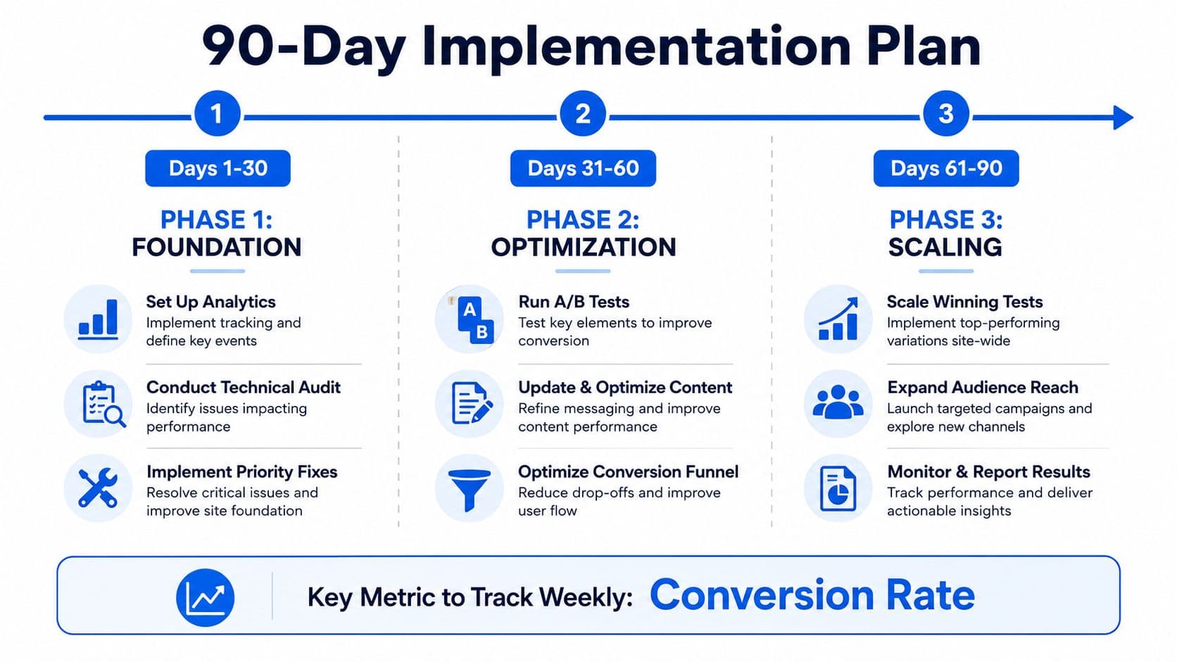
Phase 1 Foundation
Days 1 to 30 should be about measurement and cleanup. Set up the dashboard, review device splits, inspect the slowest templates, and remove the easiest checkout blockers. This is also the point to lock a baseline for conversion rate, load time, and abandonment by step, so later tests have something real to compare against.
Phase 2 Optimization
Days 31 to 60 are for testing and content fixes. Update the pages where shoppers hesitate, ship FAQ and comparison improvements, and run a controlled checkout test. If you're using onsite support, this is the time to turn the most common questions into answer content and recommendation logic.
Phase 3 Scaling
Days 61 to 90 are for expansion. Scale the tests that won, widen the audience segments that respond, and connect acquisition messaging to the questions already showing up onsite. If you need extra learning material for the team, the 100Signals resource library is a practical place to pull demand-generation ideas into the planning process.
The weekly metric that keeps the whole plan honest is conversion rate. Revenue per visitor should improve because the site is easier to understand, easier to trust, and easier to buy from, not because discounts got louder.
Treat speed as an ongoing discipline, not a one-time project. Avoid blanket discounting, watch abandonment by device, and keep measuring the same funnel steps after every change so you know what moved revenue.
If you want a store that answers product questions, recommends the right item, and recovers hesitant shoppers without adding more manual work, Carti is built for that job. It gives Shopify stores instant support, proactive product guidance, and cart recovery in one assistant, so you can turn more browsers into buyers without stacking more disconnected tools.

Written by
Daniel AndersonFounder of Carti. 10+ years building ecommerce brands in apparel and supplements. Still runs a Shopify store and built Carti to help merchants convert more browsers into buyers.
Ready to boost your store's sales?
Install Carti in 5 minutes and let AI handle customer questions, recommend products, and close sales 24/7.
Start Free Trial14-day free trial