
70.19% of online shopping carts are abandoned, and Baymard's checkout research says design improvements alone can lift conversion by as much as 35%. That's the upside this playbook targets, not with generic tweaks, but with a measurement-first approach that separates where shoppers drop off, by device and by step.
Why Most Shopify Checkouts Leak Revenue
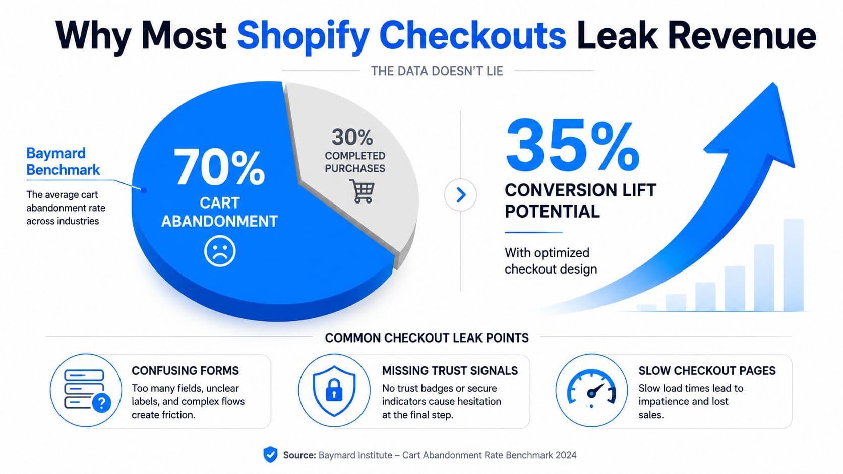
The central problem in checkout process optimization is simple. A large share of shoppers get all the way to checkout, then stop, and Baymard's long-running benchmark puts that global abandonment rate at about 70.19% in 2024. Their published research stream also shows that a large ecommerce site can raise conversion by as much as 35% through checkout design improvements alone, with the published PDF citing 35.26% as the uplift from better checkout design (Baymard benchmark summary).
Most advice doesn't go far enough. It stops at surface-level ideas like “simplify the layout” or “add trust badges,” which are not wrong, but they're incomplete when the core issue might be payment authorization, mobile keyboard friction, or a hidden step that only fails on one device type.
Practical rule: don't change the checkout until you know exactly where shoppers are dropping out, and on which device.
That's why a serious audit starts with a diagnostic sequence. The four stages are cart-to-checkout entry, form completion, payment authorization, and post-abandonment recovery. If you don't isolate those stages, you can celebrate a prettier checkout that still leaks revenue in the same place.
The difference between a helpful checklist and a useful playbook is focus. Cart abandonment is the historical baseline, but the work is not “reduce abandonment” in the abstract. It's identify the single largest preventable source of friction, then remove it in order of impact.
For a deeper look at how drop-off is usually measured in practice, this drop-off rate guide is a useful companion.
Mapping Your Checkout Funnel and KPIs
The first move is instrumentation, not redesign. If you can't see where users exit, you're guessing, and guessing is expensive in checkout because the same visible symptom can come from very different causes.
Start by mapping the funnel into four stages, then split that funnel by device, browser, channel, and payment method. The sequence is cart-to-checkout entry, form completion, payment authorization, and post-abandonment recovery. Benchmarks from independent ecommerce guidance place cart abandonment around 65–75%, checkout conversion around 30–50%, time-to-complete checkout at 4–8 minutes, and authorization rates at 80–90%; the same source recommends targets of below 70% abandonment, 45–65% checkout conversion, under 3 minutes to complete, and 85–95% authorization (checkout optimization guidance).
Checkout KPIs and Target Ranges
| Stage | KPI | Typical Range | Target |
|---|---|---|---|
| Cart-to-checkout entry | Abandonment rate | 65–75% | Below 70% |
| Form completion | Checkout conversion | 30–50% | 45–65% |
| Payment step | Time-to-complete | 4–8 minutes | Under 3 minutes |
| Authorization | Authorization rate | 80–90% | 85–95% |
Use Shopify's analytics and whatever funnel tracking you already have to log each step. The key is not fancy tooling, it's clean separation of the failure points so you can tell whether the problem is a long form, a payment rejection, or a device-specific rendering issue.
A checkout problem that only appears on mobile is not a general checkout problem. It's a mobile checkout problem, and it needs its own fix.
Once the data is segmented, prioritize by frequency and severity. A rare but catastrophic bug matters, but a smaller, recurring point of friction can cost more over time because it hits every day. That's the logic Baymard emphasizes in its research stream, and it's the right way to avoid wasting tests on cosmetic changes.
UX and Form Fixes That Move the Needle
The most impactful UX changes usually come from removing effort, not adding visual polish. If a shopper has to think, type, or hesitate more than necessary, the checkout starts to feel like a chore instead of a continuation of intent.
Fix the path before you fix the styling
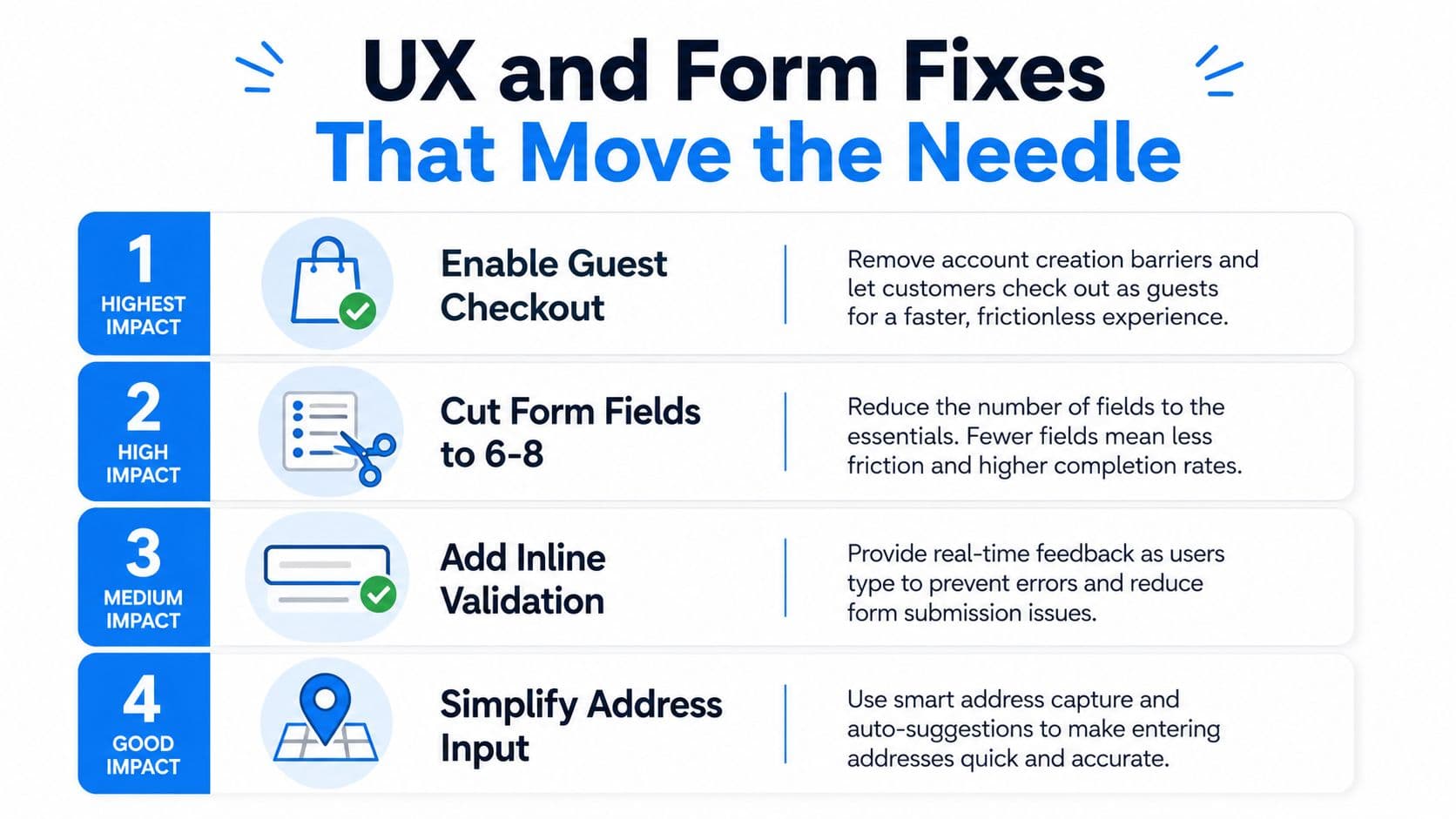
Enable guest checkout first. Forcing registration adds a decision right when the buyer is trying to finish, and independent guidance reports that guest checkout can lift completion by 12–18%. After that, cut the number of form fields aggressively. Baymard's research says the average checkout uses 14.88 fields, while most can be reduced to 6–8 without harming fulfillment (Baymard field guidance).
Inline validation comes next, because it lets people fix errors while the context is still fresh. That's especially important on mobile, where keyboard switching and repeated errors turn a small typo into a full abandonment trigger. I also look for total-cost disclosure before the payment step, because surprise fees create distrust at the exact moment the shopper is most sensitive to friction.
The practical sequence is straightforward.
- Enable Guest Checkout: make it obvious, primary, and easy to choose.
- Reduce Required Fields: remove anything you don't need to process or deliver the order.
- Add Inline Validation: show field-level feedback as the shopper finishes each input.
- Show Total Cost Early: surface shipping and other charges before payment.
A subtle but important detail is address entry. If address autocomplete is missing, the form feels slower than it should, and the error rate climbs because buyers are forced to type the most failure-prone part of the order by hand. On mobile, that pain compounds, so correct keyboard types and large tap targets matter more than they do on desktop.
The common mistake is to make the checkout prettier while keeping the same number of inputs and the same amount of typing. That kind of redesign looks better in screenshots and does very little in practice.
The most useful internal benchmark for this work is your own form completion path. If a field doesn't help shipping, payment, or legal compliance, it's probably a candidate for removal or deferral. For a broader Shopify CRO context, this Shopify conversion rate optimization guide is a useful reference.
Payments, Shipping, and Trust Signals
Once form friction is lower, payment and shipping choices become the next big lever. A checkout can look “clean” and still underperform, because the failure is happening at authorization or at the moment the total becomes visible.
Express wallets are the fastest win for many stores. Independent ecommerce analyses report that adding Apple Pay and Google Pay can raise mobile conversion by 30–40%, while broader wallet support and payment diversity are associated with higher completion because the shopper doesn't need to type card details on a phone (express payment guidance). The exact effect depends on your audience, but the direction is consistent, less typing means less abandonment.
Practical rule: place the payment option the buyer wants as close to the top of the flow as your platform allows.
Authorization is the other overlooked leak. A shopper can complete every visible step and still fail at payment approval, which means the UX looked fine while revenue still disappeared. That's why the KPI list in the earlier section matters, payment approval deserves its own tracking, not just a general conversion number.
Shipping transparency belongs before the final click, not after. Hidden fees are one of the most reliable reasons shoppers hesitate, and the trust hit is worse when the checkout asks for card details before the total is clear. If you need a sensitive field for fraud screening, explain why it's required, especially for international buyers who are already balancing privacy, delivery certainty, and unfamiliar payment flows.
Trust signals should sit where anxiety peaks, usually around the payment button and card fields. That means recognizable payment logos, a clear security message, and a concise reminder of return or support policy at the moment of commitment. If you hide those cues in the footer, they're too far from the decision point to matter.
The best payment setup is not the one with the most options. It's the one that lets the right buyer complete quickly without second-guessing the total, the security, or the approval step.
Choosing the Right Shopify Checkout Flow
Shopify merchants usually don't need a “reinvented” checkout, they need the right default flow for their audience. The wrong architecture can create friction before a single field is even filled out, which is why this choice deserves more care than many give it.
Compare the flow, not just the branding
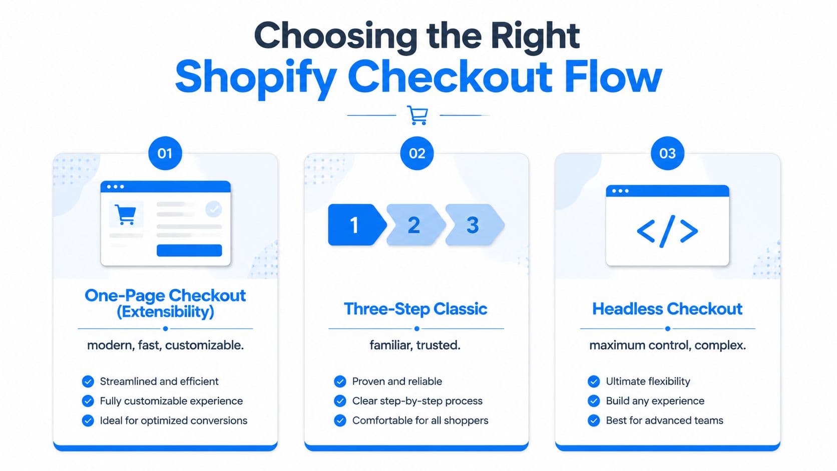
The one-page checkout in Shopify's extensibility era is best when speed, clarity, and mobile usability matter most. It reduces the sense of moving through multiple hurdles, and it gives the shopper a fuller view of the process in one place. The trade-off is that it demands disciplined layout, because too much content on one page can feel crowded if you don't prune the form.
The three-step classic flow can still make sense for stores with more complex shipping or review needs. It's familiar, and familiarity can reduce uncertainty for certain audiences, especially if your buyers expect a linear sequence and the store has multiple information-gathering requirements. The downside is simple, every additional step creates more opportunities for abandonment if the progress indicator, data persistence, or back-button behavior is weak.
The Shop Pay accelerated flow is the strongest convenience play when returning shoppers dominate and mobile traffic is a major share of demand. It removes a lot of low-value friction and can be a smart default if repeat purchase behavior is common. The trade-off is control, because the more accelerated the experience becomes, the less room you have for custom branding or unusual field logic.
Pick the flow that matches your store
A practical decision rule helps. Default to a Shop Pay-accelerated path if most traffic is mobile and returning, otherwise optimize the standard Shopify flow first. If your catalog is complex, or your shipping rules are unusually nuanced, the classic flow may be the safer operating choice because it lets you present information more deliberately.
Don't choose a checkout flow because a competitor uses it. Choose it because your customers need that specific balance of speed, clarity, and control.
The experimental side matters just as much as the structural choice. Frame each test with one hypothesis, one stage, and one expected lift. Then run one test per week across the funnel stages so attribution stays clean and you don't confuse a payment fix with a form fix.
A simple logging template keeps the work honest. Record the hypothesis, the exact change, the device segment, the metric watched, and whether the result was shipped or discarded. That discipline is what keeps false positives from becoming permanent code.
Layering AI Chat and Cart Recovery on Top
AI chat belongs after the core checkout friction is under control. If the checkout is broken, chat becomes a bandage. If the checkout is already solid, chat can remove hesitation, answer pre-purchase objections, and bring back buyers who were about to leave.
Put chat where uncertainty starts
The first job is instant answers. A shopper asking whether something fits, ships quickly, or works with a specific use case doesn't want to hunt for policy pages, and every minute of waiting increases the chance they exit. That's why chat is most useful at the point where the buyer is about to leave for a question that your checkout doesn't answer on its own.
The second job is smart suggestions. If a shopper is already in the cart, relevant recommendations can support the basket without feeling random. The goal isn't to flood the screen with upsells, it's to surface the few items that match the shopper's intent.
The third job is cart recovery. Chat can send nudges before a standard email sequence catches up, which matters because not every abandonment is the same. Some shoppers need a clarification, some need a reminder, and some need a better reason to return.
| Funnel Stage | Chat Use Case | Metric to Track |
|---|---|---|
| Product page | Answer fit, policy, and compatibility questions | Response time |
| Cart | Suggest relevant add-ons or alternatives | Deflection rate |
| Checkout | Resolve late-stage objections | Completion rate |
| Post-abandonment | Send recovery nudges | Recovered-cart revenue |
The useful metrics are response time, deflection rate, recovered-cart revenue, and the incremental conversion lift versus control. That gives you a clean read on whether chat is helping the funnel or just creating another support channel.
For a closer look at chatbot use in ecommerce, this AI chatbot for ecommerce guide is a good follow-up.
Measure the layer, not the hype
A four-week test is enough to tell you whether chat is reducing hesitation or just adding noise. Start with one use case, usually instant answers, then expand to recovery nudges only after you see clean engagement in the first segment. A chat layer should complement checkout design, not distract from it.
Your 30-60-90 Day Checkout Optimization Plan
The right rollout is phased, because checkout improvements stack best when the measurement stays clean. Trying to fix every leak at once makes it hard to know what moved the needle.
Days 1 to 30
Set up funnel tracking by device and step, then identify where drop-off is strongest. Roll out the first low-friction wins, guest checkout, fewer fields, and better mobile input behavior. If your store supports it, enable express wallets early so the payment path gets shorter before the next round of tests.
Days 31 to 60
Push shipping transparency and trust cues closer to the payment moment. Add inline validation if you haven't already, then begin A/B tests on the biggest friction point from your earlier audit. Keep each test isolated to one stage so you can trust the readout.
Days 61 to 90
Decide whether your current checkout flow is the right one for your audience. If not, test the alternative in a controlled way rather than assuming the default is optimal. Then add AI chat and recovery nudges on top of the cleaned-up funnel, and measure whether they reduce hesitation or increase recovered revenue.
Bottom line: checkout optimization isn't a one-time redesign, it's a cycle of measure, remove friction, test, and re-prioritize.
The merchant who wins this game doesn't guess better. They review the funnel, fix the biggest break first, and keep the process tight enough that each change can prove its value.
If you want an AI layer that answers pre-purchase questions, nudges abandoning shoppers, and helps recover carts without adding more manual support work, explore Carti. It's built for Shopify merchants who want faster responses, smarter recovery, and a checkout experience that keeps high-intent buyers moving instead of dropping off.

Written by
Daniel AndersonFounder of Carti. 10+ years building ecommerce brands in apparel and supplements. Still runs a Shopify store and built Carti to help merchants convert more browsers into buyers.
Ready to boost your store's sales?
Install Carti in 5 minutes and let AI handle customer questions, recommend products, and close sales 24/7.
Start Free Trial14-day free trial